Bootstrap Multiselect Dropdown
What is a multi-select Dropdown?
Multi-select dropdown lists are used when we want to select multiple options for a particular record. Usually, dropdown lists provide the feature of choosing just one value for a record. However, Bootstrap provides the functionality of creating multi-select dropdowns.
We can create custom categories of either dropdown or multi-select dropdown lists and define various items in each category.
How to make a Multiselect Dropdown?
First, include all the necessary CDNs in the <head> tag: The bootstrap CDN, the CSS CDN etc. The following CDNs that must be included are:
<link rel="stylesheet" href="https://stackpath.bootstrapcdn.com/bootstrap/4.1.1/css/bootstrap.min.css">
    <link rel="stylesheet" href="https://cdnjs.cloudflare.com/ajax/libs/bootstrap-select/1.13.1/css/bootstrap-select.css" />
    <script src="https://ajax.googleapis.com/ajax/libs/jquery/2.1.1/jquery.min.js"></script>
    <script src="https://stackpath.bootstrapcdn.com/bootstrap/4.1.1/js/bootstrap.bundle.min.js"></script>
    <script src="https://cdnjs.cloudflare.com/ajax/libs/bootstrap-select/1.13.1/js/bootstrap-select.min.js"></script>
Now, include any Internal CSS you want to include in the <style> tag. For example,
<style>
.
.
.
</style>
Next, write the main code in the <body> tag, include the time picker component here,
<body>
<div class ="container">
    		<div class ="row">
 		.
		.
		</div>
	</div>
</body>
In the end, we can include the JavaScript required for the multiselect dropdown in the <script> tag as shown below,
 <script>
        $(function () {
    $('component').component();
});
</script>
Example 1:
<!DOCTYPE html>
<html lang="en">
<head>
    <meta charset="UTF-8">
    <meta http-equiv="X-UA-Compatible" content="IE=edge">
    <meta name="viewport" content="width=device-width, initial-scale=1.0">
    <title>Bootstrap Multiselect Dropdown</title>
    <link rel="stylesheet" href="https://stackpath.bootstrapcdn.com/bootstrap/4.1.1/css/bootstrap.min.css">
    <link rel="stylesheet" href="https://cdnjs.cloudflare.com/ajax/libs/bootstrap-select/1.13.1/css/bootstrap-select.css" />
    <script src="https://ajax.googleapis.com/ajax/libs/jquery/2.1.1/jquery.min.js"></script>
    <script src="https://stackpath.bootstrapcdn.com/bootstrap/4.1.1/js/bootstrap.bundle.min.js"></script>
    <script src="https://cdnjs.cloudflare.com/ajax/libs/bootstrap-select/1.13.1/js/bootstrap-select.min.js"></script>
      <style>
        body {
   background-color: rgb(213, 213, 248);
    min-height: 100vh;
    font-family: 'Segoe UI', Tahoma, Geneva, Verdana, sans-serif; color: rgb(6, 6, 73);
}


.bootstrap-select .bs-ok-default::after {
    width: 0.3em;
    height: 0.6em;
    border-width: 0 0.1em 0.1em 0;
    transform: rotate(45deg) translateY(0.5rem);
}
.btn.dropdown-toggle:focus {
    outline: none !important;
}
.btn-primary{
    margin: 0;
  position: absolute;
  top: 70%;
  left: 50%;
  -ms-transform: translate(-50%, -50%);
  transform: translate(-50%, -50%);
}
    </style>
</head>
<body >
    <div class="container">
        <h2>Following is an example to demonstrate Multiselect Dropdown</h2><br>
            <p>Choose the following options to make a sandwhich.</p></br><br>

        <div class="row text-center">
            <div class="col-lg-6 mx-auto">
                <label class="mb-3 lead">Choose the bread from the list:</label>
                <!-- sauces -->
                <select multiple data-style="bg-white rounded-pill px-4 py-3 shadow-sm " class="selectpicker w-100">
                    <option>White Bread</option>
                    <option>Brown Bread</option>
                    <option>Multigrain Bread<option>
                    <option>Milk Bread</option>
                </select>
            </div>
            <div class="col-lg-6 mx-auto">
                <label class="mb-3 lead">Choose the vegetables from the list:</label>
                <!-- sauces -->
                <select multiple data-style="bg-white rounded-pill px-4 py-3 shadow-sm " class="selectpicker w-100">
                    <option>Cucumber</option>
                    <option>Tomato</option>
                    <option>Lettuce<option>
                    <option>Pickles</option>
                    <option>Onion</option>
                    <option>Cheese</option>
                </select>
            </div>
            <div class="col-lg-6 mx-auto">
                <label class="mb-3 lead">Choose the sauces from the list:</label>
                <!-- sauces -->
                <select multiple data-style="bg-white rounded-pill px-4 py-3 shadow-sm " class="selectpicker w-100">
                    <option>Mustard</option>
                    <option>Barbeque</option>
                    <option>Ranch<option>
                    <option>Chipotle Sauce</option>
                    <option>Ketchup</option>
                    <option>White Mayo</option>
                </select>
            </div>
        </div>
        <button type="button" class="btn btn-primary">Make the sandwhich</button>
    </div>
    <script>
        $(function () {
    $('.selectpicker').selectpicker();
});
    </script>
</body>
</html>
Output:
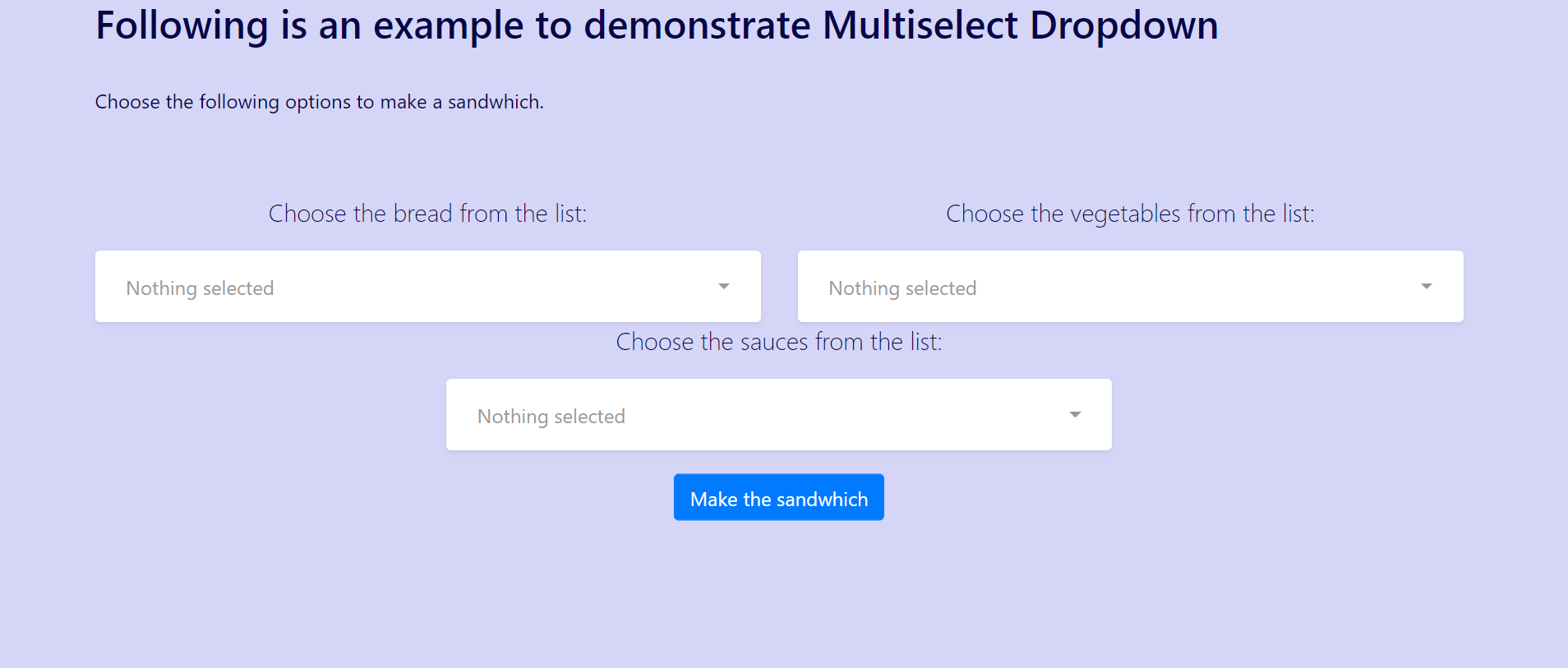
Initially, the screen looks like this,
Example 2:
<!DOCTYPE html>
<html>
<head>
        <link rel="stylesheet" href="https://netdna.bootstrapcdn.com/bootstrap/3.3.2/css/bootstrap.min.css">
        <script src="https://ajax.googleapis.com/ajax/libs/jquery/2.1.3/jquery.min.js"></script>
        <script src="https://maxcdn.bootstrapcdn.com/bootstrap/3.3.2/js/bootstrap.min.js"></script>
        <link rel="stylesheet" href="https://cdn.jsdelivr.net/gh/bbbootstrap/libraries@main/choices.min.css">
        <script src="https://cdn.jsdelivr.net/gh/bbbootstrap/libraries@main/choices.min.js"></script>
<style>
body {

    margin-top: 100px;
    background-color: rgb(19, 19, 5);
    font-family: 'Segoe UI', Tahoma, Geneva, Verdana, sans-serif;
    color: #514B64;
    min-height: 100vh;
}
.content{
    align-items: center;
    align-content: center;
}
.para{
    color: white;
    align-items: center;
    align-content: center;
    font-family: 'Segoe UI', Tahoma, Geneva, Verdana, sans-serif;
    font-size: larger;
}
</style>
</head>
<body>
<div class="container">
<div class="row">
    <p class="para">Following is an example to demonstrate the multiselect dropdown using Bootstrap.</p></br>
    <div class="col-md-12 content">
        <select id="multipleselect" placeholder="Hello! You can choose upto 5 colors of your choice." multiple>
            <option value="Red">Red</option>
            <option value="Yellow">Yellow</option>
            <option value="Green">Green</option>
            <option value="Purple">Purple</option>
            <option value="Orange">Orange</option>
            <option value="Mauve">Mauve</option>
            <option value="Black">Black</option>
            <option value="White">White</option>
            <option value="Cyan">Cyan</option>
            <option value="Pink">Pink</option>
            <option value="Gray">Gray</option>
        </select> </div>
</div>
</div>
<script>
$(document).ready(function(){
var multipleSelectButton = new Choices('#multipleselect', {
removeItemButton: true,
maxItemCount:5,
});
});
</script>
</body>
</html>
Output:
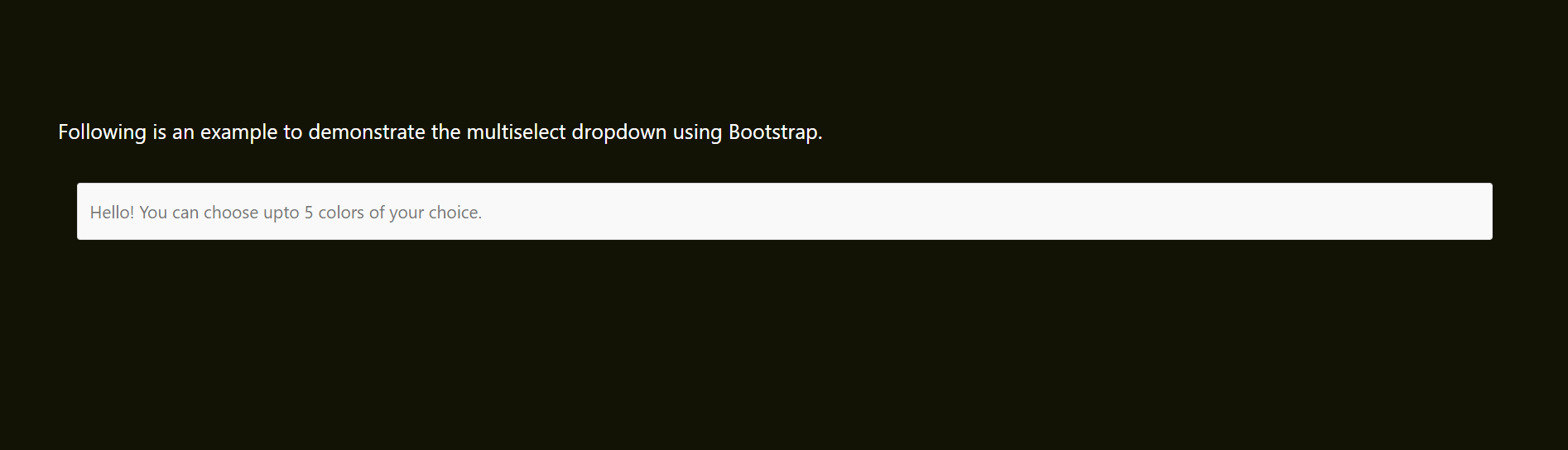
Initially, the screen looks like this,
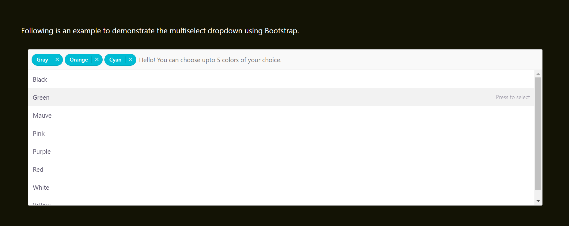
We can now use the dropdown to select at max five options,