Error Bar in Microsoft Excel
Error Bar is considered the essential term used in Microsoft Excel. It is defined as the graphical representation of the respective data used to denote the errors.
The Error bars can consist of minus, plus or both types of directions with the Cap and No Cap styles. To insert the error bars, an individual first needs to create a chart in Microsoft Excel with the help of the Column Charts or using the error bars, mainly from the tab "Insert menu tab." After that, an individual need to click on the button that is the "Plug Button" present at the top right corner of the particular charts and after that select the Errors Bars from there. Besides these, if an individual wants to customize the error bars, then the individual chooses "More Options" in the respective Menu List.
Furthermore, the bars primarily represent the standard deviation and the standard error. They are also responsible for denoting or indicating how far the actual value is from the determined value.
The simple representation of the Error Bars used in Microsoft Excel is usually depicted in the below-attached Screenshot.
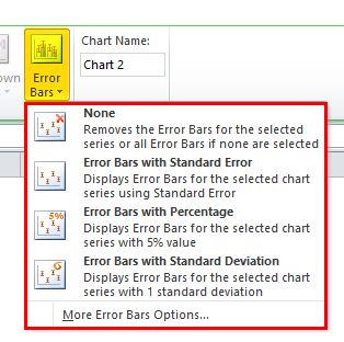
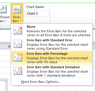
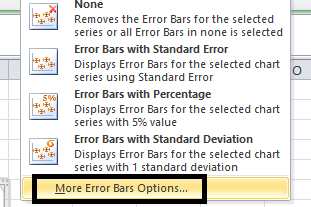
It was known that in the Error Bar, we could have three options that are listed as follows:
- The Error Bars with the Standard Error.
- The Error Bars with the help of the Percentage.
- The Error Bars with the use of the Standard deviation.
As shown in the below-attached Screenshot,
How to Add Error Bars in the Microsoft Excel?
It was assumed that adding the error bars in Microsoft Excel is straightforward to use by any individual.
Let us see and understand the various examples of how to add the error bars in Microsoft Excel.
#Example 1: Sta
In the respective Microsoft Excel, the individual standard bar is the exact standard deviation. The standard error is the term that measures the accuracy of the specific types of data used in Microsoft Excel by an individual effectively.
Moreover, in statistics, a sample means effectively deviates from the actual mean of the population; thus, this type of deviation is known as the “standard error.”
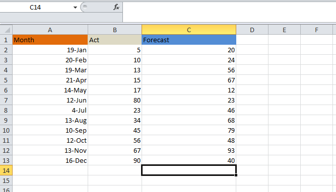
In the example below, an individual will effectively learn how to add error bars to a particular chart. Let us assume the below example where it could be shown that the actual figures are effectively related to the sales and the forecasting figures.
As depicted in the below example,
Now, we will try to apply the Excel error bars with the help of the following mentioned steps below respectively,
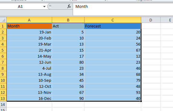
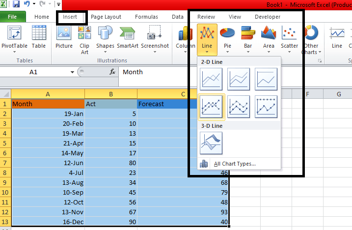
Step 1: First of all, we need to select the Actual figure and the Forecast Figure along with the respective considered month to get the graph for the data effectively, as shown in the below-attached Screenshot.
Step 2: Now, we will move on selecting the "Insert Menu" and then an individual must choose the "line chart" in order to get the chart as depicted in the below Screenshot.
Step 3: We will effectively get the line chart for the above data, as shown in the below-attached Screenshot, with actual figures and forecasting figures.
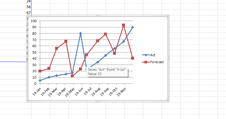
Step 4: After that, we need to click on the forecast bar in order to get that the actual line respectively selected with the help of the dotted line as depicted in the below attached figures.
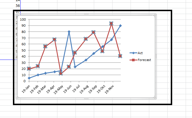
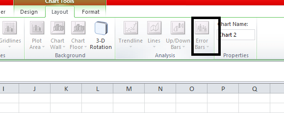
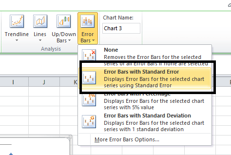
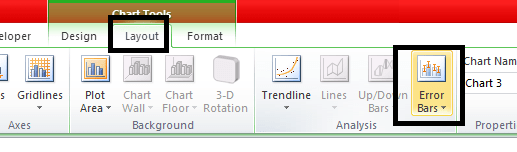
Step 5: Once we click on the figure that is the forecast figure, we can effectively see the layout menu. Now click on the "Layout Menu", and then we will select the Error bar option. As shown in the below attached figures.
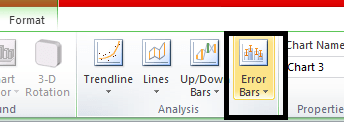
Step 6: After that, we should click on the "Error Bars" options to get the various options shown below in the attached Screenshot respectively.
Step 7: In the error bar, we will click on the particular defined second option that is “Error bar with the Standard Error.”
As shown in the below attached figures.
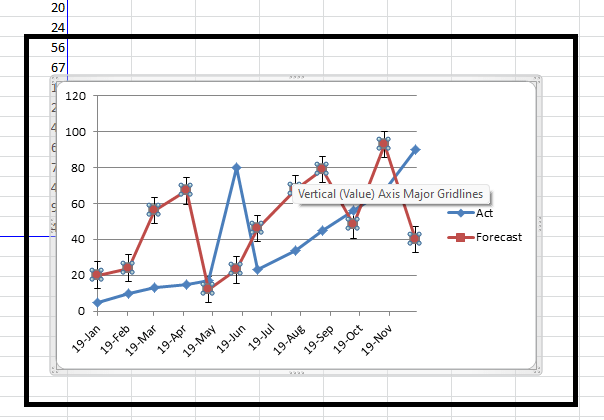
Step 8: Once we click on the standard error bar, the respective graph will change effectively, as depicted below in the attached Screenshot. As in the below-attached Screenshot, we can figure out the standard error bar, which shows the fluctuation in the statistical measurement of the Forecast and the Actual report.
# Example 2: Error Bar with percentage
In this particular example, we will effectively learn how to add an Excel Error Bar with the help of the Percentage in the mentioned below chart.
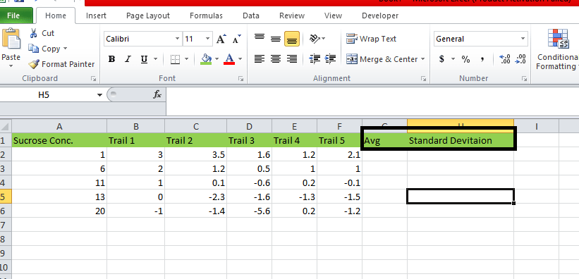
For this, we will assume the below-mentioned example, which consists of the chemistry lab test trail as shown below in the attached Screenshot respectively.
As depicted in the below-attached Screenshot.
Now, we will move on to calculating the Average as we all as the standard deviation, to apply for the error bar with the help of the following mentioned below steps respectively,
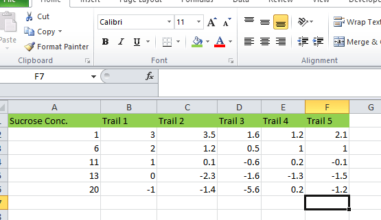
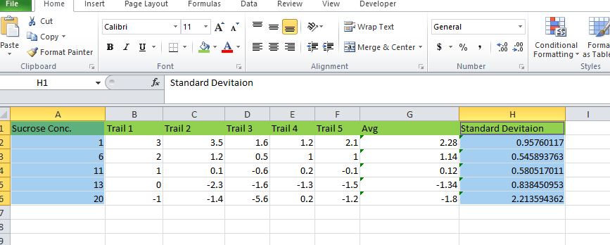
Step 1: First, we need to create the two new columns for the standard deviation and the Average.
As shown below in the attached Screenshot.
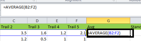
Step 2: After creating the two columns, we will insert the Average Formula that is Average = AVERAGE (B2:F2) by selecting the B2:F2. As depicted in the below-attached Screenshot.
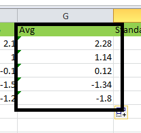
Step 3: After applying the formula, we will get the average output in the below-attached Screenshot.
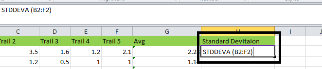
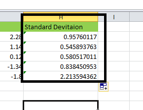
Step 4: Now, after calculating the AVERAGE, we will now move forward on calculating the Standard Deviation with the help of the mentioned formula,
Standard Deviation = STDDEVA (B2:F2).
As depicted in the below-attached Screenshot respectively,
Step 5: After applying the formula, we will get the following output, as depicted in the below-attached Screenshot.
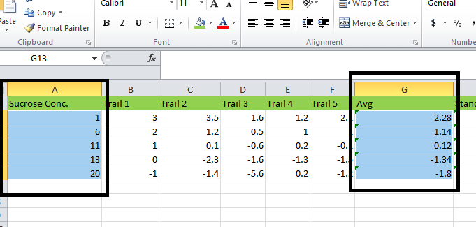
Step 6: After this, we need to select the Sucrose Concentration Column and the AVG column by holding the CTRL+Key effectively.
As clearly seen in the below-attached Screenshot.
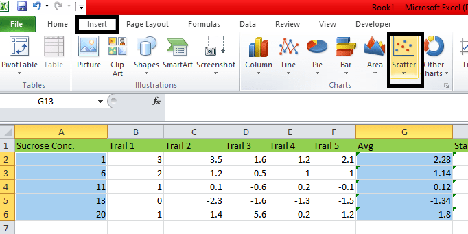
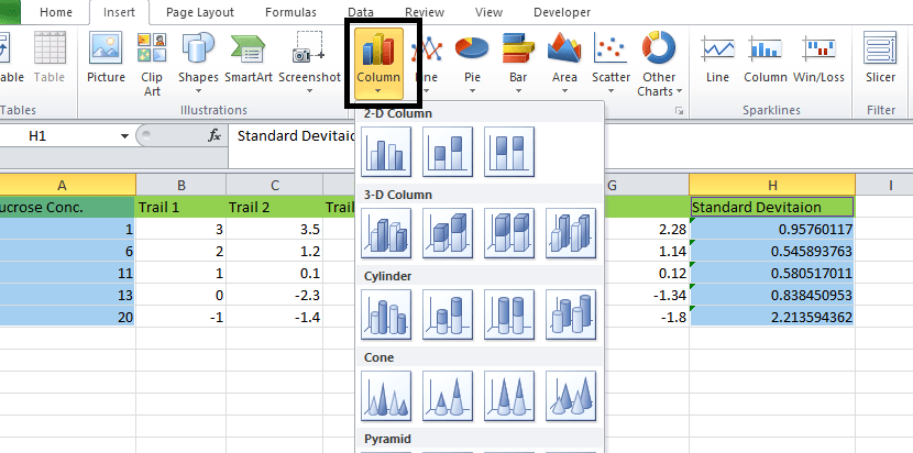
Step 7: After selecting the two columns, we will go to the INSERT menu. And then establishes the Scatter Chart that is mandatory to be shown or displayed, and click on the Scatter chart respectively.
As depicted in the below-attached Screenshot.
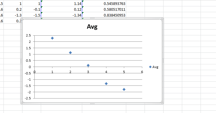
Step 8: Now, we will notify the respective dotted lines to show the average trail figure.
Step 9: After that, click on the dots line, which is in blue, so that we will effectively get out the layout menu.
Step 10: Now we should move on to the Layout Menu, and we can easily find the error bar options, as displayed in the below-attached Screenshot.
Step 11: Now, we will click on the "Error Bar", and effectively we will encounter huge options, and from that, we will click on the option "Error Bar with Percentage." As depicted in the below-attached figure.
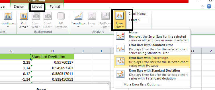
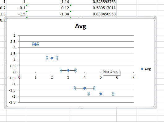
Step 12: Once we click on the " Error Bars with Percentage" option, the graph above will change, as shown in the attached Screenshot.
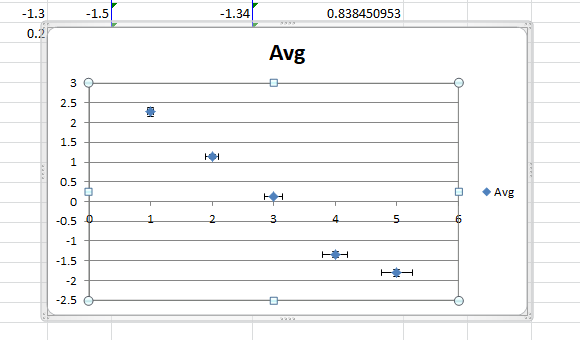
As per the above Screenshot attached, some of the points can be noted; they are as follows:
- As per the above Screenshot, we can visualize the Error bar with five percentage measurements.
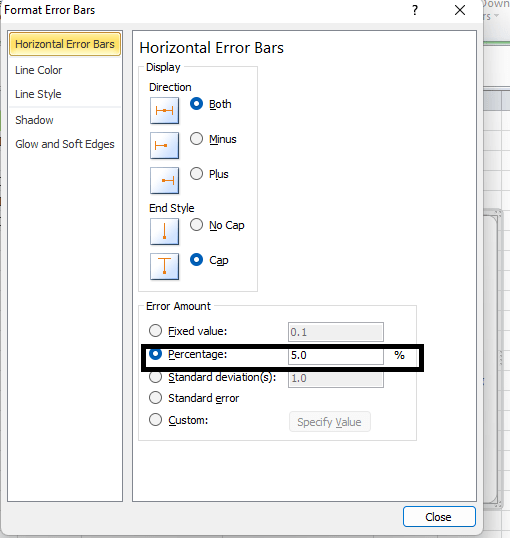
- And by default, the Error Bar with the Percentage takes five percentages. We can also make changes in the Error Bar Percentage with the help of the custom values available in Microsoft Excel, as shown below in the attached figure.
- We should click on the "Error Bar", where we will encounter the More Error Bar option, as seen in the attached figure below.
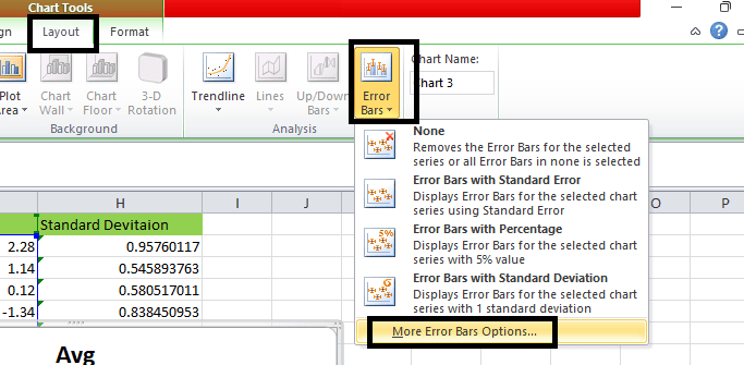
- Now we should need to click on the "More Error Option."
- As soon as we click on the "More Error bars options", a dialogue box will appear on the screen, and in that, we can see that in the column of Percentage by default, the excel will take as 5 Percent respectively. As depicted in the below-attached Screenshot.
- And in these, we are effectively moving on increasing the Error Bar Percentage by 15%, as shown below in the attached Screenshot.
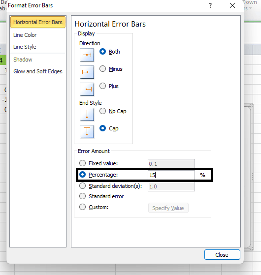
- After that, close the dialogue box, and after closing the dialogue box, it will increase the Error Bar percentage by 15 %, as depicted in the attached Screenshot.
# Example 3:
Now in this particular example, we are efficiently going on discussing and seeing,
how to add an Error Bar with the help of the Standard Deviation in Excel?
For these, we will effectively consider the above same example in which we have already calculated the standard deviation as depicted in the attached figures, which will effectively depict the chemistry lab test trails with the average and the standard deviation.

In these, we will apply an Error Bar with the help of the Standard Deviation by the benefit of the below-mentioned steps.
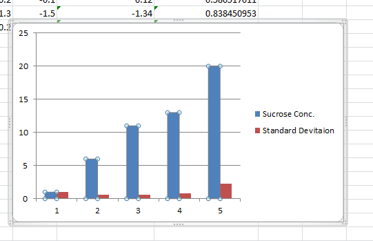
Step 1: First, we need to select the "Sucrose Concentration" column as well as the “Standard Deviation Column.”
As depicted below attached figures.
Step 2: Now we will go to the "Insert" menu in order to choose the chart type and then from that we will select the "Column chart" as depicted in the below-attached figures.
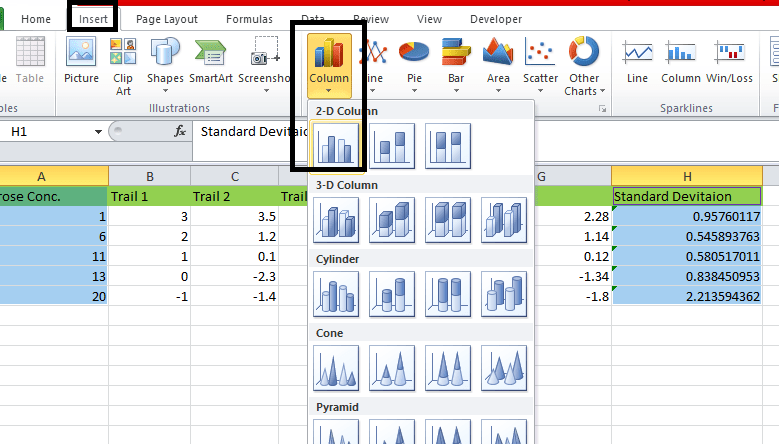
Step 3: The chart will be displayed after selecting the respective column.
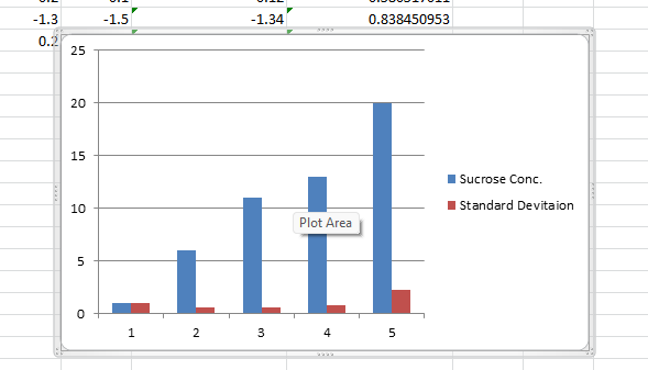
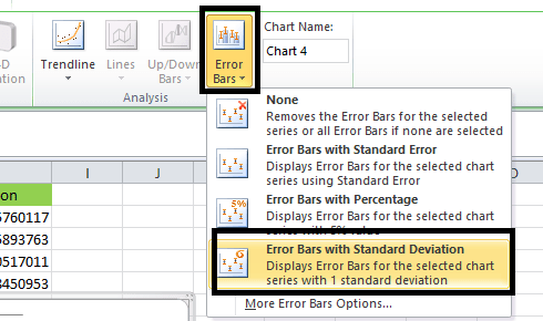
Step 4: Now, we will click on the particular Blue Colour bar to get the dotted lines as depicted below in the attached Screenshot.
Step 5: Once we click on the particular selected dots, we will effectively get the chart layout with the help of the "Error Bar Options" and then choose the fourth option from it, "Error Bars with the Standard Deviation." As shown below in the attached Screenshot.
Step 6: Once we click on the Error Bars with the Standard Deviation, we will get the following chart below.
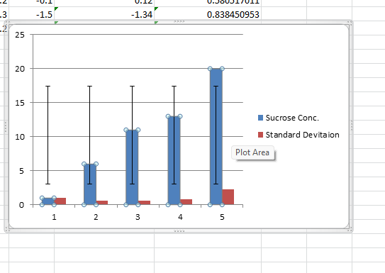
Step 7: To get or to show the Error Bar in the Red Bar, we must follow the same process as discussed above.
Things to Remember
The various essential things that need to be remembered by an individual while working on the Excel sheet with the Error bars are as follows:
- The essential thing to be remembered by an individual are that the Error Bras in Microsoft Excel should be applied only for the chart formats.
- And in Microsoft Excel, the particular Error bars are most probably used in the Chemistry lab and the biology lab, which can be used to describe the data set.
- And while using the Error bars in the respective Microsoft Excel, one should ensure that the individual is using the real axis, which means the numerical values should start at zero.