Gauge Chart in Excel
A Gauge Chart in Microsoft Excel is considered the meter type chart of a group dial chart, which is eventually similar to the speedometer that has the pointer towards the different numbers mentioned on the respective arc.
And the Gauge chart in Microsoft Excel primarily measures and shows the numerical data or the values starting from the zero value to the maximum limit it is supposed to have.
Furthermore, we can effectively use the Gauge Chart to represent the completion status with the help of the percentage and to represent the profit and loss. And to create the Gauge chart, we need to have the first three numbers from which the sum of the two numbers will efficiently give the value for the 3rd one. After that using these numbers, we can create the Pie chart that is available in the "Insert menu tabs Chart section." Once we complete the creation of the Pie Chart, we will delete the rest of the portion coming out of the summation of the two above-selected numbers. This will only depict how our gauge chart (primary) will look when they are created with the data provided by the company, etc.
How to Create the Gauge chart in Microsoft Excel?
In Microsoft Excel, creating the Gauge chart is the most straightforward task to work on.
It is now moving on to understanding the effective creation of the Gauge chart in Microsoft Excel with the help of the example discussed below in brief.
# Example: 1 Creating the Simple and the Easiest Gauge chart in Microsoft Excel.
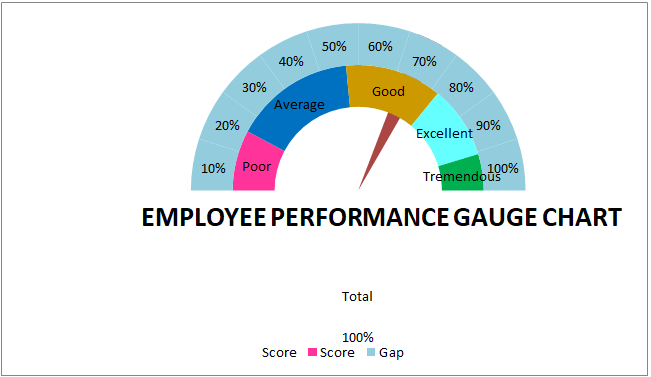
It was assumed that the Pie Chart could efficiently reassemble the simple Gauge Chart in Microsoft Excel. As it primarily does not make any involvement of any kinds of the levels such as the speedometer, which has various parameters like:
- Excellent.
- Good.
- Average.
- Poor.
It is responsible for showing only two items that include,
- What needs to be achieved?
- What is the Current Achievement?
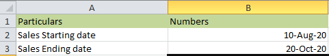
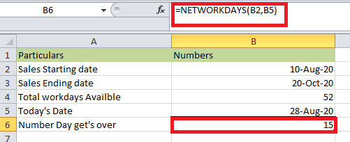
And for this respective example, we have already defined or set up the data, and this data mainly includes the sales ending data and the sales starting date. As shown below in the attached figure.
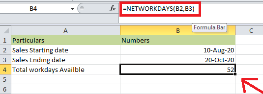
With the help of the NETWORKDYAS function, we have shown that the full days are available in the sales cycle.
The function NETWORKDAYS excludes the weekends and effectively gives out the number of days.
As shown in the below-attached screenshot.
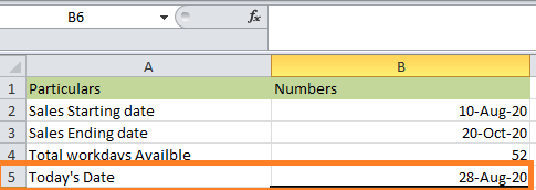
And in the very next cell, we will enter the current data, as depicted in the below-attached screenshot.
Now, we will again use the function that is the NETWORKDAYS to calculate and know how many days have been getting over from the sales starting date effectively.
As depicted clearly in the below-mentioned figure.
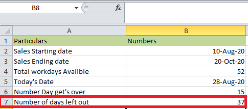
And then, we will see how many days have been left out in the sales cycle, as depicted in the attached screenshot below.
After that, we will efficiently create the Gauge chart (Simple) in Microsoft Excel that primarily shows the total number of available days, the total number of days we are left out with, and the total number that gets over.
For this, we will follow the below-mentioned steps.
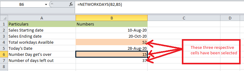
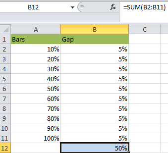
Step 1: First, we will select the three cells, B7, B6, and B6, with the help of holding the control key. As depicted in the below-mentioned steps.
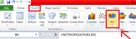
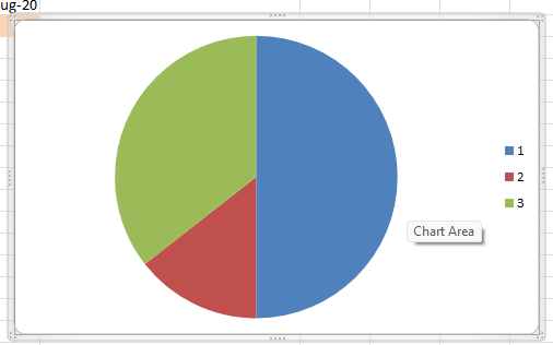
Step 2: After selecting the above three respective cells, we will click on the "Insert options" and then select the pie chart for the selected cells that get the outcomes, as clearly depicted in the attached screenshot below.
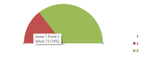
Step 3: After that, we will get our desired output in the pie chart, as seen from the attached screenshot below.
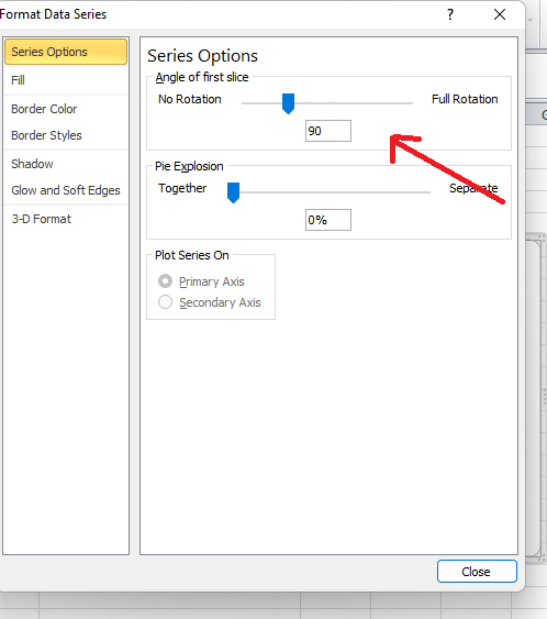
Step 4: Now, in the very next step, we will select the ChartChart and then press the CTRL + 1, which is termed to be the shortcut keys for the above respective ChartChart, and soon after doing this, we will be notified with the format option on the right-hand side.
Now we will efficiently make out the Angle of the first slice to the 90-degree respectively, as shown in the below-attached screenshot.
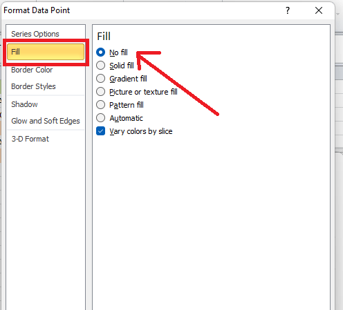
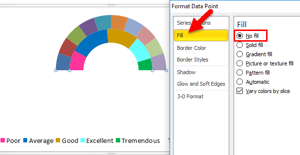
Step 5: After that, we will select the blue-colored area with the maximum value or the highest value, and then make the fill the "NO FILL." As we can see in the below-attached screenshot.
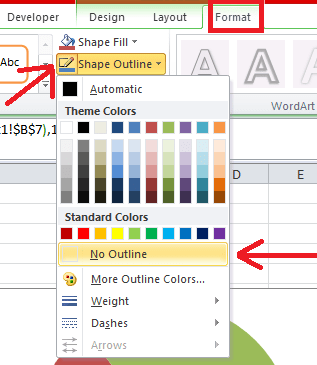
Step 6: Now, in these steps, we will effectively select the entire ChartChart. And under "Format options," the particular tab will make out the "Shapes Outline" as making it no outline. As clearly depicted in the below-mentioned figure.
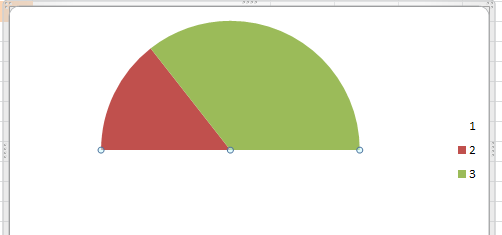
And the results will be as follows:
Step 7: Now, after that, we will select only the portion in the “GREEN COLOR” part to make and FILL as NO FILL, shape outline as “BLACKLINE.” As shown below in the attached figure.
Step 8: After that, we will effectively select only the area that is colored, and we will make the shape outline similar to the black line. Now move to the FILL>PATTERN FILL>then Select 90-degree pattern fill as depicted below in the attached screenshot.
Step 9: Now, we will make the respective chart title the “Number of days over.” As shown below in the attached figure.
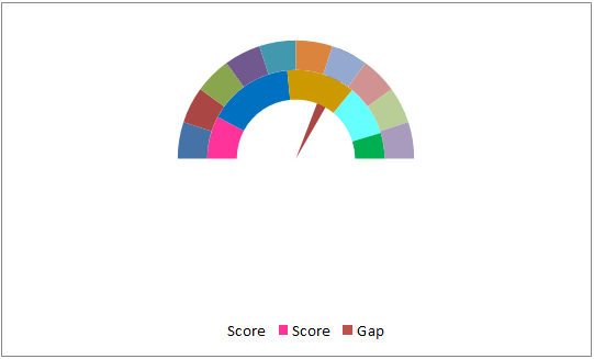
Now, it is concluded that we have effectively set up the Simple Gauge chart. But it was noticed that it does not have any indicators like the parameters such as Excellent, Good, Average, and Poor; as we will see this in the below discussed formula efficiently.
# Example: 2 Creation of the Speedometer Chart with the help of the Indicators
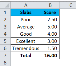
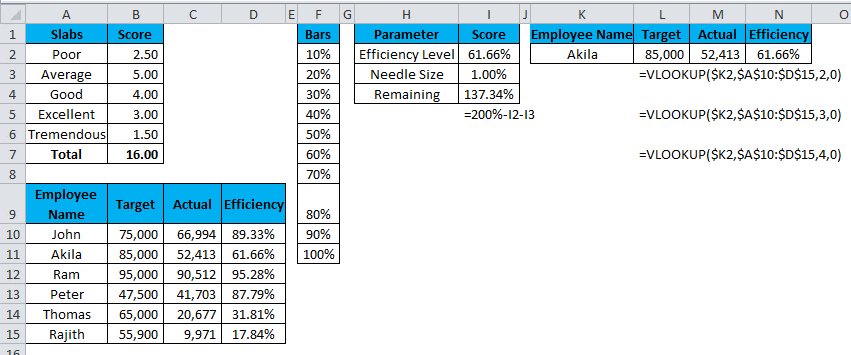
For these respective examples, we will assume the data related to the sales of the individual employee's performance in the past years. To judge this, we have separately created some slabs for their efficiency level.
As depicted below in the attached screenshot of the data.
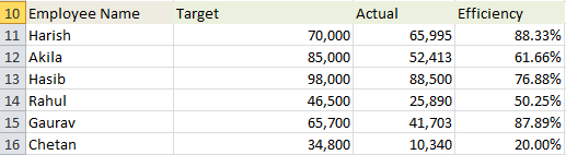
And on the contrary, on the other side, we will define the sales of the individual employee's performance for the entire year, as clearly depicted in the screenshot below.
After that, we will create one more data series, as depicted in the attached figure below.
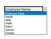
Now, we will create the drop-down list of the employees' names. As depicted in the below screenshot.
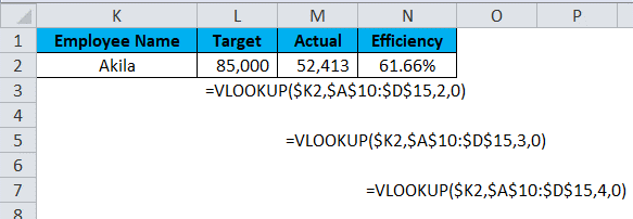
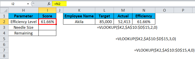
Now, we will effectively apply the VLOOKUP to get the target, and the particular efficiency level based upon the selection from the above drop-down, as seen in the attached screenshot below.
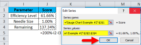
After that, we will create one more table for the Speedometer needle. As depicted in the below-attached figure.
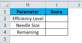
And for the Efficiency level, we will give the link for the VLOOKUP Efficiency cells, the N2. As depicted in the below-attached figure.
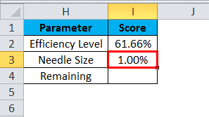
And for the Needle size, as depicted in the below-attached screenshot for the length of 1%
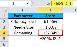
And for the remaining cells left out, we will mention the formula = 200%I2-I3, respectively.
As depicted in the below-attached screenshot.
We have already set up the adequate data that is effectively required to create the ChartChart, which is the GUAGE CHART in Microsoft Excel. As shown in the below-attached screenshot.
Step 1: In this, we will select the table and then effectively insert the ChartChart, a donut, as shown below in the attached figure.
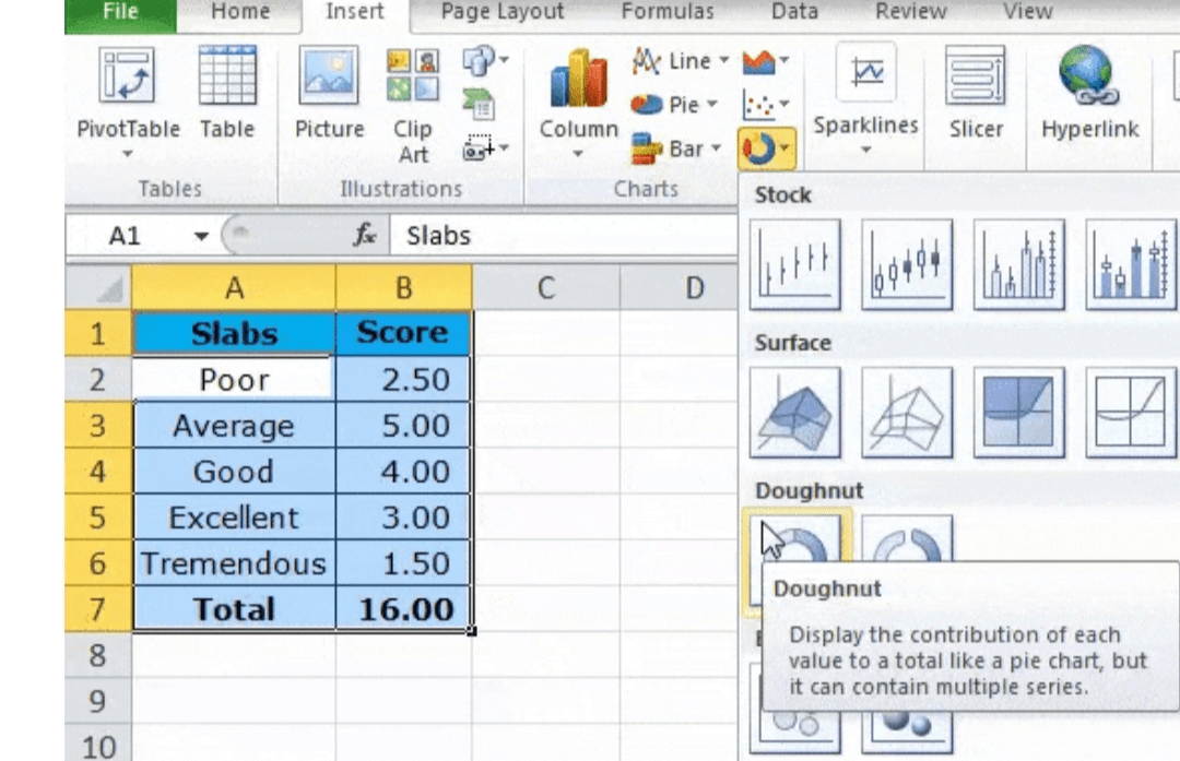
Step 2: After applying the ChartChart, we will get the output shown below in the attached screenshot.

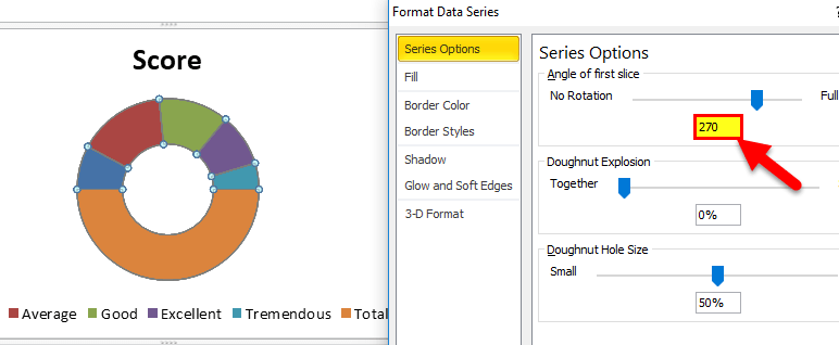
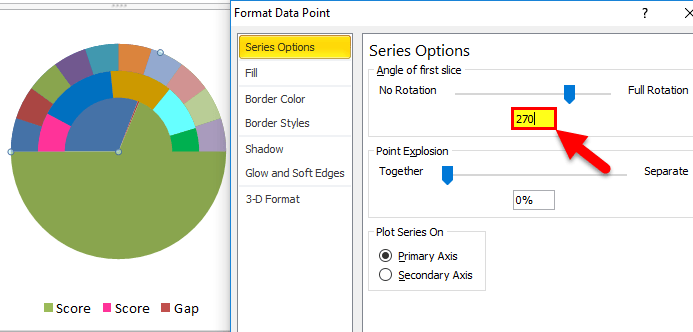
Step 3: Now, we will select the respective ChartChart and make the Angle of the particular first slice to a degree of 270, as shown in the attached screenshot below.
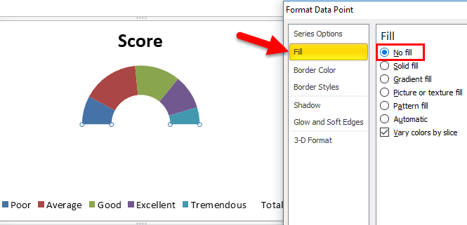
Step 4: After that, we will select the huge or the significant portion of the above donut chart to make the respective fill the "NO FILL." As depicted in the below-attached figure for the separate data.
Step 5: And now, for the rest of the left-out part, that is, the remaining five pieces, we will fill that with the various colours as depicted in the below-mentioned image.

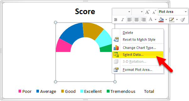
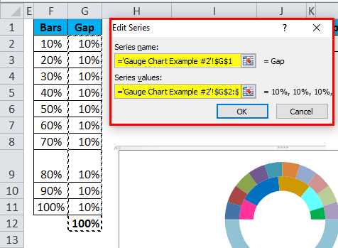
Step 6: In the next step, we will right-click on the particular above ChartChart and then click on the "Select Data" options, as shown in the attached image below.
Step 7: We will select the second table we have efficiently created in these steps. As shown in the below-mentioned figure.
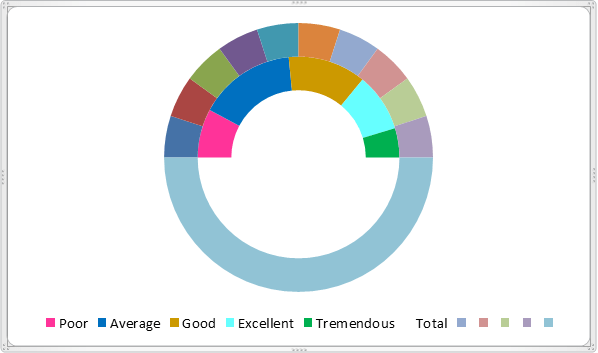
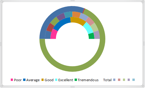
Step 8: After performing the above steps, we will get the charts with the attached screenshot below.
Step 9: In this particular step, we will again select the huge or significant portion of the newly inserted ChartChart and then fill it to be the "NO FILL." As shown in the below-attached screenshot.
Step 10: Now, we will right-click on the respective above ChartChart and then select "Select Data", and here we will select the final table that we have created, as depicted in the attached screenshot below.
Step 11: After performing the above step, we will get the respective output, as shown in the screenshot below.
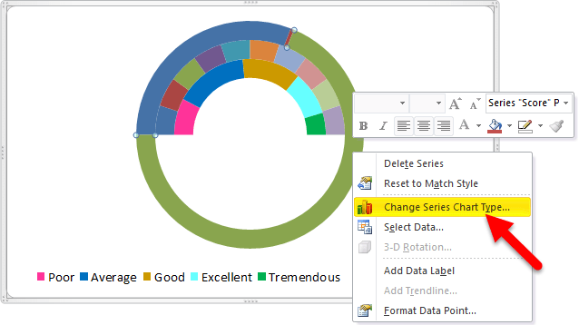
Step 12: Now, we will select the newly inserted ChartChart and click on the chart type “Change Series Chart Type.”
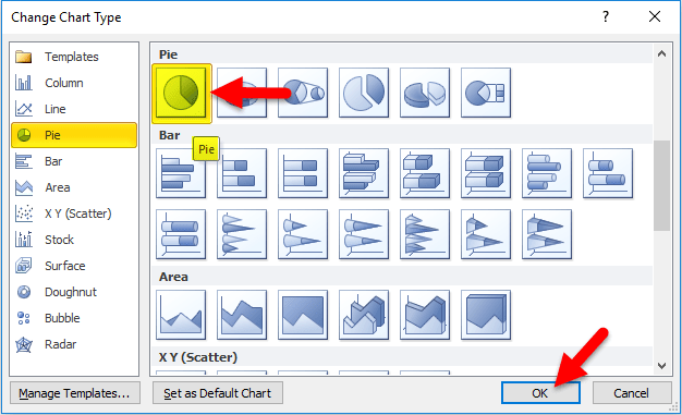
Step 13: Now, we will select the respective ChartChart that is the "PIE CHART", and then we will click on the "OK" Button. As clearly seen in the below-attached image.
Step 14: We will make out the Angle to 270 degrees, respectively.
As seen in the below image.
Step 15: In the above Pie chart, we will fill out the two considerable portions to be the "NO FILL" and then change the particular needle size to 5%, respectively. As clearly seen in the below-attached screenshot.
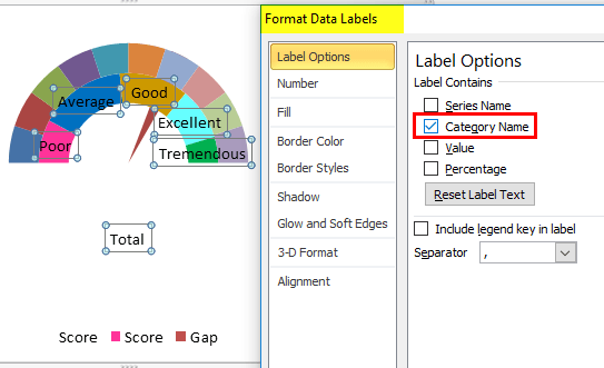
Step 16: After that, we will click on the Right click on the first doughnut chart, and then we will select the format data labels in that respective select only in the category name, as seen in the below-attached screenshot.
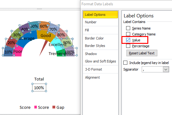
Step 17: Afterwards, we will select the second doughnut chart and add the data labels, choosing the Select Value. As seen in the below-attached screenshot.
Step 18: Now, we will make some colour adjustments for the respective type of data we selected for a better lookout. As seen in the below-attached screenshot.