Excel Axes
What is Excel Axes?
Axes are a horizontal or vertical line containing units of measure. There are two types of axes X and Y axes. X is a horizontal and Y is vertical one. Axes are used in chart, graph used to measure the data in a graph. For plotting 3-D cone, 3-D pyramid, 3-D column Y axis also added.
How to plot X and Y axes?
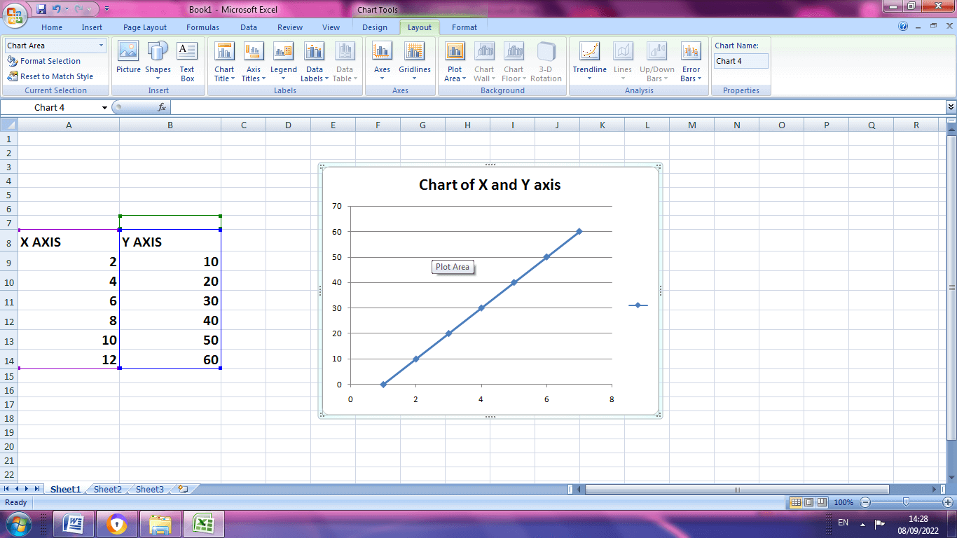
Step1: Insert the data table in Excel spreadsheet
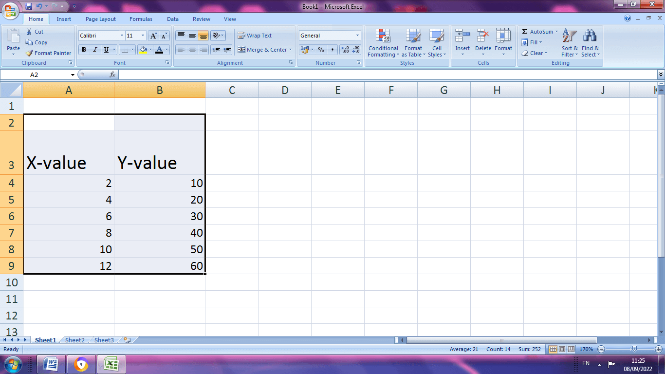
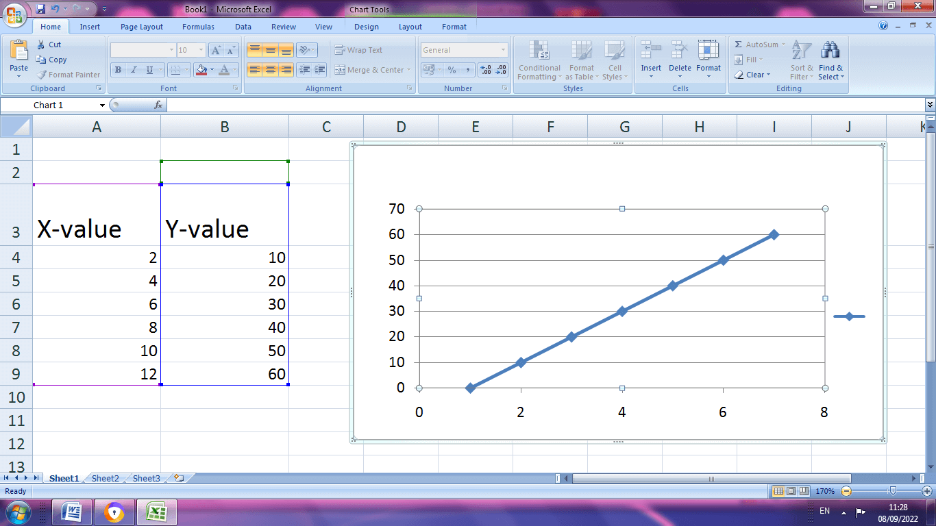
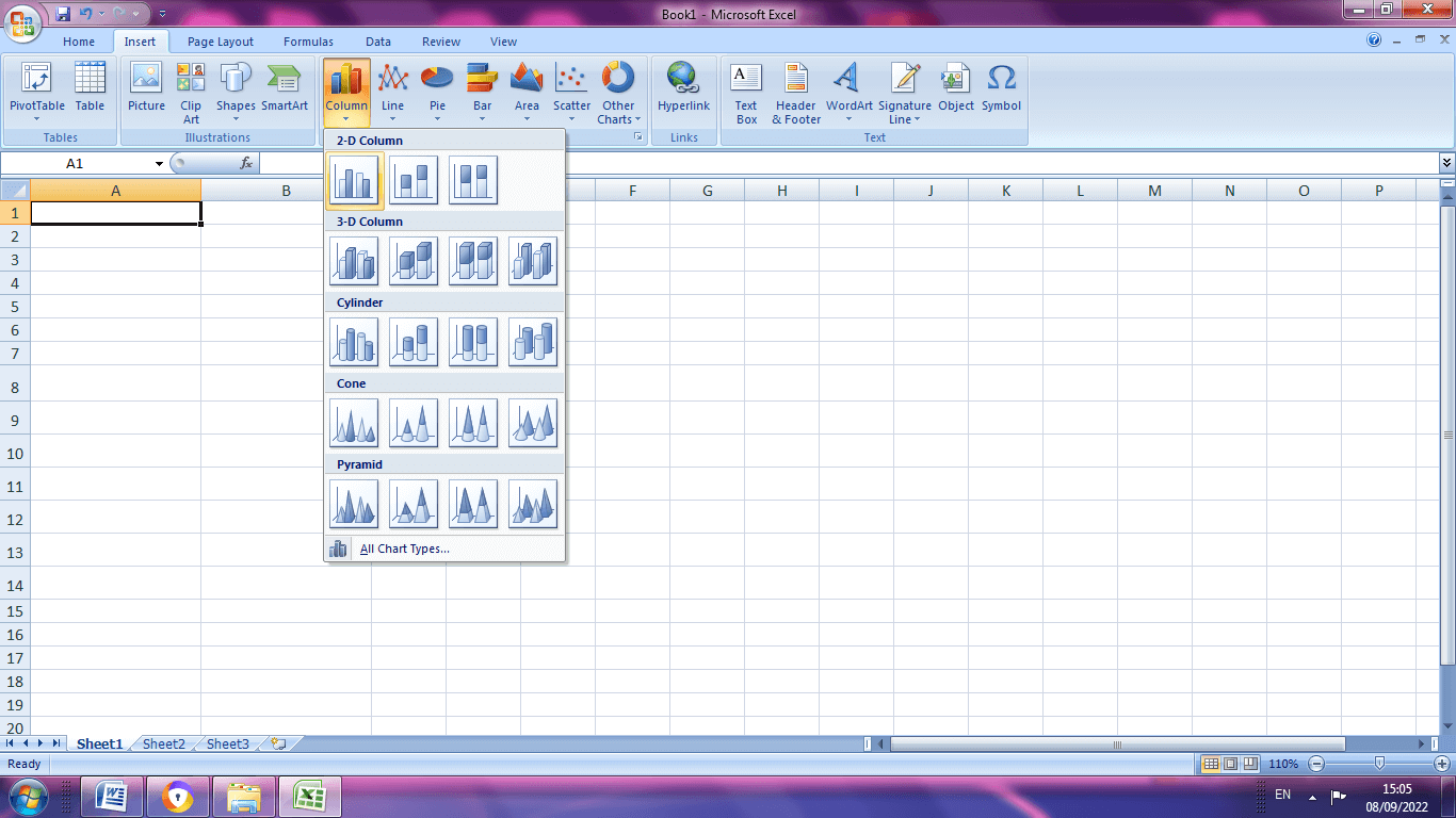
Step 2: Highlight the data table, choose Insert option .If it is 2010 Excel, the Scatter group is present in Insert tab. Select the desired chart type.
Step 3: If the Excel is 2013, choose the Chart group from Insert tab, select X and Y Scatter chart.
Step4: The data are represented in chart form as shown in the below picture.
Changing Axes to X and Y graph in Excel
To add the details in the graph like horizontal and vertical axes, the following steps should be followed.
Step 1: Click Add Chart Elements, choose Axis titles.
Step 2: There exist two options, Primary horizontal and Primary Vertical. Select the required options.
Step 3: The Horizontal and vertical axes are added to the graph.
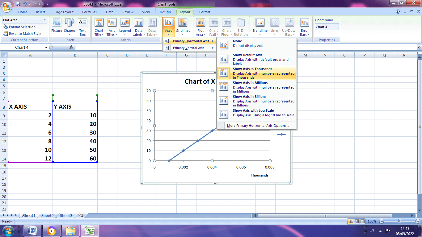
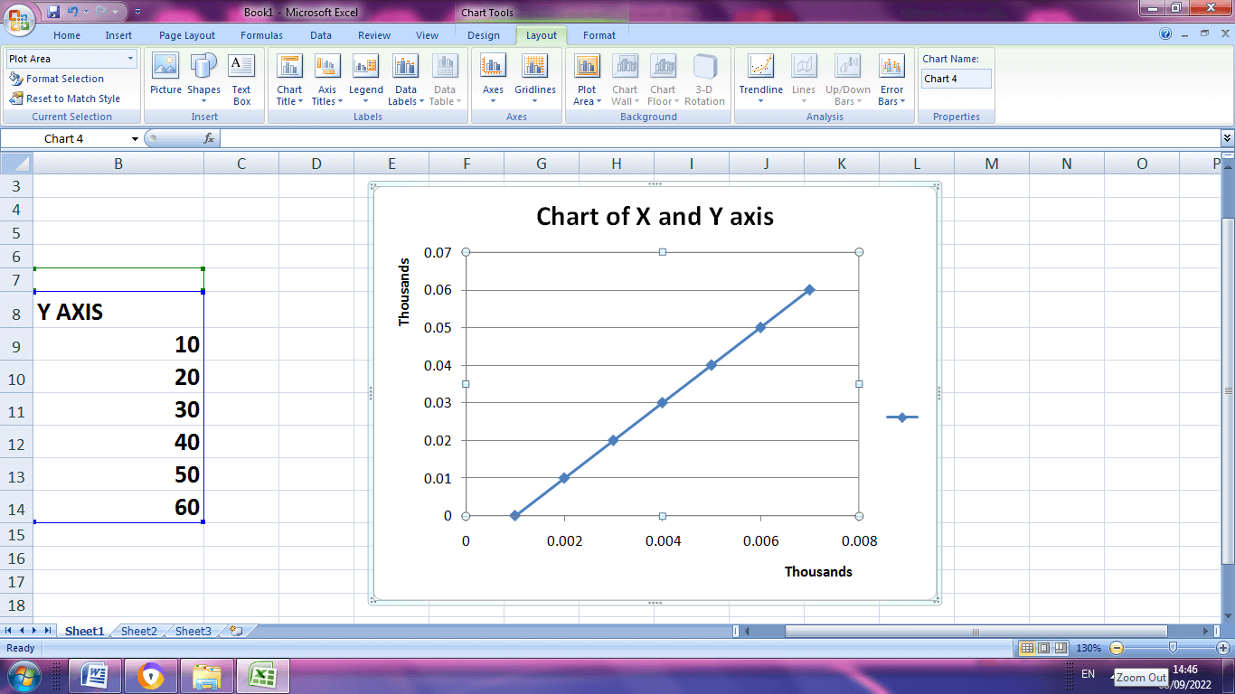
Step 4: The horizontal and vertical axes are changed in thousands which is displayed below.
Adding a Chart Title
Step 1: Click the chart
Step 2: Choose Chart title from the layout command tab and select the location
Step 3: In the chart title box type the name
Axes Classification
The axes are classified into two types,
- Value Axis
- Category Axis
The value axis indicates the numerical values, while the category axis indicates the multiple data that measured against each other by numerical values. These axes intersect by means of bars, columns, dots used to understand the data chart.
Example: How to create a chart with two Y-axes and one shared X- axis?
Step1: Select the insert tab from toolbar .In chart section select the column button and click the first chart.
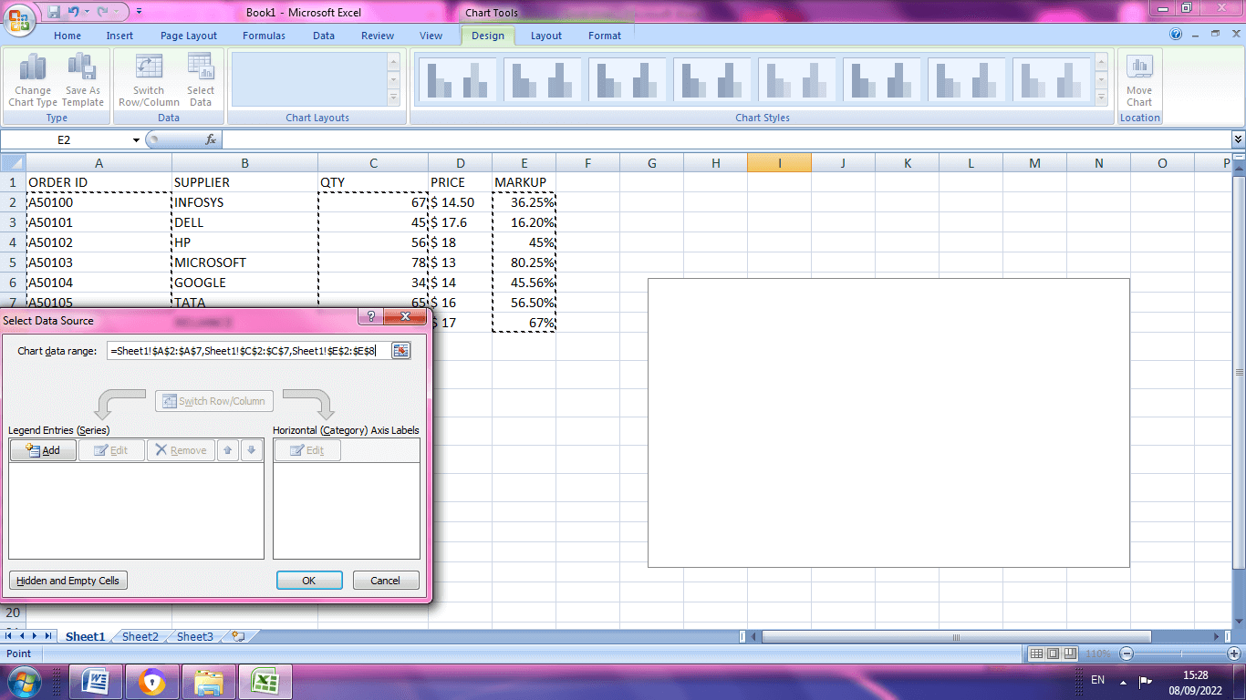
STEP 2: Enter the data in the spreadsheet. Then right click the graph. A dialog box will appear, in that choose select data
Step 3: A dialog box will appear where the particular data range should be selected using comma.
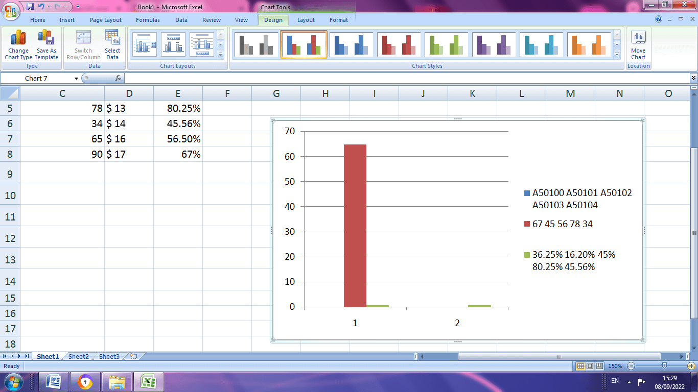
Step 4: After selecting press Enter key. The graph will display as shown below.
Step 5: The final result of the graph.
Elements present in the Excel Charts
The multiple elements present in the excel helps to make the data more meaningful and effective.
Step 1: While click on the chart, three buttons appear at the upper right corner of the chart. They are as follows,
- Chart Elements
- Chart Styles and Colors
- Chart Filters
Step 2: Under the Chart Elements various subdivisions are,
- Axes
- Axis titles
- Chart Titles
- Data labels
- Data table
- Error bars
- Gridlines
- Legend
- Trend line
To check this option the users are allowed to watch the preview of each option.
Step 3: The users can select or deselect the chart elements, they decide what to display in the chart.
Setting a Multiple Axes with Excel
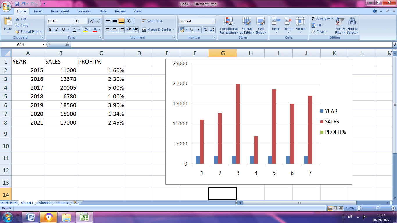
Step 1: Create a dataset and choose the desired graph to plot the datas as shown below.
Step 2: To add the secondary axis chooses Data>Insert>Charts>Recommended Charts
Step 3: After selecting the recommended chart option, a pop up window displays with various charts depends on dataset. The users are allowed to choose the desired chart as per the requirement.
Step 4: The title of the chart is added by choosing the Axis title from the Chart Elements menu.
Step 5: By choosing data labels from labels, the required data are set to the graph.
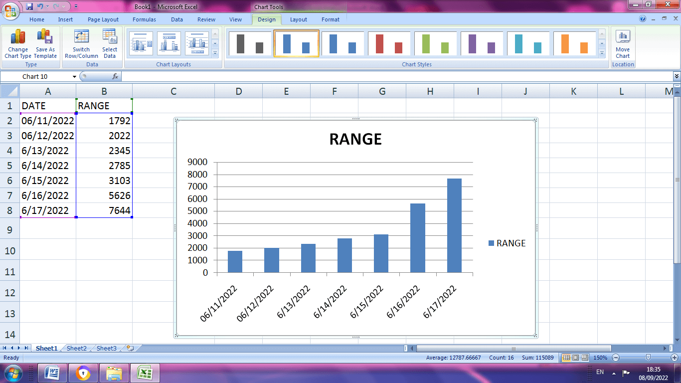
Date and Text Axis
One can arrange the data in the graph by means of date and text wise.
Step1: Create a data set with specified date and values
Step 2: On the insert tab, in chart group click the column symbol
Step 3: Choose the clustered column.
Step 4: To change the data from date to text format choose Format Axis from the horizontal axis.
Step 5: Choose Text Axis.
Step 6: A Final graph will be displaying the text axis from the date axis.