Charts in Excel
Charts
Definition of Charts
A chart is used to show numbers or data in a spreadsheet visually. It is the visual representation of your data. It is a tool that can be used in Excel to communicate data graphically. Different elements, such as columns or lines can be used to display a series of numeric data in a graphical format. It is useful to see the meaning behind the numbers and can show the comparison and trends much more accessible and easier. It enables the end user to look at the chart and interpret the results or observe the trends easily.
How to insert a chart?
Step: 1
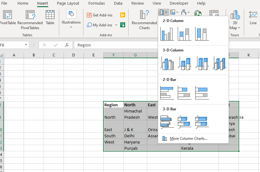
- Select data you want to put on a chart
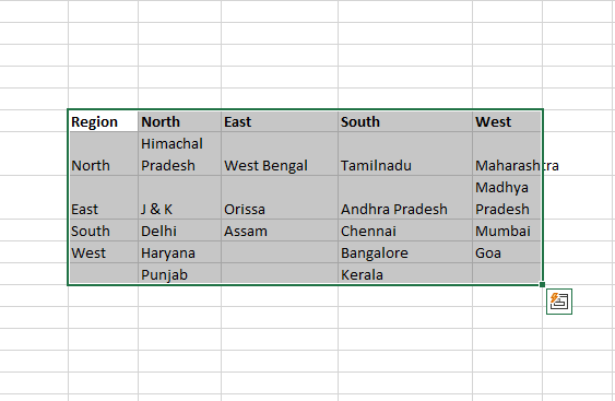
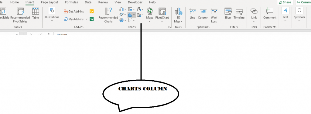
- Go to ‘Insert’ and then click on the chart which you want to insert
Step: 2
1. Select the chart which you want to insert
2. Once the chart appears on the spreadsheet, do a right-click and click on ‘Select Data’
3. Click on Chart Range and select the data which you want to see in the chart and click on OK
Parts of Charts
- Horizontal Axis (X-axis) - It consists of different values of the variable for which we are plotting data on the graph.
- Primary Vertical Axis (Y-axis.)-It consists of a scale based on different data points we are plotting on the graph.
- Secondary Vertical Axis – This is not present in all the graphs and is used when we are plotting 2 different variables on the graph and there is huge value different between the 2 variables – for ex we are plotting age and salary – age will be in 10’s multiples whereas Salary in 1,000’s – so if we plot them on the same Y-axis, age graph/line/data-points will not be visible at all.
- Data Points – These are the values which we are plotting on the graphs like age, salary.
- Chart Title – It gives the title of the chart. Once can change it, link it to a cell and even format it beautifully.
- Legend - Legend is sort of a key. It tells the user about the values that have been plot on the graphs.
- Data Label – When you plot values on a graph, you may also want to see values of each of these data-points. These values are called Data Labels.
Chart Types
Column Chart
This is one of the most widely used chart types. Each data value (or data-point) is plotted as a vertical column/rectangle. The height of each column corresponds to the value of a data-point. Y-axis (primary vertical axis) provides us the scale for these values.
Column charts are often used to compare discrete items.
Column charts are also of several types -
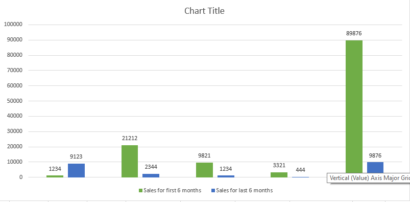
Clustered Column
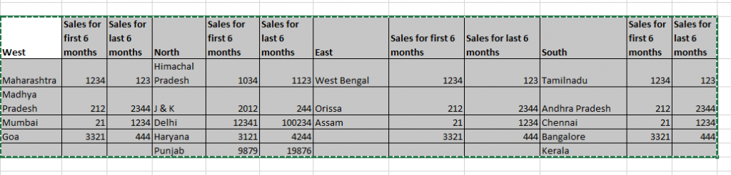
If there are 2 (or more than) variables which need to be plotted on a graph, then you will have 2 (or more) columns for each of the X-axis values – suppose we have total sales and profit for the entire 2016 for Company A – we can plot monthly sales and profit to see in which months the sales dipped and in which months the profit was less. We can also use this to understand if there is a correlation between sales and profit
As can be seen the quarter ending months (Mar’16, Jun’16, Sep’16 and Dec’16) have really high sales as compared to previous 2 months of the quarter. We can also see that the profit goes down when the sales go down.
Stacked Column
If there are 2 (or more than) variables which contribute to another variable, we can use Stacked Columns to see how they contribute to the overall variable over time – if you look in the table above which lists sales and profit of Company A, there are 2 products AB and BC which lead to the overall profit. By using stacked columns chart we can see which product leads to more profit across months and if there is any change in the profit being contributed by a product over the entire year
100% Stacked Column
This is like Stacked Columns just that it calculates percentages that each value contributes to the total. We can also see the percentage changes over time. In the below chart, we have plotted the percentage of profit being contributed by Product AB and BC. Do note that you do not have to calculate percentages yourself, Excel will automatically calculate it and plot the percentages.