Trendline in Excel
A Trendline is a line imposed on a graph to predict the direction of the data. It connects the series of data together to showcase the data best fit. The data points presented in the graph are not linked, but if Trendline is implemented it correlates the data points. It is used to analysis the trend or pattern in a graph which helps in finding the relationship between two points. This Trendline shows the behavior of the data points and helps the user to get approximate outline of the graph.
Types of Trendline in Excel
The Trendline in Excel is classified as following types,
- Exponential
- Linear
- Logarithmic
- Polynomial
- Power
- Moving Average.
How to insert Trendline in a Graph?
Following the are steps to insert a Trendline in an Excel Graph:
STEP 1: Enter the required data in the graph and select the data.
STEP 2: Choose on Insert > Chart
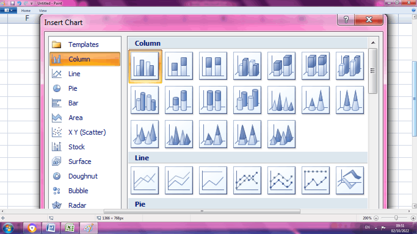
STEP 3: Insert the desired chart from the above list. Select the graph, choose Layout. In the analysis tab select Trendline
STEP 4: Select the Trendline option> Choose Trendline option
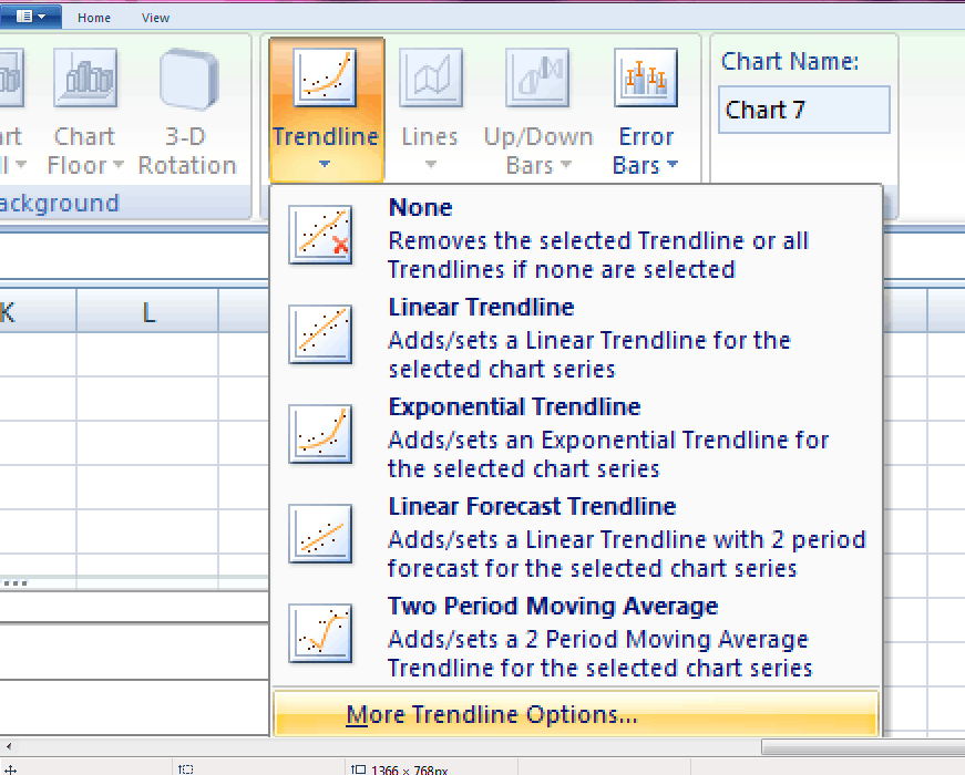
STEP 5: The various types of Trendline option is listed below.
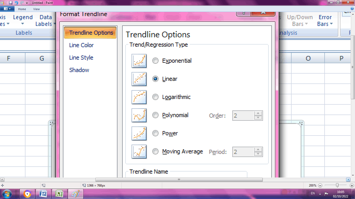
STEP 5: Choose the desired Trendline option. It will display in the chart.
Exponential Trendline
The exponential Trendline is represented in the form of a curved line when the data values have a higher rate of rise or fall in values. If the data contains zero or negative values, the exponential Trendline is not created.
Example for Exponential Trendline
In the following example, the decrease in disease rate in certain cities is described using Exponential Trendline as follows.
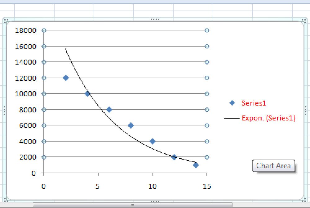
Here in the above chart, there occurs a high decrease in values. This high decrease in values is represented in Exponential Trendline.
Linear Trendline
As the name suggests, the linear Trendline represents a straight line with a simple rise or decrease in values. For a simpler data set, a linear Trendline is used as it is a best-fit straight line.
Example for Linear Trendline
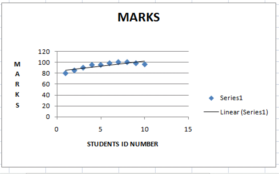
The mark scored by first ten students in the same class, is represented using Linear Trendline. In the above chart slight deviation in marks of the students is represented using Linear Trendline.
Logarithmic Trendline
Logarithmic Trendline accepts both positive and negative values. It is a best-fit curve used to represents the data, if it increases or decreases quickly.
Example for Logarithmic Trendline
The population increase of animals in certain area is illustrated below using Logarithmic Trendline.
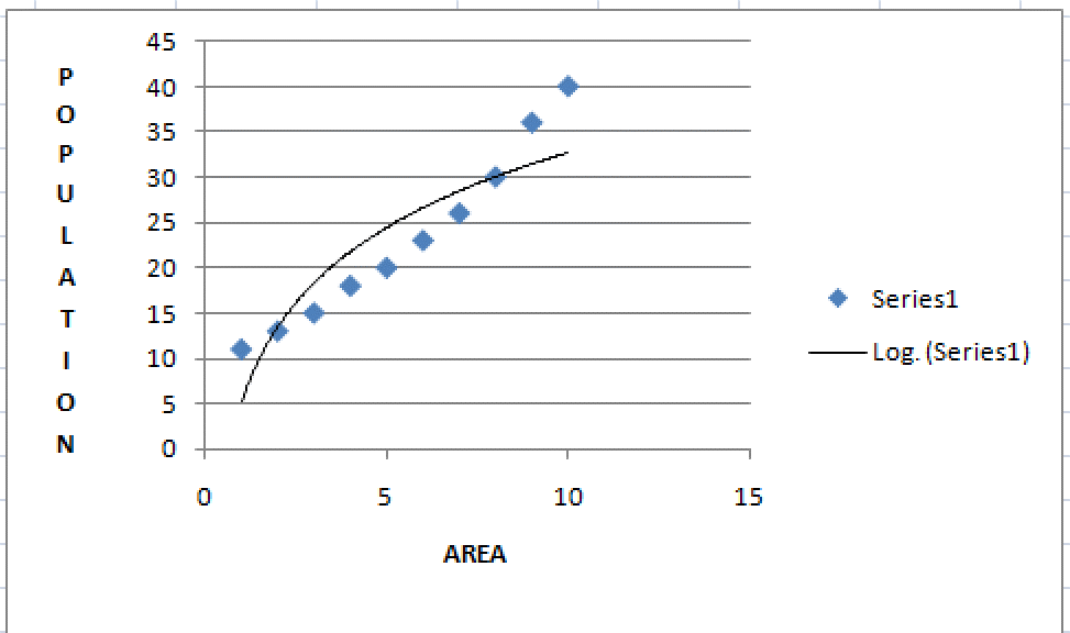
In the above example, the value increses quickly regarding animals population in certain area.
Polynomial Trendline
Data fluctuations happen in Polynomial Trendline. This curve represents the number of bends in the data set. It is used to analyze the gain or loss in the data set. The order of polynomial is determined by counting hills or valleys called bends. If the data value increases, the curve will go upwards, it is called hill.
Example for Polynomial Trendline
Here the relationship between speed and gasoline consumption is determined using Polynomial Consumption.
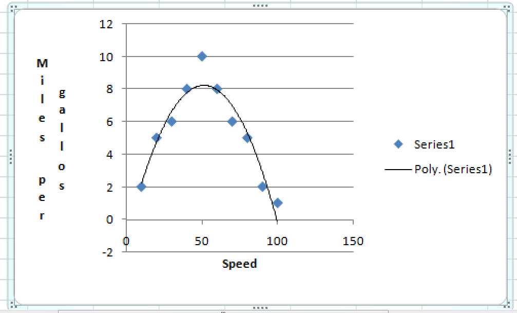
In the above chart, there is one hill called peak present in the chart.
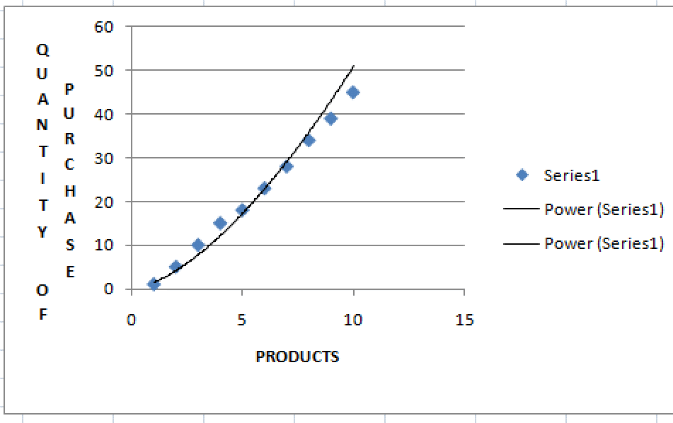
Power Trendline
In Power Trendline, the value increases at certain rate. Implementation of power Trendline is not possible if the data set value contains zero or negative values. The data set value increases at specific rate in the chart.
Example of Power Trendline
Here in sales department, the rise of purchasing in particular product is illustrated using power Trendline.
Moving Average
As the name suggests, the moving average Trendline is a combination of increasing and decreasing data values. This Trendline shows the trend or pattern of the data effectively. The moving average Trendline calculates the average of certain data points and uses the average as a point in the Trendline. For example, the average of the first two points is plotted as the first point in Trendline. This method continues for plotting the second, third and the following values.
Example for Moving Average Trendline
In this example, the relationship between the various car sales and the year is demonstrated using Moving Average Trendline.
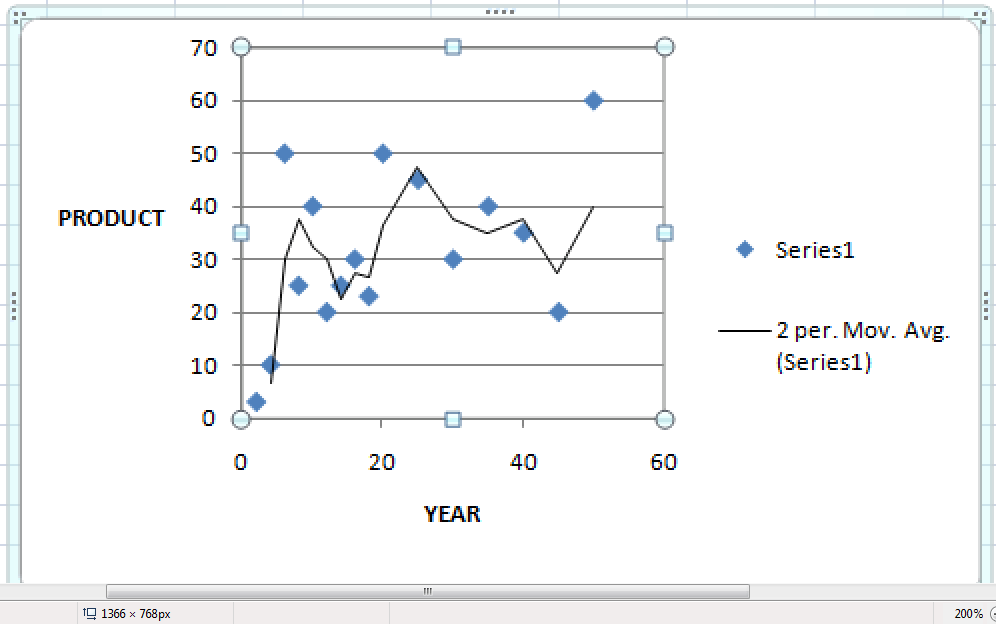
In the above graph the variation in values is presented by Moving Average Trendline.
Summary
Trendline is used to calculate or predict the relationship between the data. From the above tutorial, the various types of Trendline and their functions are described.