
What do you understand by Combination Chart in Microsoft Excel?
In Microsoft Excel, an individual has the Combo Chart option available, which can be effectively clubbed into two charts types, which are Column Clusters Chart, Line Chart to get the valuable outcome or the output, but for this, an individual must have two data sets that can be respectively plotted on it.
And for this, firstly, an individual will create the Combo chart and then select the data which an individual needs to plot on it, and after that, we will choose the Combo chart type from the respective Insert menu section.
One can find out the Combo Chart of the Column – Line Column Cluster – Line and with the Area Chart Type.
Moreover, under the recommended chart option, an individual can change the type axis for any data an individual has selected and can effectively change the chart type.
It was known that the Combination charts are not inbuilt in Microsoft Excel 2007 and the earlier versions; Combo charts are in-built tools from the Microsoft Excel version 2013 onwards, respectively. We can see the combination chart under the "INSERT TAB."
As clearly seen in the below-attached screenshot,

Let us now observe the icon of the particular chart. It has two charts, one of them is the column chart, and the other is the line chart.
So, the combination of the two different charts is termed the combination charts in Microsoft Excel, and these charts are constructive to compare the two things at a single instance of the time. Moreover, it was known that the combination charts primarily lets an individual display various type of data in different ways and on the same chart respectively. And an individual can also display multiple columns, lines, areas, and steps on the same combination charts. An individual can effectively use this to visualize the difference between the different data sets.
When to make use of the Combination Chart?
It was known that the combination charts are a bit flexible way of displaying the data and are instrumental in addition to the various reports and presentations.
Furthermore, they are also considered the basis for analytic tools like the Pareto Analysis. And it is assumed that they are very much ideal for making use of the combination chart when:
- There are many mixed data types, for example, price and volume).
- And there is a need to effectively show various kinds of the relationship and trends between the enormous numbers of data types.
- Moreover, the numbers in the detailed data vary widely across the data types effectively.
- And also, the outliers, if any, need to be identified.
- There exists a need to communicate the data shape more than the value of the categorical data effectively.
How to Create the Combination of the Charts in the Microsoft Excel?
The Microsoft Excel charts are considered to be a bit simple as well as easy to create. Now let us move on to combining the charts in Microsoft excel with the help of the various examples discussed in this tutorial.
#Example: 1 Combo Chart in the Microsoft Excel
Firstly, to create the Microsoft Excel combination chart, we will consider the data like a few years' sales, cost, and profit in a separate excel sheet.
As clearly seen in the below-attached screenshot,

Step 1: First, we will select the entire range and then insert the simple column chart, as seen in the below-attached figure.

Step 2: After performing the above steps, our chart will look like this, as seen in the below-attached screenshot.

Step 3: Then, after that make, right-click on the respective chart and then select "Select Data," As clearly depicted in the below-attached screenshot.

Step 4: Firstly, we will remove "Year" from the respective window, as shown in the below-attached figure.

Step 5: Now, after that, we will click on the "Edit" option on the right-hand side, which is the horizontal axis label, as seen in the screenshot below.

Step 6: After moving out, select the respective "Year" listed here and click on the "Ok" button to complete the process.
As seen in the below-attached screenshot,

Step 7: Now, after performing the above, our chart will look like this, as seen in the below-attached screenshot.

Step 8: Now move on to selecting the bar of the COGS, and then right-click and choose the "change series chart type." As seen in the below-attached screenshot as well.

Step 9: After that, we will be seeing out the change chart type dialogue box, and in these, we will be selecting the particular option that is the "COMBO" (Microsoft Excel must have chosen this specific option by default), as we can see in the below-attached screenshot.

Step 10: Now, after that, in these same windows, we will be changing out the chart type of both the respective COGS and profit to Line the chart as clearly seen in the below-attached screenshot as well and then clicking on the "OK" button.
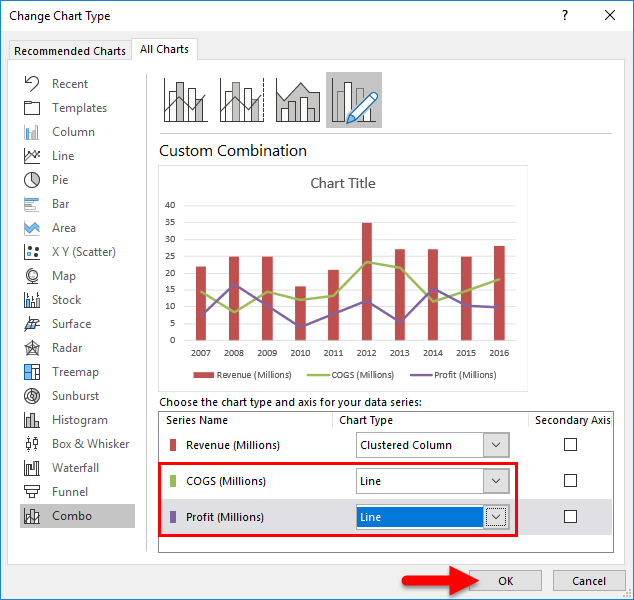
Step 11: It will effectively give out the below-mentioned combination chart after performing all the earlier steps.

Moreover, it was known that we could efficiently change the line colour and the column bars colours according to the wish. In this example, we have made changes according to our needs and preferences, and the combo charts look like this in Microsoft Excel.

Discuss the Interpretation of the above chart.
Now moving on to discussing the use of the combination chart in Microsoft Excel for this question, below are some of the critical points and observations for the above chart, which will clear out the above question very well.
- It was noted that the sales have been fluctuating throughout the last ten years effectively.
- And it reached its peak sale in the last year, in 2012, at nearly 35 million respectively.
- And in terms of the profit margin, the respective year 2008 has primarily given out a profit percentage of about 66.50%, which is considered the highest in the portion.
- And from the particular year from 2013 to 2016, the revenue remained constant, but the profit fluctuated due to the variance in COGS. And in the respective year, 2013, the COGS are a little more in action, and the yields move down drastically.
# Example: 2 Combo Chart in the Microsoft Excel
As from the previous example, we have seen the followings things:
- The combination of the sales
- and the COGS.
- As well as the margin related to the profit.
In this example, we will see the sale of leather jackets in the last 12 months respectively with the help of the temperate data.
Moreover, the data includes the data related to the sales of the jackets (leather) against the average temperature data for the last 12 months. We need to plot the respective graph to see when the sales are high and for which reasons.
Now moving on to discussing the steps for the example mentioned earlier,
Step 1: The following dataset for the above example will look like this, as seen in the screenshot below.

Step 2: Select the data and insert the new column chart. As seen in the below-attached screenshot,

Step 3: After performing the above steps, our charts will look like this, as depicted in the screenshot below.

Step 4: It was seen that the number of jackets sold and the average temperature is the data plotted as the clustered chart only. And now we don't know where the temperature bar is. Then select the column bar by clicking and selecting "Change Series Chart Type.”
As seen clearly in the below-attached screenshot respectively,

Step 5: Now, under the Combo, we will change the Average Temperature chart type to the particular Line Chart and then make this the secondary axis; then click on the "Ok" button to complete the process effectively, as clearly seen in the below-attached screenshot.

Step 6: After performing the above steps, we will effectively get our charts, as seen in the below-attached screenshot.

And from the above diagram, it is noticed that we have the Vertical Axis labels down here. Besides this, it was also seen that one represents the Number of jackets (leather) sold out, and another one is the Temperature data.
And since we have effectively selected the Temperature chart type as the secondary axis, it has created the new vertical axis.
Discuss the Interpretation of the above chart.
From the respective above charts, it is clear that when the temperature goes down when the temperature is primarily decreasing, the sales of the jackets increase rapidly and efficiently. Moreover, in November, December, January, and February, the Jackets' sales will advance to the good and at an enormous rate.
And the main reason behind this is that in those four months, November, December, January, and February, the temperature is a bit low, that is, 16, 14, 12 and 15, respectively.
And besides this, we are seeing that in February, even though the temperature is a bit low compared to the three months mentioned, the leather jacket sales are a bit slow or significantly less. The main reason behind this is that most individuals are ready with leather jackets by the time temperature goes on, reducing to the lowest of all effectively.
Things to Remember
The following things need to be remembered by an individual while working with the combination charts in Microsoft Excel are as follows:
- It was known that the particular combination chart could effectively interpret the two different datasets in the respective Microsoft Excel.
- And the other important point related to handling the combination charts is that the respective combo charts show how one individual amount of the data set impacts the other data set in Microsoft Excel.
- And in case of a considerable amount or the number differentiation, an individual needs to select any of the datasets in the Microsoft Excel sheet in terms of the secondary axis. If not, then it won't be easy to see the differences.