CSS Justify Content
Justify Content: These properties are applied for the alignment of items of a flexible box container if any item does not cover every available space over the main-axis, i.e., horizontally. Justify content property specifies how a browser classifies the area everywhere and between any content item.
It is not used to define items or containers inside any vertical axis. We can apply the property, i.e., align-items, for the alignment of the items vertically.
Syntax:
justify-content: center | flex-start | flex-end | space-around | space-evenly | space-between | initial | inherit;
The flex-start value is used as a default value. Take a look at the following description:
| Values | Description |
| center | As the name suggests, it set-up an item’s position in the starting of a container. |
| flex-start | It is used as a default value and places an item at the starting of a container. |
| flex-end | This value is applied to set an item’s position at a container’s end. |
| space-around | These are applied to position any item along with parallel spacing to each other. The space-around value evenly classifies several items inside the line with the same space about them. |
| space-between | By using this value, an item is spaced evenly. Here, any first item (element) is at a starting, and any last item (element) is at an end. |
| space-evenly | It places the items along with a parallel space. Although, the spacing about all the corners varies. |
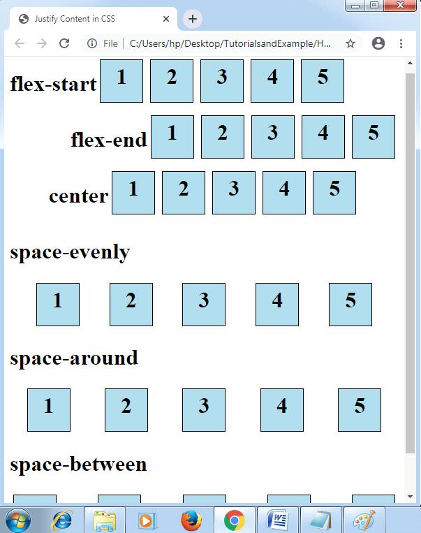
Take a look on the following illustration of these property values:
Example:
<!DOCTYPE html>
<html>
<head>
<title>Justify Content in CSS </title>
<style>
#flexstart
{
 display: flex;
 justify-content: flex-start;
}
#flexend
{
 display: flex;
 justify-content: flex-end;
}
#cent
{
 display: flex;
 justify-content: center;
}
#evenly
{
 display: flex;
 justify-content: space-evenly;
}
#around
{
 display: flex;
 justify-content: space-around;
}
#between
{
 display: flex;
 justify-content: space-between;
}
.flex-item
{
 width: 50px;
 height: 50px;
 margin: 5px;
 padding: 5px;
 color: black;
 font-size: 2em;
 font-weight: bold;
 text-align: center;
 border: 1px solid black;
 background-color: lightblue;
}
</style>
</head>
<body>
<div id="flexstart">
<h1>flex-start</h1>
  <div class="flex-item">1</div>
  <div class="flex-item">2</div>
  <div class="flex-item">3</div>
  <div class="flex-item">4</div>
  <div class="flex-item">5</div>
</div>
<div id="flexend">
<h1>flex-end</h1>
  <div class="flex-item">1</div>
  <div class="flex-item">2</div>
  <div class="flex-item">3</div>
  <div class="flex-item">4</div>
  <div class="flex-item">5</div>
</div>
<div id="cent">
<h1>center</h1>
  <div class="flex-item">1</div>
  <div class="flex-item">2</div>
  <div class="flex-item">3</div>
  <div class="flex-item">4</div>
  <div class="flex-item">5</div>
</div>
<h1>space-evenly</h1>
<div id="evenly">
  <div class="flex-item">1</div>
  <div class="flex-item">2</div>
  <div class="flex-item">3</div>
  <div class="flex-item">4</div>
  <div class="flex-item">5</div>
</div>
<h1>space-around</h1>
<div id="around">
  <div class="flex-item">1</div>
  <div class="flex-item">2</div>
  <div class="flex-item">3</div>
  <div class="flex-item">4</div>
  <div class="flex-item">5</div>
</div>
<h1>space-between</h1>
<div id="between">
  <div class="flex-item">1</div>
  <div class="flex-item">2</div>
  <div class="flex-item">3</div>
  <div class="flex-item">4</div>
  <div class="flex-item">5</div>
</div>
</body>
</html>
Output: