CSS Clip
CSS Clip
The Clip property in CSS describes the element’s visible area. It applies over the elements which are absolutely positioned (position: absolute ;). Generally, it is used when an image is more significant than the existing element.
It permits us to portray a rectangle described as any four coordinates to clip the element, which is absolutely positioned.
Syntax:
clip: auto | shape | initial | inherit;
Property values
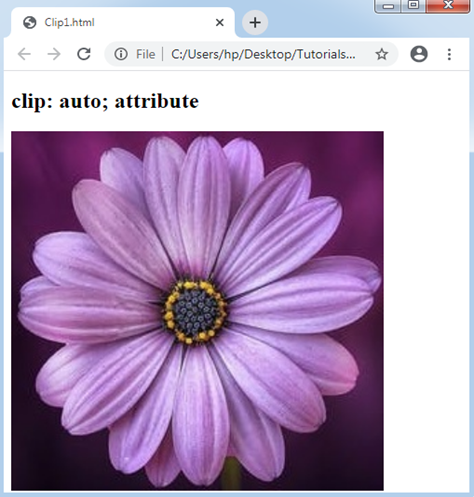
auto: This property value is used as a default value, which displays the elements as they are. Using this value, no clipping will be defined.
Example:
<!DOCTYPE html>
<html>
<head>
<style>
.auto
{
 position: absolute;
 width: 400px;
 height: 400px;
 clip: auto;
}
</style>
</head>
<body>
<h2> clip: auto; attribute </h2>
<img src= "Flower3.png" class= "auto">
</body>
</html>
Output:
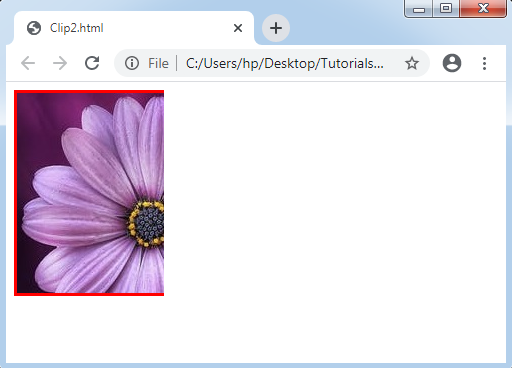
Shape: This property value is applied for clipping the elements. Any element’s defined area can be clipped using this value. Its authentic value is like this-rect(top, right, bottom, left);
Example:
<!DOCTYPE html>
<html>
<head>
<style type= "text/css">
div
{
  background: url(flower3.png);
  clip: rect(0px, 150px, 250px, 0px);
  border:3px solid red;
  height:200px;
  width: 250px;
  position: absolute;
}
</style>
</head>
<body>
<div></div>
</body>
</html>
Output: