CSS @keyframes rule
CSS @keyframes rule
It describes the rule of animation that depicts the properties of CSS for the components at every state along with the timeline.
We may make the properties of complex animation with the use of the @keyframe. The animation can be made with the varying styles of CSS that are repeated endlessly or the time’s finite number. A general animation may contain two keyframes, although a complex animation contains various keyframes.
Syntax:
@keyframes animation-name {keyframes-selector {css-styles;}}
To use the keyframes, we must create the @keyframe rule with the property animation-name to match the animation along with their keyframe declaration.
This property of CSS accepts the three values, which are discussed in detail, as given below:
Property Values
animation-name: This value is a required value, and it represents the animation name.
keyframes-selector: This value describes the percentage with an animation when any keyframe occurs. It has values that lie among 0%-100%, from (similarly as 0%), to (similarly as 100%). The percentage o keyframe can be defined in order because this percentage will be controlled in that order in which they occur.
css-styles: This property value represents one or above than one property of CSS style.
If any keyframe rules do not define the end and start animation states, then any browser will apply the actual component’s styles. The properties can be ignored that will not be animated inside the keyframe rules.
Timing function of keyframes
To control the rule of animation, we may apply the values discussed as follows:
linear: It specifies the rate of the transition perceptual from start edge to end edge.
ease: It stipulates that animation will start gradually, and after a period of time, the speed will increase, and the speed of before end will slow down again.
ease-in: This function is the same as ease function, although an animation will end quickly.
ease-out: This function is also the same as the ease function, although an animation will start fast.
Let’s understand the @keyframe rule of CSS, along with the following examples.
Example:1
<!DOCTYPE html>
<html>
<head>
<style>
div
{
width:200px;
height:200px;
animation:demo 5s ease-in infinite, trans 5s ease-in-out infinite;
border-radius:40px;
}
@keyframes demo
{
0% {background:orange;}
50% {background:lime; width:100px; height:100px;}
100% {background:blue; width:300px; height:300px;}
}
@keyframes trans
{
0% {transform:translate(0px) scale(1.4) rotate(80deg);}
50% {transform:translate(250px) scale(1.2) rotate(40deg);}
100% {transform:translate(350px) scale(1) rotate(0deg);}
}
</style>
</head>
<body>
<div></div>
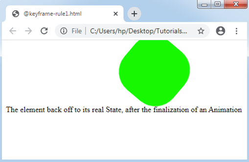
<p> The element back off to its real State, after the finalization of an Animation </p>
</body>
</html>
Output:
Example:2
<!DOCTYPE html>
<html>
<head>
<style>
h1
{
color: black;
text-align: center;
}
div
{
position: relative;
animation: exp 7s infinite;
}
@keyframes exp
{
0%
{
top: 500px;
width: 0px;
font-size:10px;
transform: translate(0px) scale(1.4) rotate(80deg);
}
25%
{
top: 400px;
background: lime;
font-size:20px;
width: 50px;
transform: translate(100px) scale(1.3) rotate(60deg);
}
50%
{
top: 300px;
background: tomato;
font-size:30px;
width: 150px;
transform: translate(200px) scale(1.2) rotate(40deg);
}
75%
{
top: 200px;
background: violet;
width: 250px;
font-size:40px;
transform: translate(300px) scale(1.1) rotate(20deg);
}
100%
{
top: 100px;
background: blue;
font-size:50px;
width: 500px;
transform: translate(400px) scale(1) rotate(0deg);
}
}
</style>
</head>
<body>
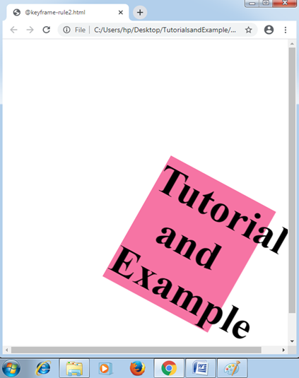
<div>
<h1> Tutorial and Example </h1>
</div>
</body>
</html>
Output:
Key Points:
There are some key points about the rule are discussed below:
- We may apply from keyword rather than the use of 0%.
- We may refer to the keyword rather than the use of 100%.
- Even when we use from and to keywords, the values among them will be declared within 0%.
- To a valid animation, the starting time and ending time should be declared.
- These declarations will get avoided that concerns the !important.