CSS Box-shadow
CSS Box-shadow
This property is referred to include effects as shadow-like around an element’s frame.
Syntax
box-shadow: h-offset v-offset blur spread color |inset|inherit|none;
Property values
Following are the various property values which can be used to provide distinct kind of variations to our elements or text. Let’s have a look:
| Values | Description |
| h-offset | It sets the horizontal position of the shadow. It includes some positive value that will be used to position the shadow towards the right surface of a box. It includes some negative values that will be used to position the shadow towards the left surface of a box. |
| v-offset | It sets the vertical position of the shadow. It includes some positive value that will be used to position the shadow down the box. Also, it includes some negative values that will be used to position the shadow over the box. |
| blur | As the name suggests, this value is referred to blur any box-shadow. It is also optional. |
| spread | This value set-up the size of the shadow. The size of the shadow spread in CSS depends on the value of the spread. |
| color | As the name suggests, it sets the shadow color. This attribute is optional. |
| inset | Generally, the shadow produces outside of a box, after using the inset attribute, theshadow may be designed inside a box. |
| initial | This value is generally referred to set-up the box-shadow attribute to its default value. |
| inherit | This value can be acquired from the parent element. |
| none | None value is a default value, and it does not add any property of shadow. |
Example of Box-shadow
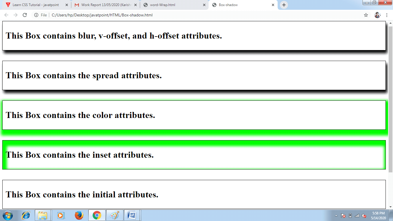
Let’s consider the following simple example for box-shadow effect:
<!DOCTYPE html>
<html>
<head>
<title> Box-shadow </title>
<style>
div
{
 border: 1px solid;
 padding: 10px;
}
.hvb
{
 /* box-shadow: h-offset v-offset blur */
 box-shadow: 5px 10px 10px;
}
.spr
{
 /* box-shadow: h-offset v-offset blur spread */
 box-shadow: 5px 10px 10px;
}
.col
{
 /* box-shadow: h-offset v-offset blur spread color */
 box-shadow: 5px 10px 10px 10px lime;
}
.ins
{
 /* box-shadow: h-offset v-offset blur spread color inset */
 box-shadow: 5px 10px 10px 10px lime inset;
}
.init
{
 /* box-shadow: initial */
 box-shadow: initial;
}
.non
{
 /* box-shadow: none */
 box-shadow: none;
}
</style>
</head>
<body>
<div class= "hvb">
<h1> This Box contains blur, v-offset, and h-offset attributes. </h1>
</div>
<br><br>
<div class= "spr">
<h1> This Box contains the spread attributes. </h1>
</div>
<br><br>
<div class= "col">
<h1> This Box contains the color attributes. </h1>
</div>
<br><br>
<div class= "ins">
<h1> This Box contains the inset attributes. </h1>
</div>
<br><br>
<div class= "init">
<h1> This Box contains the initial attributes. </h1>
</div>
<br><br>
<div class= "non">
<h1> This Box contains the default attributes. </h1>
</div>
</body>
</html>
Output: