CSS Radio Button
Radio Button
A radio button has been defined as an element of HTML. It can support us to take any input from the user. But it is challenging to design a radio button. The pseudo-components make it efficient to create the various radio buttons. These buttons are used when it is required to select some items from multiple items.
These HTML elements are generally applied in almost every website, although without designing them, they appear the same on all the sites. Thus, designing them will create our websites more attractive and different. Styling various radio buttons with the use of CSS will be a creative and exciting task that will give a new appearance to the radio button (default).
To design a radio button (custom), we need to address the CSS.
We need to address the HTML markup to create it.
Designing of any radio button can be precise with the use of some examples. Let’s take some examples regarding the same.
Example:
In the following illustration, we use the ‘~’ sign, which is a sibling combinator. This sign will select every element that is anticipated by any previous selector. Also, we have applied pseudo-class: hover to design any radio button if the user points the cursor on it.
<!DOCTYPE html>
<html>
<style>
.container
{
display: block;
position: relative;
padding-left: 40px;
margin-bottom: 20px;
cursor: pointer;
font-size: 25px;
}
/* Hide the radio button (default) */
.container input
{
position: absolute;
opacity: 0;
cursor: pointer;
}
/* radio button (custom) */
.check
{
position: absolute;
top: 0;
left: 0;
height: 30px;
width: 30px;
background-color: lightgray;
border-radius: 50%;
}
.container:hover input ~ .check
{
background-color: gray;
}
.container input:checked ~ .check
{
background-color: blue;
}
.check:after
{
content: "";
position: absolute;
display: none;
}
.container input:checked ~ .check:after
{
display: block;
}
.container .check:after
{
top: 8px;
left: 8px;
width: 15px;
height: 15px;
border-radius: 50%;
background: white;
}
</style>
<body>
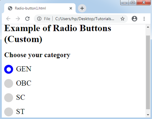
<h1> Example of Radio Buttons (Custom)</h1>
<h2> Choose your category </h2>
<label class="container">GEN
<input type="radio" name="radio" checked>
<span class="check"></span>
</label>
<label class="container">OBC
<input type="radio" name="radio">
<span class="check"></span>
</label>
<label class="container">SC
<input type="radio" name="radio">
<span class="check"></span>
</label>
<label class="container">ST
<input type="radio" name="radio">
<span class="check"></span>
</label>
</body>
</html>
Output:
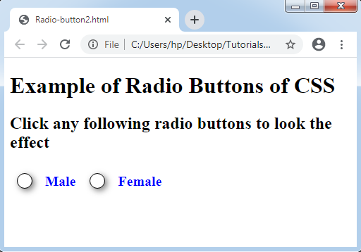
To explain it more efficiently, we will specify another example of designing any radio button. Creating any radio button with the use of CSS gives a professional appearance to any website.
Example:
<!DOCTYPE html>
<html>
<head>
<style>
.container
{
 float: left;
 margin: 10px;
}
.right
{
 float: left;
 margin: 10px;
 color: blue;
 font-size: 20px;
 font-weight:bold;
}
.radio
{
 width: 20px;
 position: relative;
}
.radio label
{
 width: 20px;
 height: 20px;
 cursor: pointer;
 position: absolute;
 top: 0;
 left: 0;
 background: white;
 border-radius: 50px;
 box-shadow: inset 0px 1px 1px white, 3px 3px 9px rgba(0,0,0,0.5);
 border: 1px solid black;
}
.radio label:after
{
 content: '';
 position: absolute;
 top: 4px;
 left: 4px;
 border: 6px solid blue;
 border-radius: 50px;
 opacity: 0;
}
.radio label:hover::after
{
 opacity: 0.3;
}
.radio input[type=radio]
{
 visibility: hidden;
}
.radio input[type=radio]:checked + label:after
{
 opacity: 1;
}
</style>
</head>
<body>
<h1> Example of Radio Buttons of CSS </h1>
<h2> Click any following radio buttons to look the effect </h2>
<div class="container">
<div class="radio">
<input type="radio" value="Male" name='gender' id='male' />
<label for="male"></label>
</div>
</div>
<div class="right">Male</div>
<div class="container">
<div class="radio">
<input type="radio" value="Female" name='gender' id='female' />
<label for="female"></label>
</div>
</div>
<div class="right">Female</div>
</body>
</html>
Output: