CSS Navigation bar
CSS Navigation bar: A navigation system or navigation bar comes upon GUI that can help many visitors to access the information. A Navigation bar is a UI component on the webpage, which contains links for many website’s other sections.
Mostly, a navigation system is shown on the page’s top area in order of the link’s horizontal list. It may be positioned below the header or logo, although it must always be positioned before the primary content of a webpage.
Every website has easy-to-use and efficient navigation, which allows many visitors to access any section easily and quickly. It also plays a vital role.
Let’s discuss the horizontal and vertical navigational system in detail. Have a look.
Horizontal Navigation Bar
Generally, a horizontal navigation system is shown on the page’s top area in order of the link’s horizontal list.
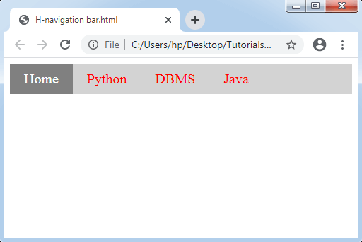
Let’s understand how to make the horizontal navigation system with the help of an example.
Example:
In the following example, we have inserted the property, i.e., overflow: hidden that restricts the li tag from moving the list’s outside. The property display: block shows many links as a block component and creates the whole link space clickable.
Also, we are inserting the property float: left, which adds float for taking any block component to shift them later to each other.
If we want the background color in full-width, we should apply the property background-color to <ul> instead of using any <a> element.
<!DOCTYPE html>
<html>
<head>
<style>
ul
{
 list-style-type: none;
 margin: 0;
 padding: 0px;
 overflow: hidden;
 background-color: lightgray;
}
li
{
 float: left;
}
li a
{
 display: block;
 color: red;
 font-size:20px;
 text-align: center;
 padding: 10px 20px;
 text-decoration: none;
}
.active
{
 background-color: gray;
 color: white;
}
li a:hover
{
 background-color: orange;
 color: white;
}
</style>
</head>
<body>
<ul>
  <li><a class="active" href="#home">Home</a></li>
  <li><a href="#">Python</a></li>
  <li><a href="#">DBMS</a></li>
  <li><a href="#">Java</a></li>
</ul>
</body>
</html>
Output:
Border dividers
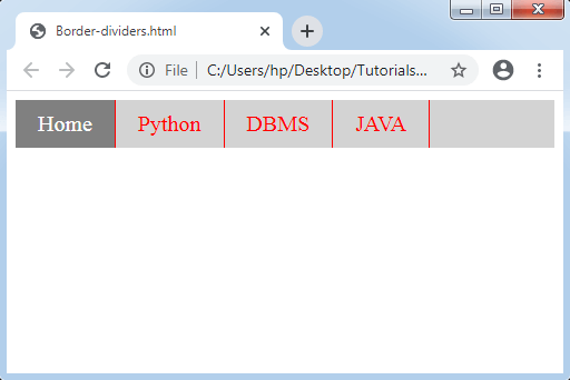
It allows us to insert a border between any links inside the navigation system with the use of the property border-right. The following illustration describes it clearly.
Example:
<!DOCTYPE html>
<html>
<head>
<style>
ul
{
  list-style-type: none;
  margin: 0;
  padding: 0px;
  overflow: hidden;
  background-color: lightgray;
}
li
{
  float: left;
  border-right: 1px solid red;
}
li a
{
  display: block;
  color: red;
  font-size:20px;
  text-align: center;
  padding: 10px 20px;
  text-decoration: none;
}
.active
{
  background-color: gray;
  color: white;
}
li a:hover
{
  background-color: orange;
  color: white;
}
</style>
</head>
<body>
<ul>
  <li><a class="active" href="#home">Home</a></li>
  <li><a href="#">Python</a></li>
  <li><a href="#">DBMS</a></li>
  <li><a href="#">JAVA</a></li>
</ul>
</body>
</html>
Output:
Fixed Navigation Bars
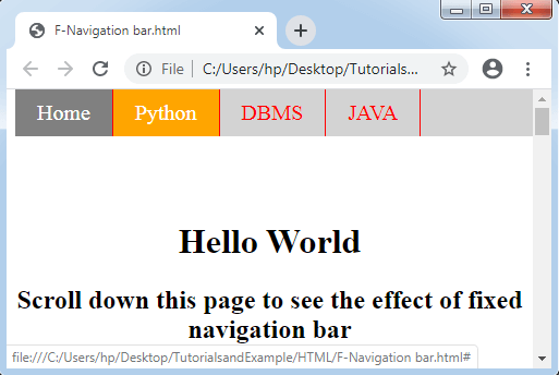
If we scroll any page, this navigation bar stops at the top or the bottom of a page. Let’s consider an example given below:
Example:
<!DOCTYPE html>
<html>
<head>
<style>
ul
{
  list-style-type: none;
  position: fixed;
  width:100%;
  top:0;
  margin: 0;
  padding: 0px;
  overflow: hidden;
  background-color: lightgray;
}
li
{
  float: left;
    border-right: 1px solid red;
}
li a
{
  display: block;
  color: red;
 font-size:20px;
  text-align: center;
  padding: 10px 20px;
  text-decoration: none;
}
.active
{
background-color: gray;
color: white;
}
li a:hover
{
  background-color: orange;
  color: white;
}
</style>
</head>
<body>
<ul>
  <li><a class="active" href="#home">Home</a></li>
  <li><a href="#">Python</a></li>
  <li><a href="#">DBMS</a></li>
  <li><a href="#">JAVA</a></li>
</ul>
<h1 style="padding-top: 100px; text-align: center;">Hello World</h1>
<h2 style="padding-bottom: 2000px; text-align: center;">Scroll down this page to see the effect of fixed navigation bar</h2>
</body>
</html>
Output:
Sticky Navbar
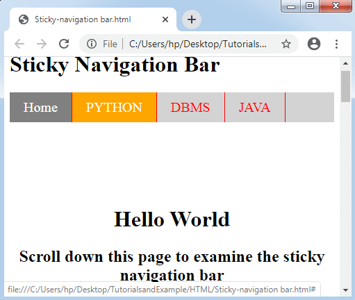
The property position: sticky is applied to place an element according to the user’s scroll position.
This property of CSS allows an element to be stuck if the scroll grasps to any particular point. Any sticky element in it switches among the relative and fixed properties.
Example:
<!DOCTYPE html>
<html>
<head>
<style>
ul
{
  list-style-type: none;
  position: sticky;
  width:100%;
  top:0;
  margin: 0;
  padding: 0px;
  overflow: hidden;
  background-color: lightgray;
}
li
{
  float: left;
    border-right: 1px solid red;
}
li a
{
  display: block;
  color: red;
 font-size:20px;
  text-align: center;
  padding: 10px 20px;
  text-decoration: none;
}
.active
{
background-color: gray;
color: white;
}
li a:hover
{
  background-color: orange;
  color: white;
}
</style>
</head>
<body>
<h1> Sticky Navigation Bar</h1>
<ul>
  <li><a class="active" href="#home">Home</a></li>
  <li><a href="#">PYTHON</a></li>
  <li><a href="#">DBMS</a></li>
  <li><a href="#">JAVA</a></li>
</ul>
<h1 style="padding-top: 100px; text-align: center;">Hello World</h1>
<h2 style="padding-bottom: 2000px; text-align: center;">Scroll down this page to examine the sticky navigation bar</h2>
</body>
</html>
Output:
Dropdown Navbar
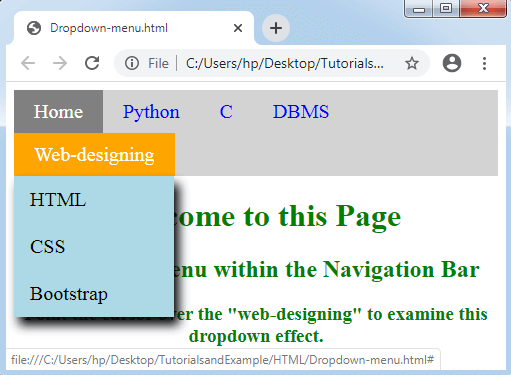
How can we make the dropdown menu in any navigation bar?
In order to find the solution for the above such problems, let’s consider an example given below:
Example:
<!DOCTYPE html>
<html>
<head>
<style>
ul
{
  list-style-type: none;
  margin: 0;
  padding: 0;
  overflow: hidden;
  background-color: lightgray;
}
li
{
  float: left;
}
li a, .dropbtn
{
  display: inline-block;
  color: blue;
 font-size:20px;
  text-align: center;
  padding: 10px 20px;
  text-decoration: none;
}
.active
{
background-color: gray;
color: white;
}
li a:hover , .dropdown:hover .dropbtn
{
  background-color: orange;
  color: white;
}
.dropdown-content
{
  display: none;
  position: absolute;
  background-color: lightblue;
  min-width: 160px;
  box-shadow: 5px 8px 10px 0px black;
 }
.dropdown-content a
{
  color: black;
  padding: 12px 16px;
  text-decoration: none;
  display: block;
  text-align: left;
}
.dropdown-content a:hover
{
background-color: gray;
color:white;
}
.dropdown:hover .dropdown-content
{
  display: block;
}
h1,h2,h3
{
text-align:center;
color: green;
}
</style>
</head>
<body>
<ul>
  <li><a class="active" href="#home">Home</a></li>
  <li><a href="#">Python</a></li>
  <li><a href="#">C</a></li>
  <li><a href="#">DBMS</a></li>
  <li class="dropdown">
    <a href="#" class="dropbtn">Web-designing</a>
    <div class="dropdown-content">
      <a href="#">HTML</a>
      <a href="#">CSS</a>
      <a href="#">Bootstrap</a>
    </div>
  </li>
</ul>
<h1>Welcome to this Page</h1>
<h2>Dropdown Menu within the Navigation Bar</h2>
<h3>Point the cursor over the "web-designing" to examine this dropdown effect.</h3>
</body>
</html>
Output:
Vertical Navigation Bar
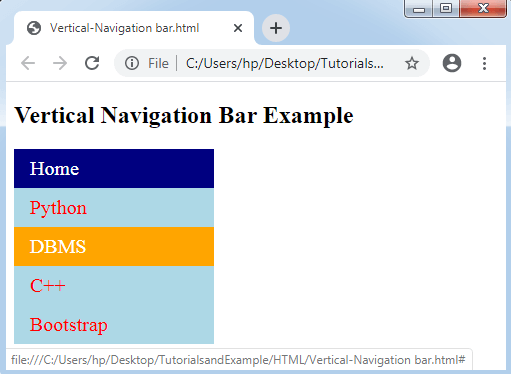
We will understand the building of the vertical navigation bar in the following example.
Example:
<!DOCTYPE html>
<html>
<head>
<style>
ul
{
  list-style-type: none;
  margin: 0;
  padding: 0;
  width: 200px;
  background-color: lightblue;
}
li a
{
  display: block;
  color: red;
  font-size:20px;
  padding: 8px 16px;
  text-decoration: none;
}
.active
{
  background-color: navy;
  color: white;
}
li a:hover
{
  background-color: orange;
  color: white;
}
</style>
</head>
<body>
<h2>Vertical Navigation Bar Example</h2>
<ul>
  <li><a href="#" class = "active">Home</a></li>
  <li><a href = "#">Python</a></li>
  <li><a href = "#">DBMS</a></li>
  <li><a href = "#">C++</a></li>
  <li><a href = "#">Bootstrap</a></li>
</ul>
</body>
</html>
Output:
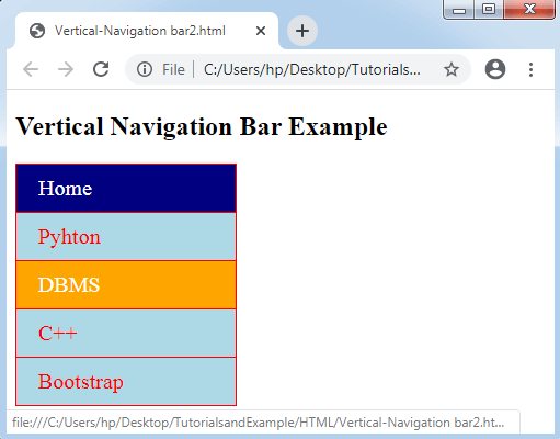
We can specify the link alignment in center and insert borders among them. Consider an example below.
Example:
In the following example, we will insert the property text-align: center; to <a> and <li> to center any link and attribute border to <ul> for adding the border. Also, we are including the property border-bottom to every <li> element. Let’s consider the following illustration:
<!DOCTYPE html>
<html>
<head>
<style>
ul
{
  list-style-type: none;
  margin: 0;
  padding: 0;
  width: 200px;
  background-color: lightblue;
  border: 1px solid red;
}
li a
{
  display: block;
  color: red;
  font-size:20px;
  padding: 10px 20px;
  text-decoration: none;
  border-bottom: 1px solid red;
}
ul:last-child
{
  border-bottom: none;
}
.active
{
  background-color: navy;
  color: white;
}
li a:hover
{
  background-color: orange;
  color: white;
}
</style>
</head>
<body>
<h2>Vertical Navigation Bar Example</h2>
<ul>
  <li><a href="#" class = "active">Home</a></li>
  <li><a href = "#">Pyhton</a></li>
  <li><a href = "#">DBMS</a></li>
  <li><a href = "#">C++</a></li>
  <li><a href = "#">Bootstrap</a></li>
</ul>
</body>
</html>
Output:
Full-height fixed Vertical Navbar
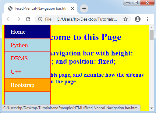
Also, we are making a full-height fixed side navigation bar with the help of the position: fixed; property and height: 100%; property. Let’s consider the following illustration:
Example:
<!DOCTYPE html>
<html>
<head>
<style>
body
{
background-color: yellow;
}
ul
{
list-style-type: none;
margin: 0;
padding: 0;
height:100%;
top:0;
width:150px;
overflow: auto;
background-color: lightblue;
border: 1px solid red;
position: fixed;
}
li a
{
display: block;
color: red;
font-size:20px;
padding: 10px 20px;
text-decoration: none;
border-bottom: 1px solid red;
}
.active
{
background-color: navy;
color: white;
}
li a:hover
{
background-color: orange;
color: white;
}
</style>
</head>
<body>
<ul>
<li><a href = "#" class = "active">Home</a></li>
<li><a href = "#">Python</a></li>
<li><a href = "#">DBMS</a></li>
<li><a href = "#">C++</a></li>
<li><a href = "#">Bootstrap</a></li>
</ul>
<div style="margin-left:20%;padding-bottom:2000px;color:blue;">
<h1>Welcome to this Page</h1>
<h2>Side navigation bar with height: 100%; and position: fixed;</h2>
<h3>Scroll this page, and examine how the sidenav sticks on the page</h3>
</div>
</body>
</html>
Output: