CSS Masking
CSS Masking
The CSS mask property is applied to hide a component with the use of the masking or clipping an image at any specific point. The masking depicts the use of a graphical image or an image like the alpha mask or luminance. It can be any graphical operation, i.e., partially or fully hide the component’s portions or object.
It can be possible to hide or show the image’s part along with the distinct opacity levels with the use of masking. The masking can be achieved using the CSS mask-image attribute, and we must give any image like the mask.
The following are some examples of CSS masking.
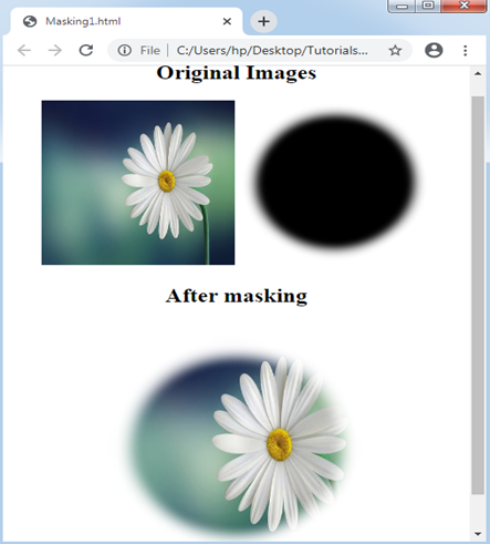
Example:1
In the following example, we will position the mask over an image component. There will be two particular images, and we will apply to mask over them, the concluding image created by putting a mask image entirely together.
<!DOCTYPE html>
<html>
<head>
<style>
div img{
width: 200px;
height: 200px;
}
#masked{
width: 300px;
height: 300px;
-webkit-mask-box-image: url(circle1.png) 25;
}
</style>
</head>
<body>
<center>
<div id = "one">
<h2> Original Images </h2>
<img src = "flower4.jpg">
<img src = "circle1.png">
</div>
<h2> After masking </h2>
<img src = "flower4.jpg" id = "masked">
</center>
</body>
</html>
Output:
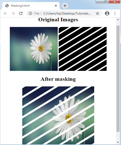
Example: 2
In the following example, here are other illustrations where we will use masking on the images. We will apply two pictures where one of the pictures is the mask picture that includes stripes. The illustration will show the positioning the mask on a picture component as mentioned below.
<!DOCTYPE html>
<html>
<head>
<style>
div img{
width: 200px;
height: 200px;
}
#masked{
width: 300px;
height: 300px;
-webkit-mask-box-image: url(stripes.png);
background-color: black;
}
</style>
</head>
<body>
<center>
<div id = "one">
<h2> Original Images </h2>
<img src = "flower4.jpg">
<img src = "stripes.png">
</div>
<h2> After masking </h2>
<img src = "flower4.jpg" id = "masked">
</center>
</body>
</html>
Output:
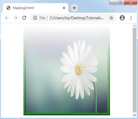
Example: 3
We may apply the gradients of CSS like the mask image’s source.
<!DOCTYPE html>
<html>
<head>
<style>
#masked
{
width: 300px;
height: 300px;
-webkit-mask-image: -webkit-gradient(linear, right top, right bottom, from(rgba(0,0,0,0)), to(rgba(0,0,0,0.9)));
border: 9px ridge green;
}
</style>
</head>
<body>
<center>
<img src = "flower4.jpg" id = "masked">
</center>
</body>
</html>
Output:
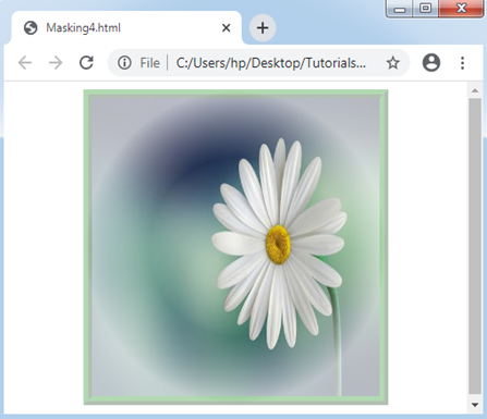
Example: 4
<!DOCTYPE html>
<html>
<head>
<style>
#masked
{
width: 300px;
height: 300px;
border-radius: 0px;
-webkit-mask-image: radial-gradient(circle at 50% 50%, blue 40%, rgba(0,0,0,0.3) 70%);
border: 9px ridge green;
}
</style>
</head>
<body>
<center>
<img src = "flower4.jpg" id = "masked">
</center>
</body>
</html>
Output:
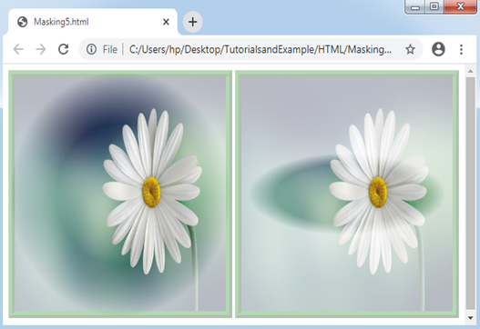
Example: 5
<!DOCTYPE html>
<html>
<head>
<style>
#circle
{
width: 300px;
height: 300px;
-webkit-mask-image: radial-gradient(circle at 50% 50%, blue 40%, rgba(0,0,0,0.3) 70%);
border: 9px ridge green;
}
#ellipse
{
width: 300px;
height: 300px;
-webkit-mask-image: radial-gradient(ellipse 80% 30% at 50% 50%, blue 40%, rgba(0,0,0,0.3) 55%);
border: 9px ridge green;
}
</style>
</head>
<body>
<center>
<img src = "flower4.jpg" id = "circle">
<img src = "flower4.jpg" id = "ellipse">
</center>
</body>
</html>
Output: