CSS Transition
CSS Transition
The transitions in CSS are influenced, included to modify the component from one design to another, without the use of the JavaScript or Flash.
We should describe two of the essential things to make the CSS transition.
- The property of CSS, on which we wish to include an effect.
- The duration of time of an effect.
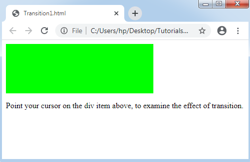
Consider the below example:
Example:
<!DOCTYPE html>
<html>
<head>
<style>
div
{
width: 100px;
height: 100px;
background: lime;
-webkit-transition: width 1s; /* For Safari 3.1 to 6.0 */
transition: width 1s;
}
div:hover
{
width: 300px;
}
</style>
</head>
<body>
<div></div>
<p> Point your cursor on the div item above, to examine the effect of transition.</p>
</body>
</html>
Output:
CSS Transition Effect: Multiple
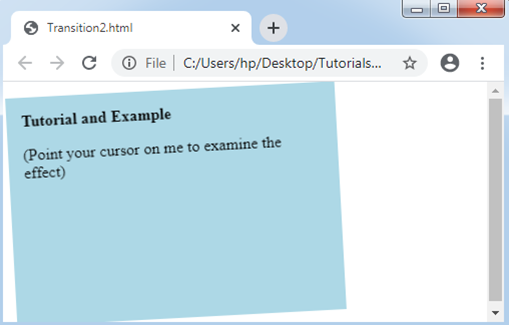
It can be applied to include the transition effect on one or more properties of CSS. When we wish to include the impact of transition over one or more properties of CSS, isolate those properties along with the comma.
Following is an illustration where we will specify the effects of transition on transformation, height, and width.
Consider the below example:
Example:
<!DOCTYPE html>
<html>
<head>
<style>
div
{
padding:15px;
width: 150px;
height: 100px;
background: lightblue;
-webkit-transition: width 2s, height 2s, -webkit-transform 2s; /* For Browser Safari 3.1 to 6.0 */
transition: width 2s, height 2s, transform 2s;
}
div:hover
{
width: 300px;
height: 200px;
-webkit-transform: rotate(360deg); /* Opera, Safari, Chrome */
transform: rotate(360deg);
}
</style>
</head>
<body>
<div><b>Tutorial and Example</b><p> (Point your cursor on me to examine the effect)</p></div>
</body>
</html>
Output: