CSS Checkbox style
CSS Checkbox style: It is an element of HTML, which is used to get input from various users. It is difficult to style any checkbox. However, some elements make it simple to design the checkbox, i.e., pseudo-elements.
Generally, these HTML elements are used on all the websites. However, without applying any style, these elements look the same on all the websites. Thus, styling them can create our website more attractive and different. We must hide the real checkbox to design the checkbox. It is a creative and interesting to style various checkboxes with the use of CSS. It will give a beautiful and a new view of any default checkbox.
Let’s consider some examples to clearly understand the checkbox stylish concept:
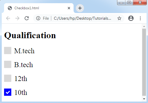
Example 1:
In the following example, we will use the '~’ symbol which is a sibling combinator. It selects every element that can be preceded by any previous selector. We should also apply a pseudo-class :hover for styling a checkbox if any user points the mouse over it.
<!DOCTYPE html>
<html>
<style>
.container
{
  display: block;
  position: relative;
  padding-left: 35px;
  margin-bottom: 20px;
  cursor: pointer;
  font-size: 25px;
}
/* Hide the default checkbox */
.container input
{
  visibility: hidden;
  cursor: pointer;
}
/* Create a custom checkbox */
.mark
{
  position: absolute;
  top: 0;
  left: 0;
  height: 25px;
  width: 25px;
  background-color: lightgray;
}
.container:hover input ~ .mark
{
  background-color: gray;
}
.container input:checked ~ .mark
{
  background-color: blue;
}
/* Create the mark/indicator (hidden when not checked) */
.mark:after
{
  content: "";
  position: absolute;
  display: none;
}
/* Show the mark when checked */
.container input:checked ~ .mark:after
{
  display: block;
}
/* Style the mark/indicator */
.container .mark:after
{
  left: 9px;
  top: 5px;
  width: 5px;
  height: 10px;
  border: solid white;
  border-width: 0 3px 3px 0;
  transform: rotate(45deg);
}
</style>
<body>
<h1>Qualification</h1>
<label class="container">M.tech
  <input type="checkbox">
  <span class="mark"></span>
</label>
<label class="container">B.tech
  <input type="checkbox">
  <span class="mark"></span>
</label>
<label class="container">12th
  <input type="checkbox">
  <span class="mark"></span>
</label>
<label class="container">10th
  <input type="checkbox" checked="check">
  <span class="mark"></span>
</label>
</body>
</html>
Output:
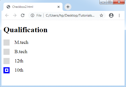
Example 2:
In the following example, we will see a modified checkmark.
<!DOCTYPE html>
<html>
<style>
.container
{
  display: block;
  position: relative;
  padding-left: 45px;
  margin-bottom: 15px;
  cursor: pointer;
  font-size: 20px;
}
/* Hide the real checkbox */
input[type= checkbox]
{
  visibility: hidden;
}
/* Create a custom checkbox */
.mark
{
  position: absolute;
  top: 0;
  left: 0;
  height: 25px;
  width: 25px;
  background-color: lightgray;
}
/*background color to be displayed if the checkbox is checked*/
.container input:checked ~ .mark
{
  background-color: blue;
}
/*checkmark to be displayed in the checkbox*/
/*It is bot displayed if unchecked*/
.mark:after
{
  content: "";
  position: absolute;
  display: none;
}
/*display the checkmark when checked*/
.container input:checked ~ .mark:after
{
  display: block;
}
/*creating a square to be the sign of checkbox*/
.container .mark:after
{
  left: 6px;
  bottom: 6px;
  width: 6px;
  height: 6px;
  border: solid white;
  border-width: 4px 4px 4px 4px;
}
</style>
<body>
<h1>Qualification</h1>
<label class="container">M.tech
  <input type="checkbox">
  <span class="mark"></span>
</label>
<label class="container">B.tech
  <input type="checkbox">
  <span class="mark"></span>
</label>
<label class="container">12th
  <input type="checkbox">
  <span class="mark"></span>
</label>
<label class="container">10th
  <input type="checkbox" checked="check">
  <span class="mark"></span>
</label>
</body>
</html>
Output:
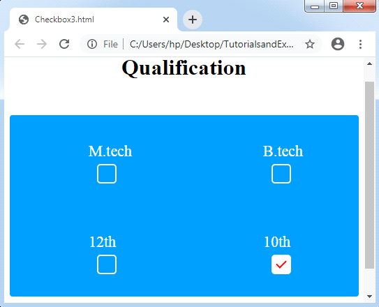
Example 3:
We will see another illustration of checkbox styling. In the following example, we feel a ripple consequence, which makes any checkbox more interesting. It will provide us a unique view to our checkbox. We are using the ‘~’ symbol which is a sibling combinator, similar as above examples. Every element will be selected by using this symbol preceded by a former selector. We can also apply some of the pseudo-classes like :checked, :before, :after, etc.
With the use of CSS, we are creating a ripple effect inside a checkbox as follows:
<!DOCTYPE html>
<html>
<head>
<style>
body
{
 text-align: center;
}
.check
{
 width: 500px;
 margin: 50px auto;
 clear: both;
 display: block;
 background-color: #009BFF;
 border-radius: 4px;
}
.check::after
{
 clear: both;
 display: block;
 content: "";
}
.check .checkbox-container
{
 float: left;
 width: 50%;
 box-sizing: border-box;
 text-align:center;
 padding: 40px 0px;
}
/* Styling Checkbox Starts */
.checkbox-label
{
 color: white;
 display: block;
 position: relative;
 margin: auto;
 cursor: pointer;
 font-size: 22px;
 line-height: 24px;
 height: 50px;
 width: 24px;
 clear: both;
}
.checkbox-label input
{
 position: absolute;
 opacity: 0;
 cursor: pointer;
}
.checkbox-label .mark
{
 top:30px;
 position: absolute;
 height: 24px;
 width: 24px;
 background-color: transparent;
 border-radius: 5px;
 transition: all 0.3s ease-in;
 border: 2px solid white;
}
.checkbox-label input:checked ~ .mark
{
 background-color: white;
 border-radius: 5px;
 transform: rotate(0deg) scale(1);
 opacity:1;
 border: 2px solid white;
}
.checkbox-label .mark::after
{
 position: absolute;
 content: "";
 border-radius: 5px;
}
.checkbox-label input:checked ~ .mark::after
{
 transform: rotate(45deg) scale(1);
 left: 8px;
 top: 3px;
 width: 6px;
 height: 12px;
 border: solid red;
 border-width: 0 2px 2px 0;
 border-radius: 0;
}
/* For Ripple Effect */
.checkbox-label .mark::before
{
 position: absolute;
 content: "";
 border-radius: 10px;
 border: 5px solid yellow;
 transform: scale(0);
}
.checkbox-label input:checked ~ .mark::before
{
 left: -3px;
 top: -3px;
 width: 24px;
 height: 24px;
 border-radius: 5px;
 transform: scale(3);
 opacity:0;
 transition: all 0.3s ease-out;
}
</style>
</head>
<body>
<h1>Qualification</h1>
<div class="check">
<div class="checkbox-container">
<label class="checkbox-label">M.tech
  <input type="checkbox">
  <span class="mark"></span>
</label>
</div>
<div class="checkbox-container">
<label class="checkbox-label">B.tech
  <input type="checkbox">
  <span class="mark"></span>
</label>
</div>
<div class="checkbox-container">
<label class="checkbox-label">12th
  <input type="checkbox">
  <span class="mark"></span>
</label>
</div>
<div class="checkbox-container">
<label class="checkbox-label">10th
  <input type="checkbox" checked="check">
  <span class="mark"></span>
</label>
</div>
</div>
</body>
</html>
Output: