CSS Overlay
CSS Overlay: It measures to cover-up something’s surface along with a coating. CSS overlay sets anything over the top area of other things. It creates a web-page more attractive. The design is also quite easy.
Designing an overlay consequence specifies that putting two div elements together at any same place. Though, both the elements will present when required. If we create any second div element that occurs, we can click or hover over one div. One div element is an overlay div and includes what will display if any user hovers on the image. The second div element is any container that holds the images both and also its overlay.
Fade Overlay Effect
This overlay specifies that if we move the point of the cursor over an image, then it will display over the image’s top area. Let’s consider an example, given below:
Example:
<!DOCTYPE html>
<html>
<head>
<title> Image Overlay </title>
<style>
.container img
{
 width: 300px;
 height: 300px;
}
.container
{
 position: relative;
 width: 25%;
 height: auto;
}
.overlay
{
 position: absolute;
 transition: 0.5s ease;
 height: 300px;
 width: 100px;
 top: 0;
 left: 0;
 background-color: violet;
 opacity: 0;
}
.container:hover .overlay
{
 opacity: 0.9;
}
</style>
</head>
<body>
<center>
<h1> Fade Overlay Effect </h1>
<h2> Point the cursor on the image to feel the effect. </h2>
<div class= "container">
<img src= "Flower3.png">
<div class= "overlay"></div>
</div>
</center>
</body>
</html>
Output:
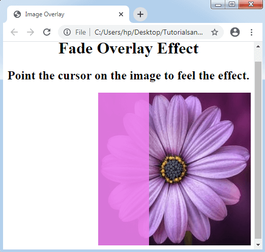
Image Overlay Slide
By using the image overlay slide, we can make any effect of sliding overlay with the help of four distinct types like left, right, top, and bottom. We will discuss it with an example.
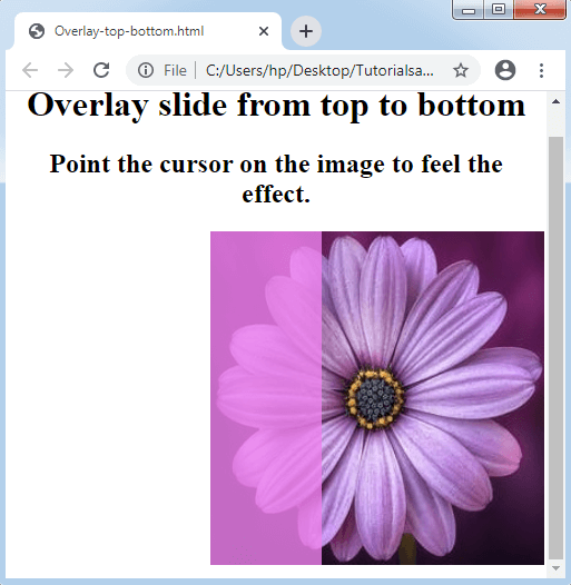
Overlay Slide from top to bottom
Now, we will understand how to make a slide inside the overlay from any top surface with the help of an example.
Example:
<!DOCTYPE HTML>
<html>
<head>
<style>
.container img
{
 width: 300px;
 height: 300px;
}
.container
{
 position: relative;
 width: 25%;
 height: auto;
}
.container:hover .overlay
{
 opacity: 0.8;
 height: 300px;
}
.overlay
{
 position: absolute;
 transition: 0.7s ease;
 opacity: 0;
 width: 100px;
 height: 0;
 top: 0;
 right: 20px;
 left: 0;
 background-color: violet;
}
</style>
</head>
<body>
<center>
<h1> Overlay slide from top to bottom </h1>
<h2> Point the cursor on the image to feel the effect. </h2>
<div class="container">
<img src= "Flower3.png">
<div class="overlay"></div>
</div>
</center>
</body>
</html>
Output:
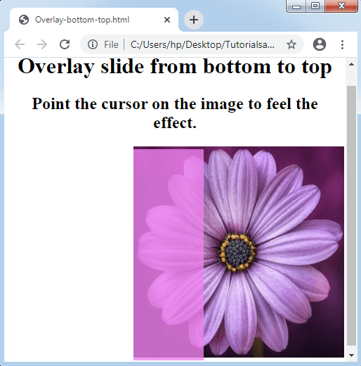
Overlay Slide from bottom to top
When we point the cursor on any image, it will slide from the bottom to the top. To understand this, let’s assume an example.
Example:
<!DOCTYPE HTML>
<html>
<head>
<style>
.container img
{
 width: 300px;
 height: 300px;
}
.container
{
 position: relative;
 width: 25%;
 height: auto;
}
.container:hover .overlay
{
 opacity: 0.8;
 height: 300px;
}
.overlay
{
 position: absolute;
 transition: 0.7s ease;
 opacity: 0;
 width: 100px;
 height: 0;
 bottom: 0;
 right: 20px;
 left: 0;
 background-color: violet;
}
</style>
</head>
<body>
<center>
<h1> Overlay slide from bottom to top </h1>
<h2> Point the cursor on the image to feel the effect. </h2>
<div class="container">
<img src= "Flower3.png">
<div class="overlay"></div>
</div>
</center>
</body>
</html>
Output:
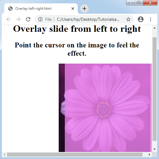
Overlay Slide from left to right
As the name suggests, left to right sliding will be there. See the example below.
Example:
<!DOCTYPE HTML>
<html>
<head>
<style>
.container img
{
 width: 300px;
 height: 300px;
}
.container
{
 position: relative;
 width: 25%;
 height: auto;
}
.container:hover .overlay
{
 opacity: 0.8;
 width: 300px;
}
.overlay
{
 position: absolute;
 transition: 0.7s ease;
 opacity: 0;
 width: 0;
 height: 100%;
 bottom: 0;
 left: 20px;
 background-color: violet;
}
</style>
</head>
<body>
<center>
<h1> Overlay slide from left to right </h1>
<h2> Point the cursor on the image to feel the effect. </h2>
<div class="container">
<img src= "Flower3.png">
<div class="overlay"></div>
</div>
</center>
</body>
</html>
Output:
Overlay Slide from right to left
This sliding method is quite similar to various effects, as mentioned above, except that it will slide from the right surface to the left surface.
Example:
<!DOCTYPE HTML>
<html>
<head>
<style>
.container img
{
 width: 300px;
 height: 300px;
}
.container
{
 position: relative;
 width: 25%;
 height: auto;
}
.container:hover .overlay
{
 opacity: 0.8;
 width: 300px;
}
.overlay
{
 position: absolute;
 transition: 0.7s ease;
 opacity: 0;
 width: 0;
 height: 100%;
 bottom: 0;
 right: 20px;
 background-color: violet;
}
</style>
</head>
<body>
<center>
<h1> Overlay slide from right to left </h1>
<h2> Point the cursor on the image to feel the effect. </h2>
<div class="container">
<img src= "Flower3.png">
<div class="overlay"></div>
</div>
</center>
</body>
</html>
Output:
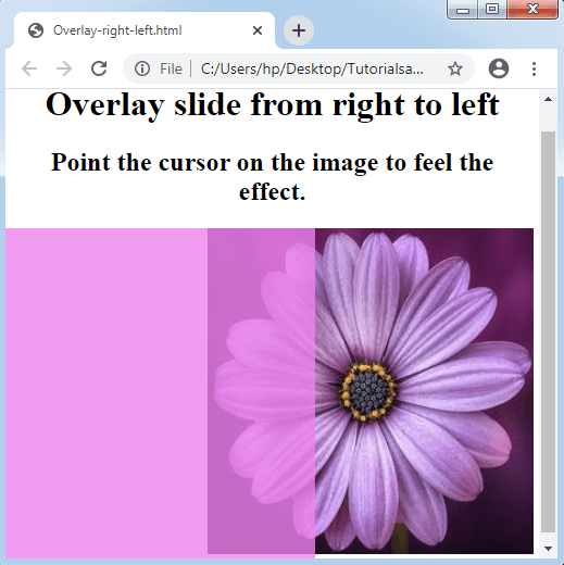
Image Overlay title
In an image overlay consequence, if we point the cursor on the image, we can see a title over it. Consider the following illustration.
Example:
<!DOCTYPE HTML>
<html>
<head>
<meta name= "viewport" content= "width=device-width, initial-scale=1">
<style>
body
{
 text-align: center;
}
* {box-sizing: border-box;}
.container
{
 position: relative;
 width: 50%;
 max-width: 300px;
}
img
{
 display: block;
 width: 100%;
 height: auto;
}
.overlay
{
 position: absolute;
 bottom: 0;
 background: rgba(0, 0, 0, 0.2);
 width: 100%;
 opacity: 0;
 transition: .9s ease;
 font-size: 25px;
 padding: 20px;
}
.container:hover .overlay
{
 opacity: 1.5;
}
</style>
</head>
<body>
<h1> Image Overlay Title Effect </h1>
<h2> Point the cursor on the image to feel the effect. </h2>
<center>
<div class= "container">
<img src= "flower.png">
<div class= "overlay"> Welcome to this Page </div>
</div>
</center>
</body>
</html>
Output:
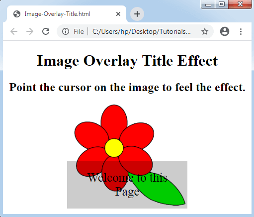
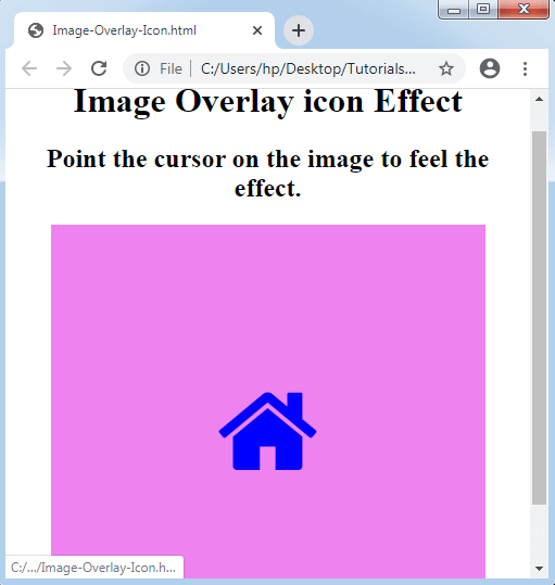
Image Overlay icon
In this effect of the overlay, an icon over the mouse hovering will be there to cover the whole image. We will also set a link over the icon to swap between any pages. Consider the following illustration given below:
Example:
<!DOCTYPE HTML>
<html>
<head>
<meta name= "viewport" content= "width=device-width, initial-scale=1">
<link rel="stylesheet" href="https://cdnjs.cloudflare.com/ajax/libs/font-awesome/4.7.0/css/font-awesome.min.css">
<style>
.container
{
 position: relative;
 width: 100%;
 max-width: 400px;
}
.img
{
 display: block;
 width: 100%;
 height: auto;
}
.overlay
{
 position: absolute;
 top: 0;
 height: 100%;
 width: 100%;
 opacity: 0;
 transition: 1s ease;
 background-color: violet;
}
.container:hover .overlay
{
 opacity: 1;
}
.icon
{
 color: blue;
 font-size: 100px;
 position: absolute;
 top: 50%;
 left: 50%;
 transform: translate(-50%, -50%);
}
</style>
</head>
<body>
<center>
<h1> Image Overlay icon Effect </h1>
<h2> Point the cursor on the image to feel the effect. </h2>
<div class= "container">
<img src= "Flower3.png" class= "img">
<div class= "overlay">
<a href= "#" class= "icon">
<i class= "fa fa-home"></i>
</a>
</div>
</div>
</center>
</body>
</html>
Output: