CSS 2d Transform
Transform property in CSS is used mainly for enhancing the effects and to animate the elements.
Transform is an effect that changes the shape, size and position of an element.
It helps to manipulate an element without interrupting the default document.
There are two types of transformation 2D and 3D. In this article we are going to learn about 2D transform property of CSS in detail.
2D - Transform Property
transform :
transform property is used inside <style> tag. Various functions like translate(), rotate(), scale() and skew() can be used using this property.
Syntax:
transform: method (values) ;
Example:
transform: rotate (20 deg) ;
Here, the function rotate () is used to rotate the element by 20 degrees.
transform-origin :
By default, the origin point of an element is centre. To change the origin point of the transformation there another property called as transform-origin.
Syntax:
transform-origin: values ;
Example:
transform-origin: left top;
Changes the origin of transformation to the left top of the element.
transform-origin: 30% 50%;
Changes the origin of x-axis by 30% and y-axis by 50%.
2D Transform Methods:
translate() method:
This method translates the element from one point to another.
There are three types of translate () methods:
- translate(x, y)
- translateX(n)
- translateY(n)
translate(x, y):
Translates the element along the x-axis and y-axis respectively.
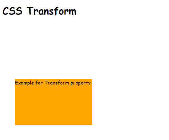
Example:
<!DOCTYPE html>
<html>
<head>
<title>CSS Transform</title>
<style type="text/css">
body{
font-family: cursive;
}
#square{
width: 250px;
height: 150px;
background: orange;
margin: 50px 40px;
}
</style>
</head>
<body>
<h1>CSS Transform</h1>
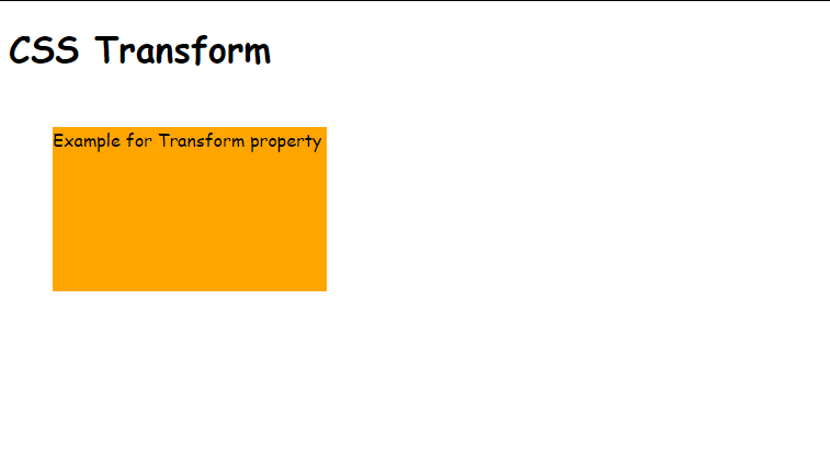
<div id="square">Example for Transform property</div>
</body>
</html>
Before using translate(x,y):
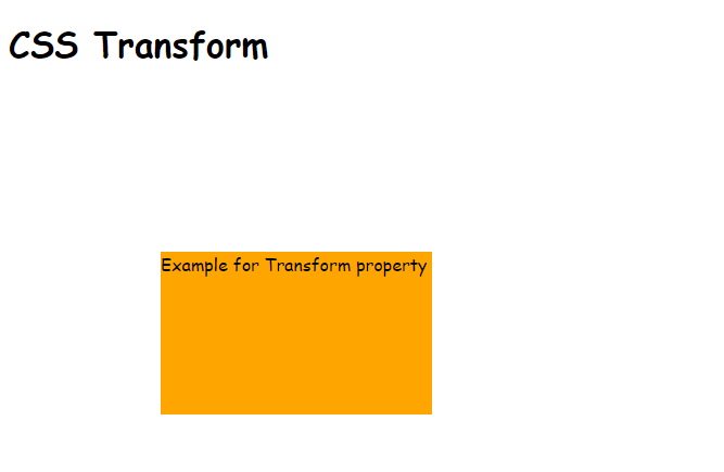
Output after using translate(x.y):
translateX(n):
This method takes only x co-ordinate as a parameter and moves the element along x-axis.
Example:
<html>
<head>
<title>CSS Transform</title>
<style type="text/css">
body{
font-family: cursive;
}
#square{
width: 250px;
height: 150px;
background: orange;
margin: 50px 40px;
transform: translateX(100px);
}
</style>
</head>
<body>
<h1>CSS Transform</h1>
<div id="square">Example for Transform property</div>
</body>
</html>
Output: Moves the square to 100px along x-axis
translateY(n):
This method takes only y co-ordinate as a parameter and moves the element along y-axis.
Example:
<html>
<head>
<title>CSS Transform</title>
<style type="text/css">
body{
font-family: cursive;
}
#sqaure{
width: 250px;
height: 150px;
background: orange;
margin: 50px 40px;
transform: translateY(150px);
}
</style>
</head>
<body>
<h1>CSS Transform</h1>
<div id="square">Example for Transform property</div>
</body>
</html>
Output: Moves the square to 120px along y-axis
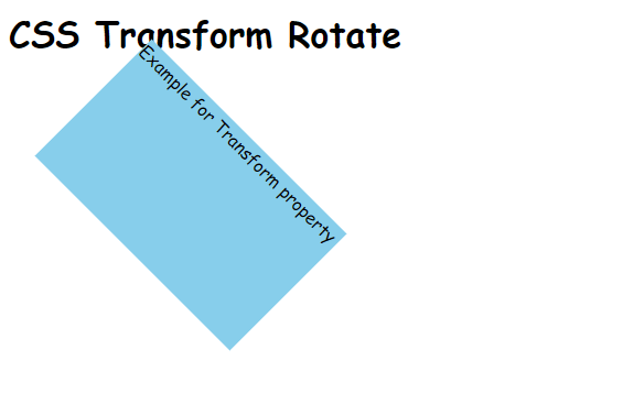
rotate() method:
The rotate() method rotates the element according to the given angle.
It can rotate the element clockwise or anti clockwise.
Syntax:
transform: rotate(angle);
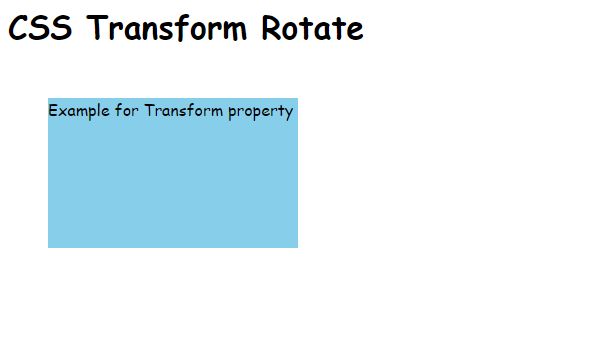
Example:
<!DOCTYPE html>
<html>
<head>
<title>CSS Transform</title>
<style type="text/css">
body{
font-family: cursive;
}
#square{
width: 250px;
height: 150px;
background: skyblue;
margin: 50px 40px;
transform: rotate(45deg);
}
</style>
</head>
<body>
<h1>CSS Transform Rotate</h1>
<div id="square">Example for Transform property</div>
</body>
</html>
Before rotation:
Output after using rotate(45):
- To rotate the element anti clockwise, you can use negative angle:
Example:
transform: rotate(-60deg);
scale() method:
This method changes the size of an element according to its width and height.
There are three types of scale() methods:
- scale(x, y)
- scaleX(n)
- scaleY(n)
scale(x, y):
This CSS transform method takes the parameters as width and height and changes the size of that element accordingly.
Syntax:
transform: scale(x, y);
where, x and y increment the size of the element x times and y times, respective to the width and height.
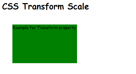
Example:
<!DOCTYPE html>
<html>
<head>
<title>CSS Transform</title>
<style type="text/css">
body{
font-family: cursive;
}
#square{
width: 250px;
height: 150px;
background: green;
margin: 50px 40px;
transform: scale(2,2);
transform-origin: left top;
}
</style>
</head>
<body>
<h1>CSS Transform Scale</h1>
<div id="square">Example for Transform property</div>
</body>
</html>
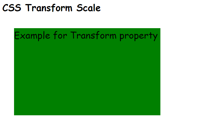
Before using scale():
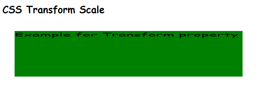
Output after using scale(x, y):
Here, the size of the square is incremented 2 times of its width and 2 times of its height. Also the transform-origin : left top; shifts the origin to the top left of the element thus facilitating the scaling inside the screen.
scaleX(n):
Increments the size of an element using the width.
Example:
<!DOCTYPE html>
<html>
<head>
<title>CSS Transform</title>
<style type="text/css">
body{
font-family: cursive;
}
#square{
width: 250px;
height: 150px;
background: green;
margin: 50px 40px;
transform: scaleX(3);
transform-origin: left top;
}
</style>
</head>
<body>
<h1>CSS Transform Scale</h1>
<div id="square">Example for Transform property</div>
</body>
</html>
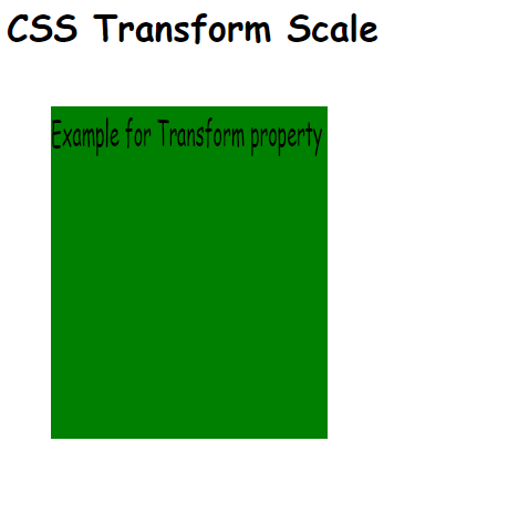
Output:
Here the square element is scaled 3 times its width using scaleX(3).
scaleY(n):
Increments the size of an element using the height.
Example:
<!DOCTYPE html>
<html>
<head>
<title>CSS Transform</title>
<style type="text/css">
body{
font-family: cursive;
}
#square{
width: 250px;
height: 150px;
background: green;
margin: 50px 40px;
transform: scaleY(2);
transform-origin: left top;
}
</style>
</head>
<body>
<h1>CSS Transform Scale</h1>
<div id="square">Example for Transform property</div>
</body>
</html>
Output:
Here the square element is scaled 2 times its height using scaleY(2).
skew() method:
This transform method skews the element along the x-axis or y-axis according to its types:
- skewX(n)
- skewY(n)
skewX(angle):
This method is used to skew the element according to its X-axis.
Syntax:
transform: skewX(angle);
Example:
<!DOCTYPE html>
<html>
<head>
<title>CSS Transform</title>
<style type="text/css">
body{
font-family: cursive;
}
#square{
width: 250px;
height: 150px;
background: brown;
margin: 50px 40px;
transform: skewX(30deg);
}
</style>
</head>
<body>
<h1>CSS Transform Skew</h1>
<div id="square">Example for Transform property</div>
</body>
</html>
Before using skewX():
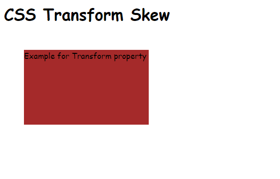
Output after using skewX():
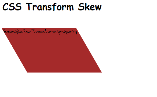
Here the element is skewed by 30 degrees along the x-axis using skewX(30deg) method.
skewY():
This method is used to skew the element according to its Y-axis.
Syntax:
transform: skewY(angle);
Example:
<!DOCTYPE html>
<html>
<head>
<title>CSS Transform</title>
<style type="text/css">
body{
font-family: cursive;
}
#square{
width: 250px;
height: 150px;
background: brown;
margin: 50px 40px;
transform: skewY(30deg);
}
</style>
</head>
<body>
<h1>CSS Transform Skew</h1>
<div id="square">Example for Transform property</div>
</body>
</html>
Output:
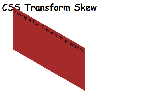
Here the element is skewed by 30 degrees along the y-axis using skewY(30deg) method.
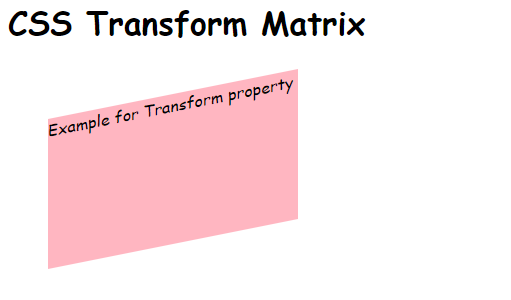
matrix() method:
matrix() method of CSS transform allows you to combine all the four methods i.e. translate(), skew(), rotate() and scale() together.
Syntax:
transform: matrix(scaleX(), skewY(), skewX(), scaleY(), translateX(), translateY());
Example:
<!DOCTYPE html>
<html>
<head>
<title>CSS Transform</title>
<style type="text/css">
body{
font-family: cursive;
}
#square{
width: 250px;
height: 150px;
background: brown;
margin: 50px 40px;
transform: matrix(1, -0.2, 0, 1, 0 ,0);
}
</style>
</head>
<body>
<h1>CSS Transform Skew</h1>
<div id="square">Example for Transform property</div>
</body>
</html>
Output:
2D Transform for Cross Browser:
CSS 2D transform property can be used for all types of browsers.
You have to use following prefixes before transform property for the respective browsers:
| Prefix | Browser name |
| -moz-transform: methodName(parameters) | Mozilla Firefox |
| -webkit-transform: methodName(parameters) | Google Chrome, Safari, Android, iPhone |
| -o-transform: methodName(parameters) | Opera browser |
So in this way we have studied the 2D Transform property of CSS and its various methods to create animated web pages.