
Thermometer Chart in the Microsoft Excel
It was known that the thermometer chart is basically based on a single data point and that in turn could be used to show the achievement percentage. It primarily depends upon the single cell of the accomplishment. It is termed the easiest way to effectively use the dashboard to show all progress, whether they have achieved the target or not.
Let us assume that we have the data for the sales value, which are captured according to the month-wise in millions as clearly depicted in the below-attached screenshot.
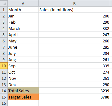
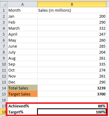
And we know that we have been target set of 3,700 million for the respective year, and the one which we have efficiently achieved is none other than the 3,239 million, which in turn, gives out the around 88% of the target that we have achieved respectively.
As clearly seen in the below-attached figure,
Where can it be used?
The respective Thermometer chart can be used to derive the range of the comparison on any part of the company’s progress. And it was seen that mainly the temperature chart could be termed a business chart.
The Thermometer chart can be efficiently used in Microsoft Excel for the making of the following things:
- For making a practical analysis of the ranges.
- To do a comparison of the sales as well as the production.
- And also to do predication of profit or the loss.
List Down the Steps to Create a Thermometer chart In Microsoft Excel?
Let us now move on to steps to create the thermometer chart in Microsoft Excel. Do the following:
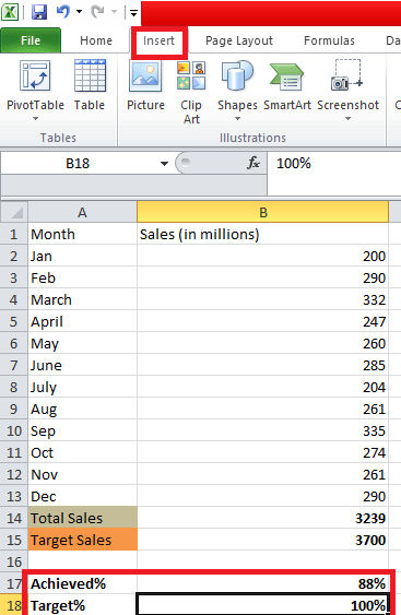
Step 1: First of all, we will select the Achieved and the Target percentage values and then navigate to insert the menu tab on the respective tab on the excel ribbon, as shown in the below-attached screenshot.
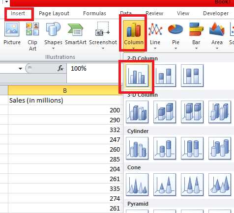
Step 2: Now, after that, within the Insert Menu, under the Graphs section, and then click on the Insert Column or the Bar Chart drop-down menu and then will eventually select the Clustered Column Chart under the 2-D Column Chart section, as we can see clearly in the below-attached screenshot.
After performing the above step, we will see the graph depicted in the screenshot below.

However, it was known that this is not something we expect in terms of the Thermometer chart. And to achieve our targets, we need to make some of the necessary amendments to this layout to convert it into the Thermometer chart.
Step 3: Now, with the help of the above-selected Chart, we will click on the particular "Design Tab" under the "Data Group" after that, click on the option that is none other than the "Switch Row or the column option." As clearly depicted in the below-attached screenshot,

And after performing the above steps, we will get the Chart which can be seen as depicted clearly in the below-mentioned figure respectively.

Step 4: After that, from the Chart, we will be selecting out the orange Column and then right-click on it to get access to all the respective available options under it, and then click on the Format Data series option. And then, it will open up the window at the extreme right in our Microsoft Excel, where we can easily format the data series effectively.
As clearly seen in the below-attached screenshot,

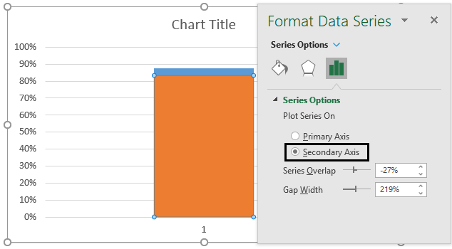
Step 5: It was known that under the “Format Data Series window" that basically appears at the extreme right in our Microsoft Excel sheet and then under the Series Option, we should click on the Secondary Axis radio Button.
Besides all these, it will enable an individual to overlap the two series columns over one another, and it is seen that it primarily becomes the stacked bar chart, as clearly seen in the below-attached screenshot.
Step 6: In these respective steps, we will now click on the primary axis for getting access to modify and format the primary axis. It was known that the primary axis is the one that are basically present on the left-hand side of the charts in the Microsoft Excel sheet.

Step 7: Under the "Format Axis Panel" which appears on the right side, change the values of the Maximum as well as the Minimum bound values to the values that are none other than that 0 and 1, respectively. And it seems that it might be appearing as either 0 and 1 by default, but we still need to change this value to 0 and 1 by doing it as manually. As soon we change out the matter, we will encounter the two Reset Buttons just beside the Minimum and Maximum bound values effectively.
As seen in the below-attached screenshot effectively,

Step 8: Now after we will move on further by clicking on the secondary axis, which is present at the rightmost corner of our Chart respectively, and we then press the Delete Button with the help of our keyboard to delete the same. And after performing these particular steps, our Chart will look like this, as seen in the below-attached screenshot.

Step 9: Now, we will be moving further by selecting out the orange column and then right-click to navigate towards the "Format Data Series" options. And Inside the Format Data Series pane, which effectively changes the following under the Fill and Line Section.
- Under Fill select the No Fill option.
- Under Border select Solid Line (Click the radio button next to the Solid Line Option).
As clearly depicted in the below-attached screenshot respectively.

After performing the above-mentioned step, we will get the graph, as shown in the screenshot below.

Step 10: Now, again, we will be efficiently right-clicking on the axis and then selecting the Format Axis Option, and under the Axis Options, we will be selecting the Major Types as Inside with the help of the Tick Mark Option respectively, as clearly depicted in the below-mentioned figure.

Now the question will get raised, what these options will do?
So, the answer to this question is that it will help add the tick mark to the options, particularly on the inner side of the axis. After that, we will move further on removing all the respective gridlines and everything. And we need to see that the axis value should be appropriately aligned, as clearly depicted in the below-attached screenshot.
Besides all these, it should be noted that we have efficiently removed all the respective gridlines that are available under this Chart. Now, we can click on the horizontal lines and then click on the delete button from the keyboard to perform the deletion of the same.
Step 11: In these respective steps, we will be deleting the Horizontal axis label as well, as seen in the screenshot below.

And it could be easily seen that we are almost done with our respect as well as the exciting Thermometer chart, and we will follow up the next few steps to get quick as well as outcomes for this particular Chart.
Step 12: In these respective steps, we will be clicking on the particular Chart and then navigating towards the "Format tab", which is present on the Microsoft Excel Ribbon, and after that, we will see the Insert shape group within it. And then, we will click on the "Oval Shape" To add it to the bottom of the Chart efficiently, as seen in the screenshot below.

Now, we will be aligning this particular Oval shape at the bottom of our current charts very efficiently, as seen in the screenshot below.

And then, we need to change the colour of the respective selected shape, the "Oval Shape", to one of the charts and remove the shape outlines so that it will look like the part of the charts instead of viewing it as a separate unit.
Step 13: After that, in these step particular step, we will click on the shape to select it and then navigate it to the "Format Tab", and from there we will be changing out the shape colour to the same as that of the Chart respectively (In our case, it is considered to be the same, so we need not worry about the same) and under the "Shape Outline" we will be moving on clicking on the "No outline options" respectively.
As is depicted in the below-attached screenshot,


And the Final Chart after performing the above steps, we will get the Chart as seen in the below-attached screenshot.

The above figure or the screenshot will help us to understand how we can configure the thermometer chart inside Microsoft Excel effectively.
Strengths of the Thermometer chart in the Microsoft Excel
The power of the particular Thermometer chart that is used in Microsoft Excel is as follows:
- It helps an individual view the profit percentage and the percentage of the completed works within the given periods of time and the other targets in one whole picture.
- Mainly the thermometer chart is used to display the trends and the comparisons.
- And they can be treated as beneficial tools for various businesses and firms (marketing).
Limitations of the Thermometer chart in the Microsoft Excel
The various constraints that are related to the use of the Thermometer chart in Microsoft Excel are as follows:
- The main rules of the thermometer chart are that it can be proved insufficient when the actual values exceed the targeted value.
- It is not a built-in option, so it could be considered the time-consuming Chart in Microsoft Excel.
Things that need to Remember about the Thermometer chart in Microsoft Excel.
The important thing needs to be remembered by an individual who all are working with the particular Thermometer Chart in Microsoft Excel are as follows:
- Its needs to be remembered that the thermometer chart is not an effectively built-in option under the charts section in the Microsoft Excel charts; instead, for that we need to make some valuable amendments to the respective 2-D Column Chart to convert it into the Thermometer chart.
- Now another essential point that needs to be remembered by an individual is that the particular Chart is well used when an individual has a target value. And it should be kept in mind that the achieved value must needs to be compared with the help of the target value.
- And adding of the shape primarily at the bottom of the respective column chart in the excel is termed to be the key while creation of the particular Thermometer chart.