Bar Plot in Python
A bar chart or bar graph displays categorical data using rectangular bars with heights or lengths proportionate to the values for the data distributed in the dataset. In a bar chart, one axis represents a dataset column, and the other shows values or counts related to that category. A column chart is another name for a vertical bar graph. We refer to bar charts organized from high to low-value counts as Pareto charts.
Why do we need to Plot a Bar Graph in Python?
Plotting a bar graph is necessary if we want to understand a dataframe in an informative, understandable manner because it clearly shows the meaning of the data.
You wanted to graph how many cake slices each party guest took on your birthday. Bar graphs can display this data. Comparing values across many categories is done using bar graphs. Both a horizontal and vertical bar plot are possible.
How to Create a Bar Plot in Python
Several of the libraries we use to make bar charts. They are particularly helpful for comprehending important data from datasets and visualizing data. We use a few libraries in Python to build bar charts.
Matplotlib in Python
Matplotlib is a maths library in python. The bar() function, used in MATLAB-style, uses an object-oriented API, which the Matplotlib API provides.
First, we have to install the matplotlib module in our terminal. So for installing this, write in your terminal as:
pip3 install matplotlib
To import this library, write the following command given below:
import matplotlib.pyplot as plt
We import this library as plt.
The bar() function has the following syntax when used with the axes given below :
plt.bar(x, height, width, bottom, align)
The parameters of this bar() function are given below:
- X: A series of scalars corresponding to the bars' x positions. The alignment determines whether the left or center of the bar, x, is used.
- Height: Representing the height(s) of the bars using a scalar or sequence of scalars.
- Width: Either scalar or array-like. the bars' default width(s) is 0.8.
- Bottom: Either scalar or array-like. The default y coordinate(s) for the bars None.
- Align:
{'center', 'edge'}
The default is “Center”.
The bars are aligned with the x coordinates:- “center” = Set the base's x locations in the middle.
- “edge” = By using the edge command, we can align the left bars' edges with the x positions.
- Pass a negative width and align= “edge” to align the bars on the right edge.
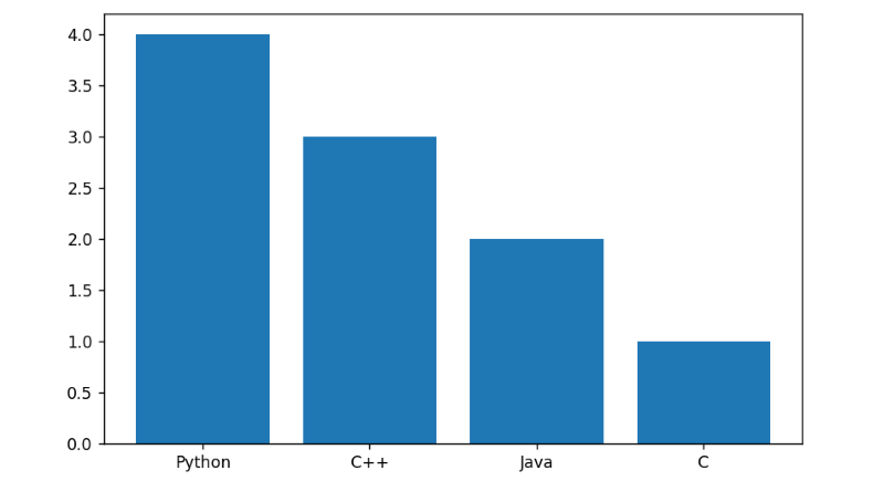
To create a Bar plot by using the Matplotlib library in Python, Let’s understand by an example given below:
Example
#Let's take an example in a class how many students learn which programming language out of 10
#code goes from here
#import matplotlib library as plt
import matplotlib.pyplot as plt
#import numpy as np
import numpy as np


#here x as height
x = np.array(["Python", "C++", "Java", "C"])
#here y as width of bar graph
y = np.array([4, 3, 2, 1])


plt.bar(x,y)
#It shows the graph
plt.show()
In the above example, we have created a Bar plot in Matplotlib in Python.
We took an example of a class. In that class, there were 10 students; out of these, how many students learned which programming language and wanted to show that data in a Bar graph.
So, in this first, we import the necessary libraries numpy and matplotlib. Then create a list as x for values. In this, we store the programming languages on the x-axis, and in a list, as y for values, we store the number of students on the y-axis. and then call plt.bar() function with parameters x,y as plt.bar(x,y).and by plt.show() function we can show the graph as output.
Output
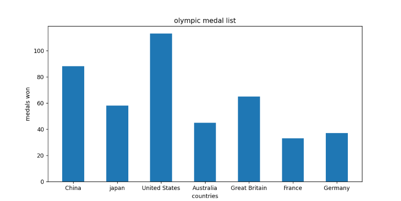
For better understanding, let’s take another example to plot a Bar graph.
Example 2:
#code goes from here
#import matplotlib as plt
import matplotlib.pyplot as plt


#create a DataFrame
medals_data = {"China": 88,
              "japan": 58,
              "United States": 113,
              "Australia": 45,
              "Great Britain": 65,
              "France": 33,
              "Germany": 37
}


country = list(medals_data.keys())
medals = list(medals_data.values())


#fixes the size of the Bar graph
fig = plt.figure(figsize=(10, 5))
plt.bar(country, medals, .5)
plt.xlabel("countries")
plt.ylabel("medals won")
plt.title("Olympic medal list")
plt.xticks()
#It shows the Bar graph
plt.show()
In the above example, we have created a Bar plot in Matplotlib in Python.
In this example, we make a dictionary to store the data of countries who took medals and how many medals each country has.
So, in this first, we import the necessary libraries numpy and matplotlib. Then create a list of a country on the x-axis and a list of medals on the y-axis. and then call plt.bar() function with parameters x,y, width as plt.bar(x, y, width).x-axis label as “countries” and y-axis label as “medals” won and gave the title of Bar graph is "Olympic medal list," and by plt.show() function we can show the graph as output.
Output:
Different Style Graphs by using Matplotlib in Python
Let’s try to make different style graphs by using Matplotlib in Python.
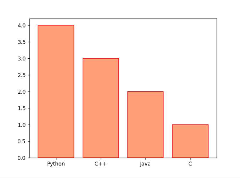
Example
#code goes from here
#import numpy
import numpy as np
#import matplotlib as plt
import matplotlib.pyplot as plt


#here x as height
x = np.array(["Python", "C++", "Java", "C"])
#here y as the width of bar graph
y = np.array([4, 3, 2, 1])
# Create bar plot with red edge color and bar color is LightSalmon
plt.bar(x, y, color="LightSalmon", edgecolor='red')
# It shows the graph
plt.show()
The above example created a Bar plot in Matplotlib in Python.
We took an example of a class. In that class, there were 10 students; out of these, how many students learned which programming language and wanted to show that data in a Bar graph.
So, In this first, we import the necessary libraries numpy and matplotlib. Then create a list as x for values. In this, we store the programming languages on the x-axis, and in a list, as y for values, we store the number of students on the y-axis. and then call plt.bar() function with parameters x,y,color,edgecolor as plt.bar(x,y,color,edgecolor) by this the bar color and edge color is changed as given.and by plt.show() function we can show the graph as output.
Output:
Example 2:
#code goes from here
# import matplotlib as plt
import matplotlib.pyplot as plt
# import numpy
import numpy as np
# stores data in the dictionary
medals_data = {"China": [38, 32, 18],
"japan": [27, 14, 17],
"United States": [39, 41, 33],
"Australia": [17, 7, 22],
"Great Britain": [22, 21, 22],
"France": [10, 12, 11],
"Germany": [10, 11, 16]
}
country = list(medals_data.keys())
medals = list(medals_data.values())
gold = np.array([i[0] for i in medals])
silver = np.array([i[1] for i in medals])
bronze = np.array([i[2] for i in medals])
fig = plt.figure(figsize=(10, 5))
plt.bar(country, gold, .5, color="gold", label="Gold")
plt.bar(country, silver, .5, bottom=gold, color="silver", label="Silver")
plt.bar(country, bronze, .5, bottom=gold + silver, color="#CD7F32", label="Bronze")
# set x label as countries
plt.xlabel("countries")
# set y label as medals won
plt.ylabel("medals won")
# set title of the Bar graph
plt.title("olympic medal list")
# it shows the graph
plt.legend()
#It shows the Bar Graph
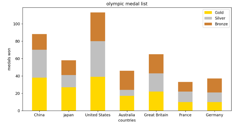
plt.show()In the above example, we have created a stacked bar graph.
A stacked bar graph is a graph that employs bars to compare categories of data, but it also allows you to compare and divide a larger whole into smaller, more manageable pieces.
We have taken an example of the Olympic medals. The yellow part of the graph shows the number of gold medals, the grey color shows the number of silver medals, and the dark orange part shows the number of bronze medals.
To create a stacked graph. We use 3 bars of gold, silver, and bronze using the .bar() function. The value of x in the .bar() function should be the same for all three bars. The bottom parameter of the silver bar should be the height of the gold bar so it will appear on the top of the gold bar. The bottom parameter of the bronze bar should be the sum of the gold bar's height and the silver bar's height so the bronze bar will appear on top of the silver bar.
Output:
Example
#code goes from here
#import matplotlib as plt
import matplotlib.pyplot as plt
#import numpy as np
import numpy as np


medals_data = {"China": [38, 32, 18],
              "japan": [27, 14, 17],
              "United States": [39, 41, 33],
              "Australia": [17, 7, 22],
              "Great Britain": [22, 21, 22],
              "France": [10, 12, 11],
              "Germany": [10, 11, 16]
}
width = .2
country = list(medals_data.keys())
medals = list(medals_data.values())
gold = np.array([i[0] for i in medals])
silver = np.array([i[1] for i in medals])
bronze = np.array([i[2] for i in medals])


bar1 = np.arange(len(gold))
bar2 = [i+width for i in bar1]
bar3 = [i+width for i in bar2]


fig = plt.figure(figsize=(10, 5))
plt.bar(bar1, gold, width, color="gold", label="Gold")
plt.bar(bar2, silver, width, color="silver", label="Silver")
plt.bar(bar3, bronze, width, color="#CD7F32", label="Bronze")
plt.xticks(bar2, country)
plt.xlabel("countries")
plt.ylabel("medals won")
plt.title("olympic medal list")


plt.legend()
plt.show()
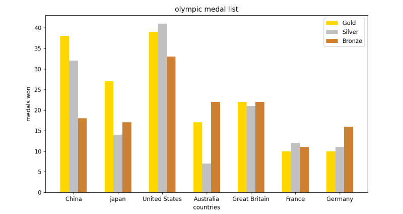
In the above example, we have created a stacked bar graph.
When comparing a specific category over time with multiple samples is impossible, unstacked bar graphs are utilized. But it also allows you to compare and divide a larger whole into smaller, more manageable pieces.
We have taken an example of the Olympic medals.
To create a stacked graph. We use 3 bars of gold, silver, and bronze using the .bar() function. The value of x in the .bar() function should be the same for all three bars.
The first parameter is a gold bar, the second is a silver bar, and the third is a bronze bar.
Output:
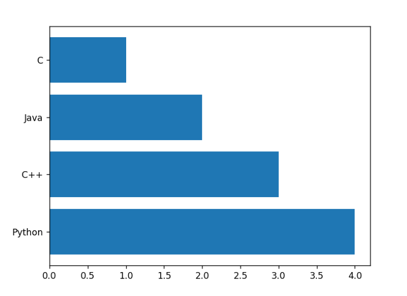
How to Create Horizontal Bar in Matplotlib in Python
Yes, we can draw a bar graph as Horizontal Bar. Use the barh() function to display the bars horizontally rather than vertically.
Let’s take an example to understand How to create a horizontal bar in Matplotlib in Python.
Example
#import numpy
import numpy as np
#import matplotlib as plt
import matplotlib.pyplot as plt


#here y as height
y = np.array(["Python", "C++", "Java", "C"])
#here x as the width of the bar graph
x = np.array([4, 3, 2, 1])
#Calling plt.barh() function with parameters y,x
plt.barh(y, x)


# It shows the graph
plt.show()
In the above example, we have created a horizontal bar in Matplotlib in Python.
In this first, we import the necessary libraries numpy and matplotlib. Then create a list as y for values on the y-axis and a list as x for values on the x-axis. and then call plt.barh() function with parameters y,x as plt.barh(y,x).and by plt.show() function we can show the graph as output.
Output
Seaborn in Python
Also based on Matplotlib, Seaborn is a popular visualization library for displaying data.
First, we have to install the Seaborn module in our terminal. So for installing this, write in your terminal as:
pip3 install seaborn
To import this library, write the following command given below:
import seaborn as sns
We import this library as sns.
The seaborn.barplot() function has the following syntax given below :
seaborn.barplot(x=' ', y=' ',data=df)
The parameters of this bar() function are given below:
- X: The name of the X-axis-specific dataframe column.
- Y: The name of the Y-axis-specific dataframe column.
- Data: Using a dataframe for plotting bar graphs.
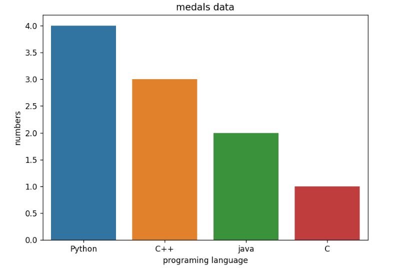
To create a Bar plot by using the Seaborn library in Python, Let’s understand by an example given below:
Example
#code goes from here
#import matplotlib as plt
import matplotlib.pyplot as plt
#import seaborn as sns
import seaborn as sns
#import pandas as pd
import pandas as pd
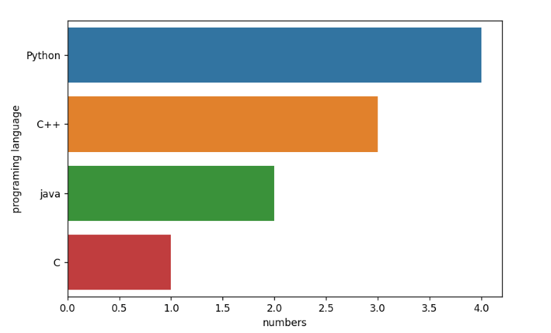
df = pd.DataFrame([["Python", 4],
["C++", 3],
["java", 2],
["C", 1],
], columns=["programing language", "numbers"]
)
#fixes the size of the bar graph
fig = plt.figure(figsize=(10, 5))
#calling sns.barplot() function
sns.barplot(x="programing language", y="numbers", data=df)
#It shows the bar graph
plt.show()
We have created a bar in seaborn in Python in the above example.
In this first, we import the necessary libraries seaborn, pandas, and matplotlib. Then, create a dataframe as df and store the data in that and then by using plt.figure(), we fixed the bar graph size and then called sns.barplot() function with parameters x,y,data as sns.barplot(x,y,data = df) .and by plt.show() function we can show the graph as output.
Output
Example
#code goes from here
#import matplotlib as plt
import matplotlib.pyplot as plt
#import seaborn as sns
import seaborn as sns
#import pandas as pd
import pandas as pd
#creates a dataframe
medals_data = pd.DataFrame([
["China", 38, "gold"],
["China", 32, "silver"],
["China", 18, "bronze"],
["japan", 27, "gold"],
["japan", 14, "silver"],
["japan", 17, "bronze"],
["United States", 39, "gold"],
["United States", 41, "silver"],
["United States", 33, "bronze"],
["Australia", 17, "gold"],
["Australia", 7, "silver"],
["Australia", 22, "bronze"],
["Great Britain", 22, "gold"],
["Great Britain", 21, "silver"],
["Great Britain", 22, "bronze"],
["France", 10, "gold"],
["France", 12, "silver"],
["France", 11, "bronze"],
["Germany", 10, "gold"],
["Germany", 11, "silver"],
["Germany", 16, "bronze"]
], columns=["country", "medal", "type"]
)
#fixes the size of the Bar Graph
fig = plt.figure(figsize=(10, 5))
#calling sns.barplot() function
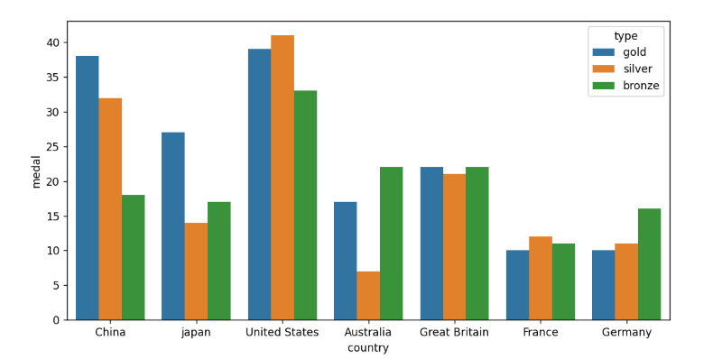
sns.barplot(x="country", y="medal", hue="type", data=medals_data)
#shows the Bar Graph
plt.show()
We have created a bar in seaborn in Python in the above example.
In this first, we import the necessary libraries seaborn, pandas, and matplotlib. Then, create a dataframe as df and store the data in that and then by using plt.figure(), we fixed the bar graph size and then called sns.barplot() function with parameters x,y,hue,data as sns.barplot(x,y,hue,data = df).
The hue parameter in Seaborn provides the data frame column you want to utilize for color encoding. And by the plt.show() function, we can show the graph as output.
Output
How to Create Horizontal Bar in Seaborn in Python
Yes, we can draw a bar graph as Horizontal Bar. Simply swapping the locations of the x and y variables will allow us to plot a bar plot horizontally rather than vertically.
It will produce a horizontal plot with the categorical variable on the Y-axis.
Let’s take an example to understand How to create a horizontal bar in Seaborn in Python.
Example
#code goes from here
#import matplotlib as plt
import matplotlib.pyplot as plt
#import seaborn as sns
import seaborn as sns
#import pandas as pd
import pandas as pd


#creates a DataFrame
df = pd.DataFrame([["Python", 4],
                  ["C++", 3],
                  ["java", 2],
                  ["C", 1],
                  ], columns=["programing language", "numbers"]
                 )


#fixes the size of the Bar Graph
fig = plt.figure(figsize=(10, 5))


#calling sns.barplot() function
sns.barplot( y="programing language",x="numbers", data=df)


#It shows the Bar Graph
plt.show()
We have created a horizontal bar in Seaborn in Python in the above example.
In this first, we import the necessary libraries seaborn, pandas, and matplotlib. Then create a dataframe by using pd.DataFrame() function. And then call sns.barplot() function with parameters y,x,data as plt.barh(y,x,data=df).and by plt.show() function we can show the graph as output.
Output
Example
#code goes from here
#import matplotlib as plt
import matplotlib.pyplot as plt
#import seaborn as sns
import seaborn as sns
#import pandas as pd
import pandas as pd
#creates a DataFrame
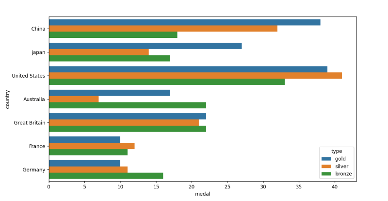
medals_data = pd.DataFrame([
["China", 38, "gold"],
["China", 32, "silver"],
["China", 18, "bronze"],
["japan", 27, "gold"],
["japan", 14, "silver"],
["japan", 17, "bronze"],
["United States", 39, "gold"],
["United States", 41, "silver"],
["United States", 33, "bronze"],
["Australia", 17, "gold"],
["Australia", 7, "silver"],
["Australia", 22, "bronze"],
["Great Britain", 22, "gold"],
["Great Britain", 21, "silver"],
["Great Britain", 22, "bronze"],
["France", 10, "gold"],
["France", 12, "silver"],
["France", 11, "bronze"],
["Germany", 10, "gold"],
["Germany", 11, "silver"],
["Germany", 16, "bronze"]
], columns=["country", "medal", "type"]
)
fig = plt.figure(figsize=(10, 5))
sns.barplot(x="medal", y="country", hue="type", data=medals_data)
plt.show()
We have created a horizontal bar in Seaborn in Python in the above example.
We have taken an example of the Olympic medals. The yellow part of the graph shows the number of gold medals, the grey color shows the number of silver medals, and the dark orange part shows the number of bronze medals.
In this first, we import the necessary libraries seaborn, pandas, and matplotlib. Then create a dataframe by using pd.DataFrame() function. and then call sns.barplot() function with parameters y,x,hue,data as plt.barh(y,x,hue,data=df).
The hue parameter in Seaborn provides the data frame column you want to utilize for color encoding. And by the plt.show() function, we can show the graph as output.
And by the plt.show() function, we can show the graph as output.
Output
Plotly in Python
Plotly is a fantastic visualization library with the capacity to handle numerous design representations, handle interactive presentations, and zoom into specific regions. We may. Additionally, it offers abstraction to describe data science, machine learning visualizations, and higher-dimensional data representation. Hover over the chart to view the data shown, frequently employed for understandable representations. Additionally, it offers abstraction to describe data science, machine learning visualizations, and higher-dimensional data representation.
First, we have to install the Plotly module in our terminal. so for installing this, write in your terminal as:
pip install plotly
To import this library, write the following command given below :
import plotly.express as px
The px.bar() function has the following syntax given below :
plotly.express.line(data_frame=None, x=None, y=None, color=None, title=None, width=None, height=None, color_discrete_sequence=None)
The parameters of this bar() function are given below:
- DataFrame: This parameter must be given for column names, but keyword names must not be utilized.
- X: The name of the X-axis-specific dataframe column.
- Y: The name of the Y-axis-specific dataframe column.
- Height: This parameter represents the height(s) of the bars.
- Width: This parameter represents the height(s) of the bars.
- Title: By this parameter, we can give the title to the bar graph.
- Color: Marks are given a color based on values from this column or an array_like.
- color_discrete_sequence: This parameter gives a specific color to the bar in the Bar graph in Plotly in Python.
Let’s take an example of how to create Bar plotly in Python.
Example 1:
# Let's take an example in a class how many students learn which programming language out of 10
# code goes from here
# import plotly.express as ex
import plotly.express as ex
# import numpy as np
import numpy as np
# here x as height
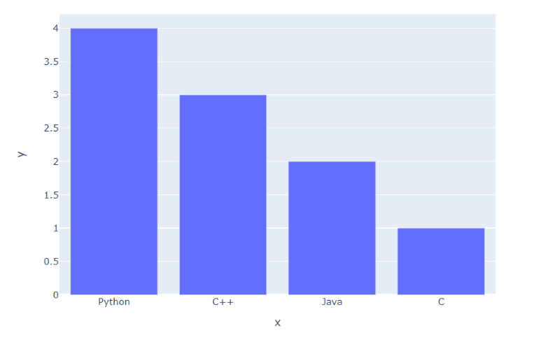
x = np.array(["Python", "C++", "Java", "C"])
# here y as the width of bar graph
y = np.array([4, 3, 2, 1])
#calling ex.bar() function as parameter x,y
fig = ex.bar(x=x, y=y)
# It shows the graph
fig.show()
In the above example, we created a bar plotly in Python.
In this first, we import the necessary libraries numpy and plotly.express.
Then create a list as x for values. In this, we store the programming languages on the x-axis, and in a list, as y for values, we store the number of students on the y-axis.
After this call ex.bar() function as parameter x,y as ex.bar(x=x,y=y).
Then fig.show() shows us the Bar graph.
Output
Example 2:
#import pandas as pd
import pandas module as pd
#import plotly.express module as ex
import plotly.express as ex
#create a dataframe as medals_data
medals_data = pd.DataFrame([
["China", 38, "gold"],
["China", 32, "silver"],
["China", 18, "bronze"],
["japan", 27, "gold"],
["japan", 14, "silver"],
["japan", 17, "bronze"],
["United States", 39, "gold"],
["United States", 41, "silver"],
["United States", 33, "bronze"],
["Australia", 17, "gold"],
["Australia", 7, "silver"],
["Australia", 22, "bronze"],
["Great Britain", 22, "gold"],
["Great Britain", 21, "silver"],
["Great Britain", 22, "bronze"],
["France", 10, "gold"],
["France", 12, "silver"],
["France", 11, "bronze"],
["Germany", 10, "gold"],
["Germany", 11, "silver"],
["Germany", 16, "bronze"]
], columns=["country", "medal", "type"]
)
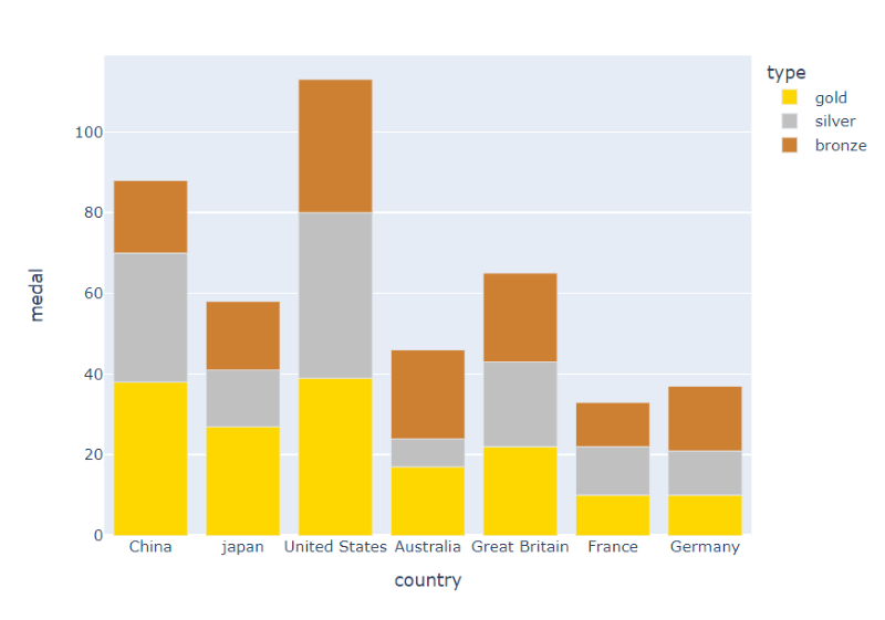
# calling ex.bar() function
fig = ex.bar(data_frame=medals_data, x="country", y="medal", color="type", color_discrete_sequence=["gold", "silver", "#CD7F32"])
#It shows the Bar graph
fig.show()
In the above example, we have created a stacked bar graph.
A stacked bar graph is a graph that employs bars to compare categories of data, but it also allows you to compare and divide a larger whole into smaller, more manageable pieces.
We have taken an example of the Olympic medals. The yellow part of the graph shows the number of gold medals, the grey color shows the number of silver medals, and the dark orange part shows the number of bronze medals.
To create a stacked graph. We use 3 bars of gold, silver, and bronze using the .bar() function. The value of x in the .bar() function should be the same for all three bars. The bottom parameter of the silver bar should be the height of the gold bar so it will appear on the top of the gold bar. The bottom parameter of the bronze bar should be the sum of the gold bar's height and the silver bar's height so the bronze bar will appear on top of the silver bar.
Output
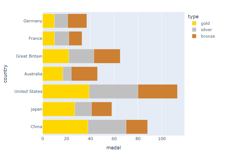
How to Create Horizontal Bar in Plotly in Python
Yes, we can draw a bar graph as Horizontal Bar.
Simply swapping the locations of the x and y variables will allow us to plot a bar plot horizontally rather than vertically. It will produce a horizontal plot with the categorical variable on the Y-axis.
Let’s take an example to understand How to create a horizontal bar in Plotly in Python.
Example
# Let's take an example in a class how many students learn which programming language out of 10
# code goes from here
#import plotly.express module as ex
# import plotly.express as ex
import plotly.express as ex
# import numpy as np
import numpy as np


# here x as height
x = np.array(["Python", "C++", "Java", "C"])
# here y as the width of bar graph
y = np.array([4, 3, 2, 1])
#calling ex.bar() function as parameter x,y
fig = ex.bar(x=y, y=x)
# It shows the graph
fig.show()
We have created a horizontal bar plotly in Python in the above example.
In this first, we import the necessary libraries plotly.express and numpy. and then call the ex.bar() function with parameters y,x as ex.bar(y,x).and by fig.show() function we can show the graph as output.
Output
Example
#import pandas module as pd
import pandas as pd
#import plotly.express module as ex
import plotly.express as ex


#creates a dataframe as medals_data
medals_data = pd.DataFrame([
              ["China", 38, "gold"],
              ["China", 32, "silver"],
              ["China", 18, "bronze"],
              ["japan", 27, "gold"],
              ["japan", 14, "silver"],
              ["japan", 17, "bronze"],
              ["United States", 39, "gold"],
              ["United States", 41, "silver"],
              ["United States", 33, "bronze"],
              ["Australia", 17, "gold"],
              ["Australia", 7, "silver"],
              ["Australia", 22, "bronze"],
              ["Great Britain", 22, "gold"],
              ["Great Britain", 21, "silver"],
              ["Great Britain", 22, "bronze"],
              ["France", 10, "gold"],
              ["France", 12, "silver"],
              ["France", 11, "bronze"],
              ["Germany", 10, "gold"],
              ["Germany", 11, "silver"],
              ["Germany", 16, "bronze"]
], columns=["country", "medal", "type"]
)
#calling ex.bar() function
fig = ex.bar(data_frame=medals_data, x="medal", y="country", color="type", color_discrete_sequence=["gold", "silver", "#CD7F32"])
#It shows the figure of Bar graph
fig.show()
We have created a horizontal bar plotly in Python in the above example.
In this first, we import the necessary libraries plotly.express and pandas. and then create a DataFrame as medals_data and then call the ex.bar() function with parameters data_frame,y,x,color,color_discrete_sequence as ex.bar(data_frame,y,x,color,color_discrete_sequence).and by fig.show() function we can show the graph as output.
Output