Joint Plot in Python
Introduction to Joint plots:
The joint plot is the finest approach to evaluate both the specific distribution of each variable and also the connection between the two variables.
Three different plots make up the Joint plot. Where middle figure is utilized to display that how x and y relate to each other. Whereas the other two regions show us the negligible distribution for the x and y axis, this area provides further details about joint distribution.
Three plots make up a joint plot. The first of the three plots depict a bivariate graph that contrasts the variation of the dependent variable (Y) with the independent variable (X). The bivariate graph's top appears longitudinally positioned with a second plot that displays the distribution of the independent variable (X). The last plot, which indicates the distribution of the dependent variable, is positioned on the right border of the bivariate graph and has its rotation set to vertical (Y). Combining univariate and bivariate plots in a single figure is highly beneficial.
That is why the bivariate analysis may examine the connection between the two variables and explain the strength of that connection. In contrast, the univariate analysis concentrates on one variable and defines, summarizes, and displays any trends in your data. The Seaborn library's joint plot() procedure, by default, make a scatter plot with two histograms at the top and right edges of the graph.
Create Joint plots using the joint plot() function
Basic Jointplot
import seaborn as sns
from matplotlib import pyplot as plt
tips = sns.load_dataset('tips')
tips.head()
total_bill tip sex smoker day time size
0 16.99 1.01 Female No Sun Dinner 2
1 10.34 1.66 Male No Sun Dinner 3
2 21.01 3.50 Male No Sun Dinner 3
3 23.68 3.31 Male No Sun Dinner 2
4 24.59 3.61 Female No Sun Dinner 4
- sns.jointplot(x='total_bill',y='tip',data=tips)
- plt.show()
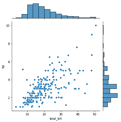
The figure shown above shows a scatterplot with two histograms bordering the graph. If you look at the scatterplot, you'll see that the columns "total bill" and "tip" appear to be positively correlated as their values rise together. The graph's dispersed points give the relationship's intensity the appearance of being medium.
Since most data are centered on the left side of the distribution while the right side is lengthier, the marginal histograms are quite right-skewed. Outliers are datasets that deviate significantly from the median and range of the data. In the chart, we can spot outliers in both the scatterplot and the histogram.
- sns.jointplot(x='total_bill',y='tip',data=tips,hue='smoker')
- plt.show()
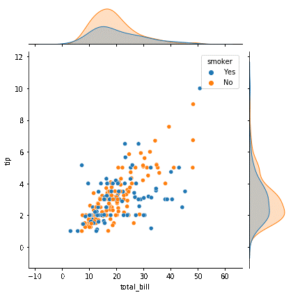
By changing the "hue" attribute to column "smoker" in the previous figure, the data sets for smokers and non-smokers are presented in distinct hues. It is simple to discern between the two stages in the "smoking" column.
Regarding the marginal plots, density plots are produced across both margins in place of histograms to represent the dataset for the two stages of the hue variable independently.
Kernel density plots in a Jointplot
- sns.jointplot(x='total_bill',y='tip',data=tips,kind='kde',hue='smoker')
- plt.show()
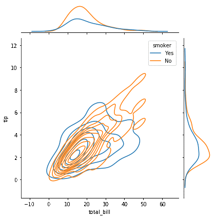
By definition, the joint plot produces a scatterplot with two marginal histograms. If necessary, multiple plots can be presented on the primary plot by changing the value of the attribute "kind" to "scatter," "KDE," "hex," "hist," etc. The joint plot exhibits a bivariate density curve on the main plot and univariate density curves on the borders since the argument "kind" in the method above is set to "KDE." Also, take note of the distinct color coding of the density curves for the two stages of the hue variable.
Regression line
- sns.jointplot(x='total_bill',y='tip',data=tips,kind='reg')
- plt.show()
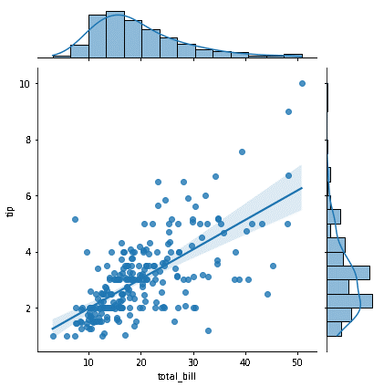
A visual representation of the connection between a dependent variable and one or more independent variables is provided by a regression line or "line of optimal fit." The line is created to be as near as feasible to all data sets. Mathematical expressions may be used to construct the regression line, and by employing this expression, we can forecast the dependent variable over a range of possible independent values. Establishing the argument 'kind' to'reg' causes the joint plot () function to be invoked, which results in the drawing of a regression line on the scatter plot. A scatter plot's trendline can be used to spot outliers. The values that deviate the most from the trendline are considered outliers. It is evident from the scatterplot that aforementioned some outliers.
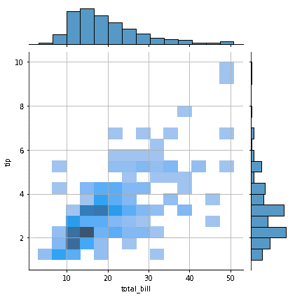
Hexagonal bin plotting
Overplotting is a common problem with scatterplots. When there is a tremendous amount of information in the plot, scatterplots are prone to overplotting, which causes the data sets to overlap and makes it challenging to comprehend the results. Overplotting may be avoided by dividing the data into a range of outcomes. This is referred to as binnin'. The entire region is initially separated into a grid of bins. Grids of various forms, such as triangular, hexagon etc., can be utilized. All of the data sets inside the specified x and y parameter ranges are contained in each bin, which depicts an interval in the plot. The hexagons are coloured using a colour gradient, and the number of points entering each bin is tallied. White bins signify that there has been no data, whereas darker hues suggest that the data sets are clustered here.
- sns.jointplot(x='total_bill',y='tip',data=tips,kind='hex')
- plt.show()
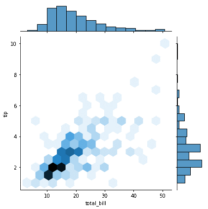
The 'kind' option in the callback mentioned above function is adjusted to 'hex,' and the joint plot uses hexagonal bins to show the relationship between the columns 'total bill' and 'tip. The distribution is presented utilizing various colors after the data sets are binned into hexagons.
- sns.jointplot(x='total_bill',y='tip',data=tips,kind='hist')
- plt.show()