Colors in Python
Adding colour to your visualisations will help them come to life. Even if you know the colours you want to use, picking good ones and putting them into practise might be challenging.
Choosing a decent colour scheme is a science in and of itself, and there are several excellent materials available on the subject (listed at the end of this post). This tutorial is all about what to do after you've decided on your colour scheme.
This package's great support for colour and plot management comes at the cost of a little of complexity when figuring out how to mix the various classes and methods.
Let's begin with a few simple plots. We can use matplotlib's imshow function to plot the density of a numpy array on a graph:
SYNTAX
import matplotlib.pytplot as plt

# define geographic extent of the image in latitude/longitude

bounds = [10.0, 11.0, 57.0, 58.0]

im = plt.imshow(np.log(data+1),

                origin='lower',

                extent=bounds)

plt.colorbar(im)
Take note of the fact that we have shown the density logarithm. There's more to it than that, though. In the same way, the data from the United States Census Bureau may be used to create a line graph.
for year in sorted(data.year.unique(), reverse=True):

    year_data = data.loc[data.year==year,:]

    plt.plot(year_data['month'],

             year_data['imports'],

             lw=2,

             label=year)
added some axis labels and a legend, and the finished product will resemble this:
OUTPUT
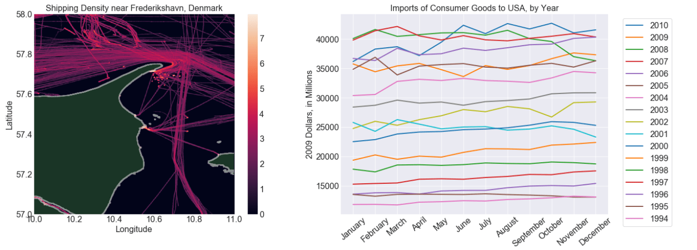
Even though the default plots appear to be rather excellent, there are a few flaws that need to be addressed. To view all of the data in the density plot, I had to plot the logarithm of the density. The legend's colour bar, on the other hand, shows the density's logarithm as well, and that's not what we want to see. Furthermore, the plot's predominant hue ended up being black and white.
Because colours are reused on the line plots, it's a little difficult to tell which line belongs to which year. Additionally, the line plot's colour scheme differs from the density plot's colour scheme, making the two plots appear disjointed.
Adjusting existing color maps
Let's begin with a look at the density plot. Each latitude/longitude coordinate has a single value for ocean traffic density. There are two phases involved in transforming that number into a colour: first, find the number.
To get a number between 0 and 1, we use a normalizer to transform the density value.
To represent red, green, and blue with three integers, we utilise the colour map (i.e., an RGB value).
There are numerous classes in Matplotlib that can do this. Matplotlib's normalizers, both linear and nonlinear, help us normalise our densities. Nonlinear scaling is possible by using classes such as PowerNorm or LogNorm rather than the Normalize class, for example.
Color maps will be discussed more in the following part, so for the time being we'll utilise one that we got from the library by calling the method get cmap.
SYNTAX
from matplotlib.cm import get_cmap

from matplotlib.colors import PowerNorm

cmap = get_cmap('inferno')

# we can adjust how our values are normalized

norm = PowerNorm(0.4, vmin=0, vmax=100)

# the colormap and normalizer can be passed directly to imshow

im = ax.imshow(data,

               cmap=cmap,

               norm=norm,

               origin='lower',

               extent=bounds)

# create a color bar with 10 ticks

plt.colorbar(im,ticks=np.arange(0, norm.vmax, norm.vmax/10))
You'll see that the colour bars have been updated to reflect the new values. Let's use the same colour scheme for our line graph. We'll normalise linearly this time, but we'll need to manually produce our colours:
SYNTAX
line_norm = Normalize(1980, 2010)

for year in sorted(data.year.unique(), reverse=True):

    year_data = data.loc[data.year==year, :]

    norm_value = line_norm(year)

    col = cmap(norm_value)

    ax.plot(year_data['month'],

            year_data['imports'],

            lw=2,

            c=col,

            label=year)

# set the background and grid colors

plt.gca().set_facecolor('#111111')

plt.grid(color='#555555')
Viewing the density plot and line plot side-by-side, we get this:
OUTPUT
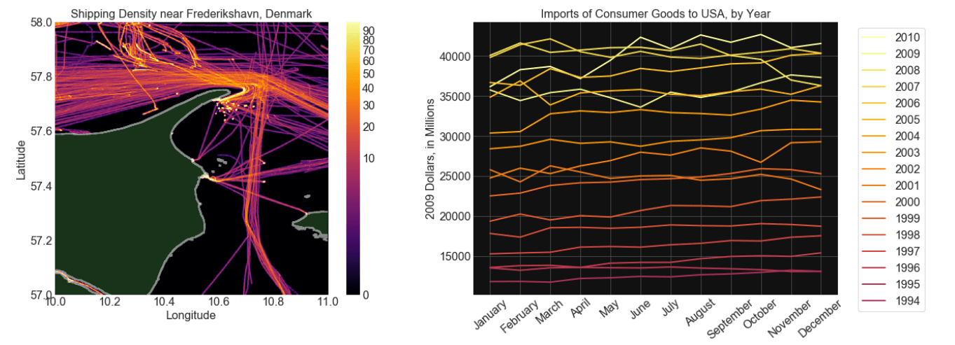
That's a step in the right direction, then. At the very least, both plots now appear to have been created by the same individual. Although these stories still have a lot to quarrel over, at least we now know how to handle it.
Customized Color Schemes
Choosing a colour scheme has several benefits. Clarity is critical, and there has been a lot written on how to utilise colour to improve the readability of plots. matplotlib's built-in colormaps make this task a lot easier. A person's personal sense of style is critical as well. Or perhaps you wish to adhere to the corporate style guidelines and feel that 'inferno' does not adequately convey the information you are delivering. To achieve this, we must first create our own colour scheme.