How to Plot Graphs Using Python?
In this article, we are going to learn about how to plot different types of graphs using Python. We are going to use different approaches for every type of graph. We will also build the Python programs to plot the graphs.
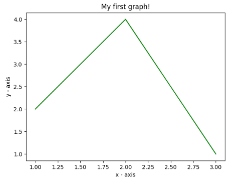
Plotting a straight line
Approach for the Program
The following steps are followed in order to build a program to plot a straight line.
- Lists should be used to define the x-axis and associated y-axis values.
- Utilize the.plot() function to plot them on a canvas.
- Utilizing the .xlabel() and .ylabel() procedures, declare the x-axis and y-axis names.
- Utilize the.title() function to give your plot a title.
- Finally, we utilise the.show() function to display your plot.
Example:
#Program to Plot a Straight line in Python
import matplotlib.pyplot as plt
# x axis values
x = [1,2,3]
# Corresponding y axis values
y = [2,4,1]


# Plotting the points
plt.plot(x, y)


# Naming the x axis
plt.xlabel('x - axis')
# Naming the y axis
plt.ylabel('y - axis')


# Giving a title to my graph
plt.title('My first graph!')


# Function to show the plot
plt.show()
Output:
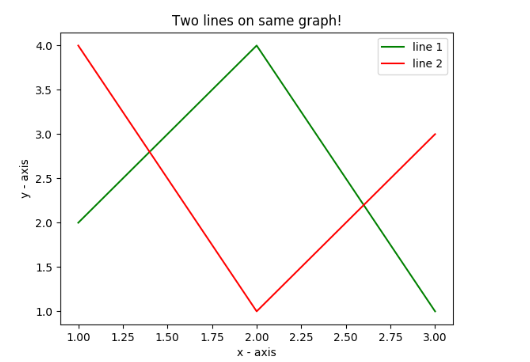
Plotting More than One line in Python
Approach for the Program
- On the same graph, two lines are plotted here. By assigning each one a name (label), which is supplied as an argument to the.plot() function, we can distinguish between them.
- A legend is a short, rectangular box that contains information regarding the characteristics of lines and its color. Using the .legend() function, we can add the legend to our plot.
Example:
#Program to Plot more than One Line in Single Graph
import matplotlib.pyplot as plt
# Line 1 points
x1 = [1,2,3]
y1 = [2,4,1]
# Plotting the line 1 points
plt.plot(x1, y1, label = "line 1")


# Line 2 points
x2 = [1,2,3]
y2 = [4,1,3]
# Plotting the line 2 points
plt.plot(x2, y2, label = "line 2")


# Naming the x axis
plt.xlabel('x - axis')
# Naming the y axis
plt.ylabel('y - axis')
# Giving a title to my graph
plt.title('Two lines on same graph!')


# Show a legend on the plot
plt.legend()


# Function to show the plot
plt.show()
Output:
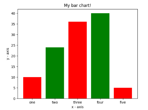
Plotting a Bar Graph using Python
Approach for the Program
- Here, a bar chart is plotted using the plt.bar() function.
- Along with the heights of the bars, the x-coordinates of the left side of the bars are passed.
- By defining tick_labels, you may also give the x-axis coordinates some names.
Example:
#Program to plot Bar Graph in Python
import matplotlib.pyplot as plt


# x-coordinates of left sides of bars
left = [1, 2, 3, 4, 5]


# Heights of bars
height = [10, 24, 36, 40, 5]


# Labels for bars
tick_label = ['one', 'two', 'three', 'four', 'five']


# Plotting a bar chart
plt.bar(left, height, tick_label = tick_label,
		width = 0.8, color = ['red', 'green'])


# Naming the x-axis
plt.xlabel('x - axis')
# Naming the y-axis
plt.ylabel('y - axis')
# Plot title
plt.title('My bar chart!')


# Function to show the plot
plt.show()
Output:
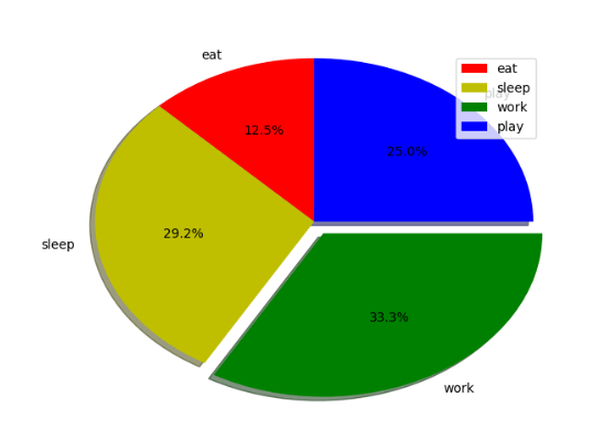
Program to Plot a Pie Chart in Python
Approach for the Program
- Here, we use the plt.pie() method to plot a pie chart.
- The labels are first defined using a list named activities.
- Then, a list named slices can be used to define a piece of each label.
- Each label's color is specified using a list called colors.
- Each label in the pie chart will have a shadow if shadow = True is set.
- startangle spins the beginning of the pie chart in a counterclockwise direction with respect to the x-axis.
- The percentage of radius by which we offset each wedge is set using explode.
- Each label's value is formatted using autopct. Here, it is configured to only display percentage values up to one decimal place.
Example:
#Program to plot a Pie Chart in Python
import matplotlib.pyplot as plt
# Defining labels
activities = ['eat', 'sleep', 'work', 'play']


# Portion covered by each label
slices = [3, 7, 8, 6]


# Color for each label
colors = ['r', 'y', 'g', 'b']


# Plotting the pie chart
plt.pie(slices, labels = activities, colors=colors,
		startangle=90, shadow = True, explode = (0, 0, 0.1, 0),
		radius = 1.2, autopct = '%1.1f%%')


# Plotting legend
plt.legend()


# Showing the plot
plt.show()
Output: