CatPlot in Python
Python Seaborn Library
Seaborn is a superb Python tool for displaying graphical statistics graphing. Seaborn provides different color schemes and attractive default styles to facilitate the creation of various statistics charts in Python more aesthetically pleasing.
Objective of Python Seaborn Library
Seaborn library strives to produce a more attractive display of the essential element of comprehending and studying data. It features dataset-oriented APIs and is based on the core of the Matplotlib toolkit.
To better understand the presented dataset, we can quickly switch between the multiple visual representations for a given variable thanks to Seaborn's close integration with Panda's data structures.
Categories of Plots in Python's Seaborn Library
Plots are frequently used to show the relationships between the chosen variables. These variables might just be numbers or they could stand in for a group, division, or class. We may produce plots in a variety of different categories using the Seaborn library.
The plot we produce is categorized under the following groups in the Seaborn Library:
- Distribution plots: Both univariate and bivariate distributions are examined using this particular style of graphic.
- Relational plots: To comprehend the relationship between the two specified variables, this kind of plot is employed.
- Regression plots: The main purpose of regression plots in the Seaborn library is to provide an extra visual aid to highlight dataset patterns during the study of exploratory data.
- Categorical plots: The categories of variables and how we can visualise them are dealt with in categorical plots.
- Multi-plot grids: The use of different subsets of a single dataset to create several instances of the same plot using the multi-plot grids is another helpful method.
- Matrix plots: A type of array of a scatterplot is a matrix plot.
Installation of Seaborn Library for Python
We will discover how to set up the Python seaborn library in this article. We may import the seaborn library into our Python program and use it in Python after installing it.
pip install seaborn
Required dependencies or prerequisites for the seaborn library:
We must have,
- Python was set up using the most recent version (3.6+).
- Version 1.13.3 or later must be installed in order to use Numpy.
- Installing SciPy requires version 1.0.1 or a later version.
- Panda libraries with versions 0.22.0 or higher are required.
- Version 0.8.0 or higher must be installed in order to use the statsmodel library.
Plotting Chart Using seaborn Library
Line plot:
// python program
//program import of the Seaborn library import seaborn as sns //importing the Mataplotlib package to produce a graph import matplotlib.pyplot as plt //using the set() method to set the style sns.set(style="dark")   //Declaring a data type using the dataset() method FMR = sns.load_dataset("fmri")   //calculating different reactions for diverse regions and events sns.lineplot(x="timepoint",                y="signal",                hue="region",                style="event",                data=FMR)
//creating a line plot with the lineplot() method plt.show() // using show() function
Output:
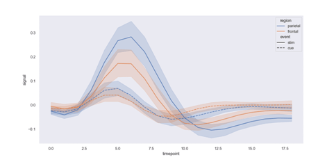
Explanation:
After establishing the dataset as a fmri type and selecting the line plot style, we use the lineplot() function in the code above to generate the line plot in the output.
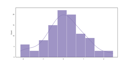
Dist plot:
// python program
//importing the np library module for numpy import numpy as np   //program import of the Seaborn library import seaborn as sns //importing the Mataplotlib package to produce a graph import matplotlib.pyplot as plt //boxplot style selection using the set() method sns.set(style="white")   //Make a univariate random distribution for the data. ru = np.random.RandomState(10)   d = ru.normal(size=100)   //simple histogram plotted using the kdeplot variation method sns.histplot(d, kde=True, color="m")   pt = sns.histplot(d, kde=True, color="m")   print(pt)   pt.show() // using show() function
Output:
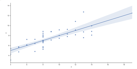
Lmplot:
The Lmplot is yet another essential plot in the Seaborn Library. With the data points on the given two-dimensional (2-D) space, the Lmplot displays a line that represents a linear regression model. In this 2-D space, the vertical and horizontal labels may be represented, respectively, by the x and y variables.
Example:
//program import of the Seaborn library import seaborn as sns //generating a graph by loading the Matplotlib library import matplotlib.pyplot as plt //using the set() function to change style
sns.set(style="ticks")   //Using the dataset() function ds = sns.load_dataset("anscombe")   //displaying outcomes as linear regression sns.lmplot(x="x", y="y", data=ds)    plot = sns.lmplot(x="x", y="y", data=ds)   print(plot)   plt.show() // using show() function
Output:
<seaborn.axisgrid.FacetGrid object at 0x000002182DC89070>
Seaborn is a Python data visualization package built on the matplotlib framework. It provides an advanced drawing tool for producing captivating and instructive statistics graphics. Seaborn aids in fixing the two primary problems with Matplotlib, which are?
- Default Matplotlib parameters
- Working with data frames
The learning curve is relatively progressive as Seaborn enhances and improves Matplotlib. If you are familiar with Matplotlib, Seaborn is already halfway done for you.
Several benefits of the Seaborn Library over other charting libraries include:
- It requires less coding syntax and is very simple to use.
- Does a great job with "pandas" data structures, which is exactly what a data scientist needs.
- It is based on Matplotlib, a different sizable and comprehensive data visualization library.
Syntax:
seaborn.catplot(*, x=None, y=None, hue=None, data=None, row=None, col=None, kind=’strip’, color=None, palette=None, **kwargs)
Data variables' names include x, y, and hue.
- Data: Long-form (organised) DataFrame dataset for visualization. An observation should be represented by each row, and a variable should be represented by each column, names of data variables in row, col, optional categorical variables that will choose how the grid is faceted.
- kind: optional, str: The name of a categorical axes-level plotting function corresponds to the type of plot to be drawn. You have the choice of "strip," "swarm," "box," "violin," "boxen," "point," "bar," or "count."
- colour: optional Matplotlib colour, Color for each element or a starting point for a gradient palette.
- palette: name, list, or dict of palettes: colours to utilize for the various hue varying levels. It must be something that color palette() can understand, or a dictionary that maps hue levels to matplotlib colours.
- key-value pairs (kwargs): Other keyword arguments are transmitted to the charting function underneath.
Categorical plots are the finest tools for comparing and visualizing various aspects of your data if you are working with any categorical variables, such as survey results. In Seaborn, categorical plotting is really simple. The names of the features in your data are used in this example for x, y, and hue. In relation to the target variable, hue parameters encode the points using various colours.
import seaborn as sns
exercise = sns.load_dataset("exercise")
g = sns.catplot(x="time", y="pulse",
                 hue="kind",
                 data=exercise)
We specify a kind parameter for the count plot and use data parameters to feed the data. Let's begin by learning more about the time feature. Starting with the catplot() function, we define the axis on which we want to display the categories using the x option.
import seaborn as sns


sns.set_theme(style="ticks")


exercise = sns.load_dataset("exercise")


g = sns.catplot(x="time",


                kind="count",


                data=exercise)
A bar plot is another well-liked option for displaying categorical data. Our plot in the count plot example just required a single variable. We frequently utilise one category and one quantitative variable in the bar plot. Let's compare the times to one another.
import seaborn as sns


exercise = sns.load_dataset("exercise")


g = sns.catplot(x="time",


                y="pulse",


                kind="bar",


                data=exercise)
We must modify the x and y features in order to create the horizontal bar plot. It's a good idea to adjust the orientation when you have many categories or long category names.
import seaborn as sns


exercise = sns.load_dataset("exercise")


g = sns.catplot(x="pulse",


                y="time",


                kind="bar",


                data=exercise)


import seaborn as sns


exercise = sns.load_dataset("exercise")


g = sns.catplot(x="time",


                y="pulse",


                hue="kind",


                data=exercise,


                kind="violin")
Use a different plot kind to visualize the same data:
import seaborn as sns


exercise = sns.load_dataset("exercise")


g = sns.catplot(x="time",


                y="pulse",


                hue="kind",


                col="diet",


                data=exercise)


titanic = sns.load_dataset("titanic")


g = sns.catplot(x="alive", col="deck", col_wrap=4,


                data=titanic[titanic.deck.notnull()],


                kind="count", height=2.5, aspect=.8)


g = sns.catplot(x="age", y="embark_town",


                hue="sex", row="class",


                data=titanic[titanic.embark_town.notnull()],


                orient="h", height=2, aspect=3, palette="Set3",


                kind="violin", dodge=True, cut=0, bw=.2)


tips = sns.load_dataset('tips')


sns.catplot(x='day',


            y='total_bill',


            data=tips,


            kind='box')
Outlier Detection Using Box Plot:
The 25th and 75th percentiles of the distribution of all bills are shown by the boundaries of the blue box. Accordingly, 75% of all the bills on Thursday were less than $20, and another 75% (counting from bottom to top) were more than roughly $13. The box's horizontal line displays the distribution's median value.
By deducting the 25th percentile from the 75th, one can determine the Inter Quartile Range (IQR): 75% — 25%
In order to determine the lower outlier limit, remove 1.5 times the IQR from the 25th: 25% — 1.5*IQR
The upper outlier limit is determined by multiplying the 75th by 1.5 times the IQR: 75% + 1.5*IQR