How to plot multiple linear regression in Python
This article lets us look into linear regression in Python and how we can plot multiple linear regressions in it.
Linear regression
One of the simplest and most widely used Machine Learning techniques is linear regression. It is a statistical technique for performing predictive analysis. This algorithm works on the assumption it takes based on the types of both variables and takes a linear relationship. We can calculate the model's necessary coefficients to make decisions based on the unseen data. This process can be done only if a relationship exists between the variables.
Plotting data is nothing but visualizing the given data into a graph. It is always better to plot pictorial data to comprehend it in a better way. Before applying multiple regressions, we have to check if there are any relationships between all features. We will use the pairplot() method from the seaborn package to plot the relationship between all the features. This pairplot() will produce a histogram along with a scatter plot mixing all the features.
To plot these regressions, we will need multiple python libraries like NumPy, Pandas, sklearn, matplotlib, etc.
You can use the below code to import all these libraries:
# Importing the required methods and modules for plotting

# all required libraries
import pandas as pd
import warnings
 import numpy as np


# For data visualizing
import seaborn as sns
import matplotlib.pyplot as plt
from mpl_toolkits.mplot3d import Axes3D
%matplotlib inline


# For building the required model
from sklearn import linear_model
Of this, we imported all the libraries required.
We use this dataset for further codes:7420 4 2
| cost | area | bedroom | floor | |
| 0 | 12300000 | 7425 | 3 | 2 |
| 1 | 15250000 | 8968 | 4 | 3 |
| 2 | 13250000 | 9999 | 3 | 4 |
| 3 | 15215000 | 7540 | 5 | 3 |
| 4 | 13410000 | 7430 | 4 | 2 |
By looking at the below code, we will get the histogram and scatter plot
# Visualizing the relationships between features using pair plots
sns.pairplot(data = housing, height = 3)
Output:
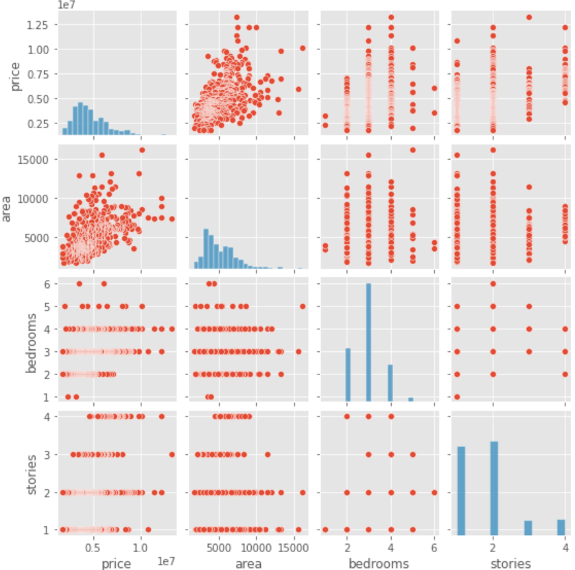
Here we used the pairplot() function, and we can also see that the first row of this graph is a linear relationship between the price and area features of the dataset. We can see the scatter plot of the rest of all variables is random, and there is no relationship between them. We should always select only one multiple independent features having a relation.
Building a Multiple Linear Regression Model:
To build a regression model, we can use every feature where there will be no relationship with collinearity among the elements, we can use all features to build a model. In this code, we will use LinearRegression() function from sklearn.
Example
# Building a Multiple Linear Regression Model
# Set the independent and dependent features of the data set
X = housing.iloc[:, 1:].values
y = housing.iloc[:, 0].values
# Initializing the model class from the sklearn package and fitting our data into it
reg = linear_model.LinearRegression()
reg.fit(X, y)
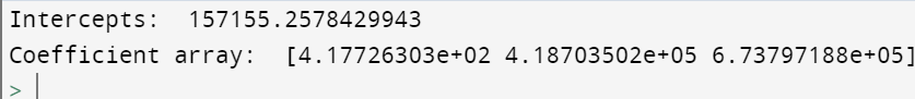
# Printing intercept and the coefficients of the regression equation
print('Intercepts: ', reg.intercept_)
print('Coefficient array: ', reg.coef_) Output:
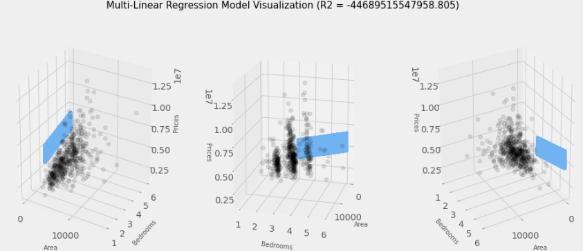
We can also convert this model into a 3-dimensional graph. To convert that, we use the below code where all the data points will be in grey color dots in the chart, and the blue plane represents the linear model.
Example
# Preparing the required data
independent = housing[['area', 'bedroom']].values.reshape(-1,4)
dependent = housing['cost']

# Creating a variable for every dimension
a = independent[:, 0]
b = independent[:, 1]
c = dependent

a_range = np.linspace(5, 10, 35)
b_range = np.linspace(3, 6, 35)
a1_range = np.linspace(3, 6, 35)
a_range, a_range, a1_range = np.meshgrid(a_range, b_range, a1_range)
viz = np.array([a_range.flatten(), b_range.flatten(), a1_range.flatten()]).T

# predicting price values by using the linear regression model built above
predictions = reg.predict(viz)

# Evaluating the model by using the R2 square of the model
r2 = reg.score(A, B)

# Ploting the model for visualization
plt.style.use('fivethirtyeight')

# Initializing a matplotlib figure
fig = plt.figure(figsize = (15, 6))

axis1 = fig.add_subplot(131, projection = '3d')
axis2 = fig.add_subplot(132, projection = '3d')
axis3 = fig.add_subplot(133, projection = '3d')

axis = [axis1, axis2, axis3]

for ax in axis:
    ax.plot(a, b, c, color='k', zorder = 10, linestyle = 'none', marker = 'o', alpha = 0.1)
    ax.scatter(a_range.flatten(), b_range.flatten(), predictions, facecolor = (0,0,0,0), s = 20, edgecolor = '#70b3f0')
    ax.set_alabel('Area', fontsize = 10, labelpad = 10)
    ax.set_blabel('Bedrooms', fontsize = 10, labelpad = 10)
    ax.set_clabel('Prices', fontsize = 10, labelpad = 10)
    ax.locator_params(nbins = 3, axis = 'a')
    ax.locator_params(nbins = 3, axis = 'a')

axis1.view_init(elev=25, azim=-60)
axis2.view_init(elev=15, azim=15)
axis3.view_init(elev=25, azim=60)

fig.suptitle(f'Multi-Linear Regression Model Visualization (R2 = {r2}, ("fontsize"))
Output:
Conclusion:
In this way, we plot multiple linear regression models in Python.