How to plot a Histogram in Python
A Histogram is used to represent a given data provided as a chunk. This histogram is a graphical representation that uses bars to indicate the ranges of the data. In this data representation, the x-axis represents the main ranges, and the y-axis represents the information about the frequency. In this article, we shall learn about plotting this histogram in python.
In python, we generally use two main libraries of a data frame. We use these libraries for any graphical representation like a line graph, bar graph, pie chart, histogram, etc. They are matplotlib and seaborn. We get these libraries from Pandas data frame. Now let us learn a way to plot a histogram in python using the library matplotlib.
Creating Histogram
The primary thing before creating a histogram is to set up the ranges for the graph and then divide the complete range of the values into a sequential interval. Then we count the values, which are into intervals.
The main function command we use to create a histogram is “matplotlib. pyplot.hist()”
Now let us create a basic histogram and use a data set containing some random values. Let us follow the code below
Example
from matplotlib import pyplot as plt
import numpy as np


# Creating a random dataset
a = np.array([25, 89, 15, 48, 66,
              70, 59, 58, 31,
              20, 81, 51, 70, 31,
              26])

# Creating a histogram
fig, ax = plt.subplots(figsize =(5, 9))
ax.hist(a, bins = [0, 20, 40, 60, 80, 100])

# Show the plot
plt.show()
Output
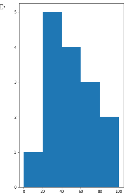
So, in the above code, we first imported pyplot from the library matplotlib. Next, we imported NumPy because we are dealing with numbers. And then, we created a random data set by naming it “a.” after creation. We created the histogram by fixing the subplots and then assigning the bin ranges for the graph. Finally, we give a plt.show() command to print the whole graph. After execution, we finally printed the plot.
Customization of Histogram
Matplotlib has a wide range of customizations for the histogram. The function matplotlib.pyplot.hist() has many built-in attributes which help modify a histogram. To access and change the created objects, the function hist() provides a patches object that will help change. With this function, we can customize the plot according to the requirements.
For example, let us look at this code
Example
import matplotlib.pyplot as plt
import numpy as np
from matplotlib import colors
from matplotlib.ticker import PercentFormatter

# Creating a random dataset
np.random.seed(23685765)
N_points = 1000
n_bins = 25

# Creating the required distribution
x = np.random.randn(N_points)
y = .8 ** x + np.random.randn(1000) + 25

# Creating a histogram
fig, axs = plt.subplots(1, 1,
                        figsize =(5, 7),
                        tight_layout = True)

axs.hist(x, bins = n_bins)

# Show the plot
plt.show()
Output:
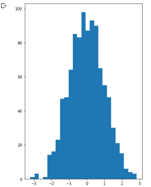
In the above code, we just created a random histogram, and now we will modify it according to our requirement, so let us look at the code continuation of this histogram.
Exqmple
import matplotlib.pyplot as plt
import numpy as np
from matplotlib import colors
from matplotlib.ticker import PercentFormatter

# Creating a random dataset
np.random.seed(23685765)
N_points = 1000
n_bins = 25

# Creating the required distribution
x = np.random.randn(N_points)
y = .8 ** x + np.random.randn(1000) + 25

# Creating a histogram
fig, axs = plt.subplots(1, 1,
                        figsize =(5, 7),
                        tight_layout = True)

# Removing the axes splines
for s in ['top', 'bottom', 'left', 'right']:
    axs.spines[s].set_visible(False)

# Removing the x, y ticks
axs.xaxis.set_ticks_position('none')
axs.yaxis.set_ticks_position('none')

# Add padding between the axes and the label
axs.xaxis.set_tick_params(pad = 10)
axs.yaxis.set_tick_params(pad = 15)

# Adding required x, y gridlines
axs.grid(b = True, color ='orange',
        linestyle ='-.', linewidth = 1,
        alpha = 0.5)

# Add Text watermark
fig.text(1, 0.25, 'new',
         fontsize = 10,
         color ='blue',
         ha ='right',
         va ='bottom',
         alpha = 0.8)

# Creating the customised histogram
N, bins, patches = axs.hist(x, bins = n_bins)

# Setting color
fracs = ((N**(1 / 5)) / N.max())
norm = colors.Normalize(fracs.min(), fracs.max())

for thisfrac, thispatch in zip(fracs, patches):
    color = plt.cm.viridis(norm(thisfrac))
    thispatch.set_facecolor(color)

# Adding extra features
plt.xlabel("X-axis")
plt.ylabel("y-axis")
plt.legend(legend)
plt.title('Customized histogram')

# Show plot
plt.show()
Output:
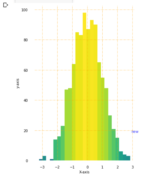
This code shows the changes we made from the previous histogram to this one. The only difference is the extra code we wrote after creating the histogram. So we first removed axes splines, then removed x and y ticks. Now we added padding between axes and labels and grid lines by setting their width. At the bottom of the graph, we also inserted a new watermark. And then, we added colors to the bars in the histogram. And finally, we print the histogram.
Conclusion
In this way, we can create a histogram in python and customize them according to our requirements.