Python Data Visualization
In this tutorial, we will understand what data visualization means in python. Further, we will see different methods of visualizing data in python.
Data visualization
- In a non-technical language, it is a method that allows the person to understand the data easily just by seeing graphs and figures.
- The Data Analytics field encompasses data visualization.
- It is easy for the human brain to grasp pictures and graphs instead of text.
- It is the method of offering information that is easy for the user to understand. For ease, data is presented in the form of figures such as graphs and charts.
- It helps the user understand and handle composite volumes of data effortlessly.
- It allows the detection of new outlines very easily.
- Various tools are available in python to achieve data visualization. Some of them are – Tableau and Power B1.
- Libraries such as Matplotlib, NumPy, Scikit learn, Seaborn, etc. are used to create the illustrations of data.
1. Matplotlib
It is a low-level library in Python widely used for visualizing the data.
It provides enough flexibility but increases the lines of code to be written.
It is easy to use as it includes the features of MATLAB. In addition to it, it is also a free and open-source library, unlike MATLAB.
Histograms, scatter plots, 3D plots, line charts, bar charts, etc. are some of the plots provided by matplotlib.
To use plots of matplotlib, one should import matplotlib as pyplot.
The succeeding command is to be used to import first.
import matplotlib.pyplot as pltNow, let us know the different types of plots available in Matplotlib
Line Chart
It is one of the basic plots in python.
plot() function is taken into account to create a line chart.
It is used to denote an association between data on two axes that is X and Y.
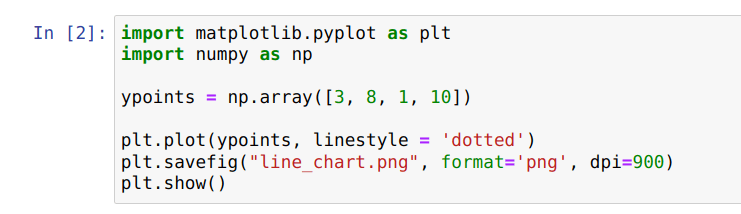
Explanation: The image above contains the code to plot the line chart.
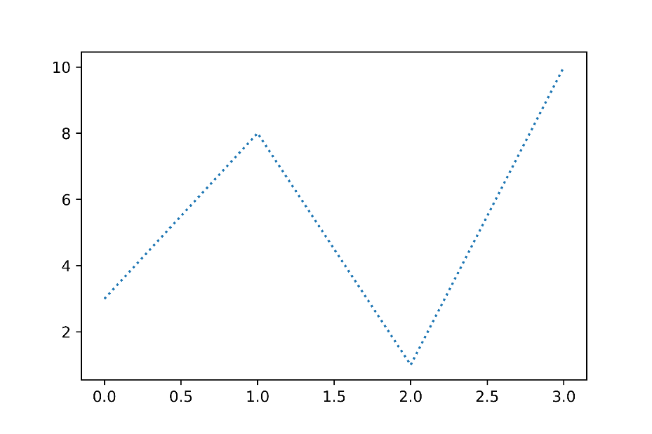
Explanation: The image above shows the plotted line chart.
Bar Chart
It describes the comparison between the discrete categories.
It is a graph that represents the category of data with rectangular bars with lengths and heights that is proportionate to the values they represent.
bar() function is taken into account to create a bar chart.
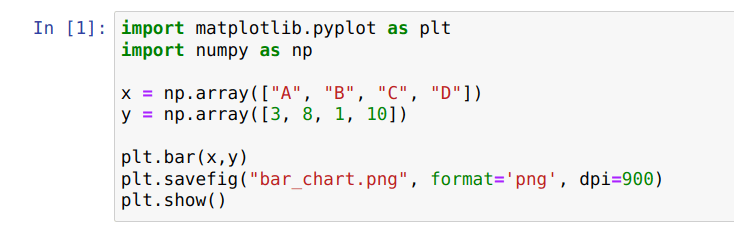
Explanation: The image above contains the code to plot the bar chart.
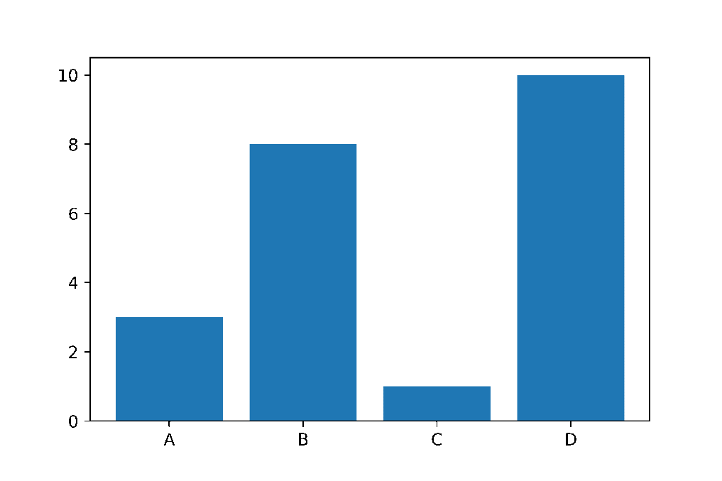
Explanation: This image shows the plotted Bar graph. Here, the Y-axis shows the frequency, and X-axis shows the values.
Histogram
It is used to represent data provided in the form of some clusters or collections.
The hist() function is taken into account to compute and create a histogram.
It is a type of bar plot where the x-axis represents the range of the containers, and the Y-axis gives information about frequency.
Scatter Plot
It is used to detect associations between the variables.
The scatter() method is taken into account to draw a scatter plot.
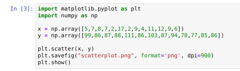
Explanation: The image above contains the code to create a scatter plot.
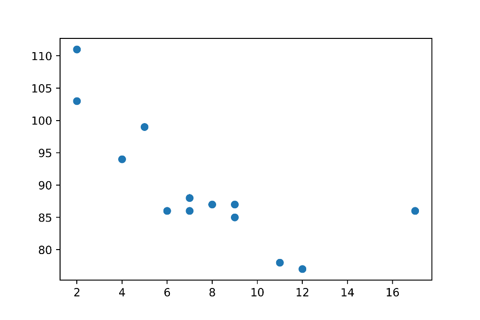
Explanation: The image above shows the scatter plot plotted by the code written above.
Pie Chart
It is a spherical chart used to display only one sequence of data.
The method pie() is taken into account to create a pie chart.
The area of a slice of the pie represents the s percentage of the parts of the data, and these slices are called wedges.
2. NumPy
It is another open-source library available in python.
It stands for numerical python.
It is a linear algebra library in python.
It is the most basic library in python but very useful.
It is capable of handling large datasets proficiently.
It serves as the base of several other libraries like pandas, matplotlib, and sci-kit learn.
The arrays in NumPy are known as nd-array, which are N-dimensional arrays.
It is already installed when one downloads Anaconda but to install it separately; the following command is used in the windows operating system.
pip install numpy 3. Scikit Learn
It is one of the most useful libraries of python used for Machine Learning.
It is built upon NumPy, SciPy, and Matplotlib libraries.
Its original name was scikits.learn, developed in 2007 as part of the GSOC project.
It provides efficient tools for Machine Learning and statistical modeling.
If NumPy and SciPy are installed already then sci-kit learn can be installed through the following command in the Windows operating system.
pip install -U sci-kit-learn4. Seaborn
It is another open-source library used for visualizing the data in python.
It mainly deals with statistics and hence draws statistical graphs.
Matplotlib library serves as the base for seaborn.
It is easier to use seaborn in comparison with the matplotlib library.
It provides a beautiful well-defined graph.
If we want to use seaborn, we have to imported it first.
import seaborn as sns