Python Seaborn
Seaborn is an open-source library in Python that is used for data visualization and plotting graphs. The plots are used for the Visualization of data. It is built on top of Matplotlib and very useful for data analysis.
Matplotlib is used for analyzing the data sets in Python, It is a 2-dimensional Plotting library. Similarly in Python, the Seaborn library is used for data visualization.
Features of Seaborn are:
- It provides built-in themes for customizing the graphics of Matplotlib.
- Statistical and multivariate data visualization.
- Plotting statistical time-series data.
- Pandas and Numpy are highly efficient for working with Seaborn.
- It is fit for linear regression model visualization.
Seaborn Installation
We can easily install Seaborn using PIP with the below command:
Syntax:
pip install seaborn
For Windows, Linux & Mac
For installing Seaborn in Windows, Linux & Mac, we can do it using conda.
Syntax:
conda install seaborn
Dependencies of Seaborn:
- Python 2.7 or 3.4+
- numpy
- scipy
- pandas
- matplotlib
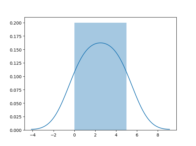
Distplots
Distplot is defined as the distribution plot, it accepts an array as input and plots a curve equivalent to the points allocation in an array.
Importing libraries
Let's begin by importing Pandas. Pandas are mainly used for managing relational datasets.
We can import it with the following command
import pandas as pd
Importing Matplotlib library
Matplotlib is used for customizing the plots.
from matplotlib import pyplot as plt
Importing Seaborn library
We can easily import the Seaborn library with the following command.
import seaborn as sns
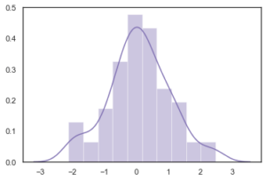
Plotting a Distplot
We can plot a histogram using a seaborn dist plot.
Example:
import matplotlib.pyplot as plt

import seaborn as sns


sns.distplot([0, 1, 2, 3, 4, 5])


plt.show()
Output:
Example 2:
import numpy as np

import seaborn as sns


sns.set(style="white")


rs = np.random.RandomState(10)

d = rs.normal(size=100)


# Plot a simple histogram

sns.distplot(d, kde=True, color="m")
Output:
Seaborn Plots Customization
The customized themes in seaborn are used for customizing the feel and look of graphs. The graphs can be customized according to the needs.
Changing Figure Aesthetic
If we want to set the looks of the plot, the set_style() method is used for that purpose.
Seaborn contains five themes.
- darkgrid
- whitegrid
- dark
- white
- ticks
Syntax:
set_style(style=None, rc=None)
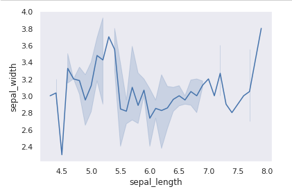
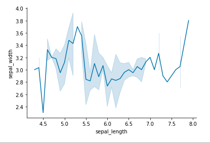
Example of using the dark theme:
import seaborn as sns

import matplotlib.pyplot as plt


# dataset loading

data = sns.load_dataset("iris")


#lineplot drawing

sns.lineplot(x="sepal_length", y="sepal_width", data=data)


# theme will converted to dark

sns.set_style("dark")

plt.show()
Output:
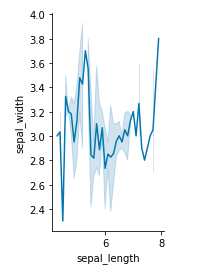
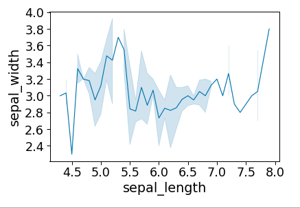
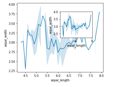
Changing the Size of the Figure
The size of the figure can be changed with the figure() method inside Matplotlib. A new figure of specified size is created with the figure() method.
Example:
import seaborn as sns

import matplotlib.pyplot as plt


# loading dataset

data = sns.load_dataset("iris")


# changing the size of figure

plt.figure(figsize = (2, 4))


# linepot drawing

sns.lineplot(x="sepal_length", y="sepal_width", data=data)


# spines removing

sns.despine()


plt.show()
Output:
Spines Removal
The data boundaries are noted by the spines and axis tick marks are connected. The despite() method is used to remove these.
Syntax:
sns.despine(left = True)
Example:
import seaborn as sns

import matplotlib.pyplot as plt


# loading dataset

data = sns.load_dataset("iris")


# lineplot drawing

sns.lineplot(x="sepal_length", y="sepal_width", data=data)


# spines will remove with this

sns.despine()

plt.show()
Output:
Plots Scaling
The plot scaling can be done using the set_context() method,. It enables overriding default parameters. This doesn't affect the overall style but it can modify the size of labels, lines, and other elements of the plot.
Syntax:
set_context(context=None, font_scale=1, rc=None)
Example:
import seaborn as sns

import matplotlib.pyplot as plt


# dataset loading

data = sns.load_dataset("iris")


# lineplot drawing

sns.lineplot(x="sepal_length", y="sepal_width", data=data)


# Setting the scale

sns.set_context("paper")


plt.show()
Output:
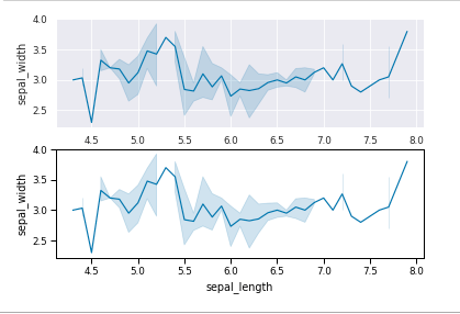
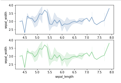
Setting the Style Temporarily
For setting the style temporarily axes_style() method is used. This method is used with the statement with.
Syntax:
axes_style(style=None, rc=None)
Example:
import seaborn as sns

import matplotlib.pyplot as plt


# dataset loading

data = sns.load_dataset("iris")


def plot():

    sns.lineplot(x="sepal_length", y="sepal_width", data=data)


with sns.axes_style('darkgrid'):


    # Adding the subplot

    plt.subplot(211)

    plot()


plt.subplot(212)

plot()
Output:
Building Color Palette
For visualizing the plots effectively and easily colormaps are used. Different types of colormap can be used for different kinds of plots. The method which is used for giving colors to the plot is color_palette() method.
We can use palplot() function to deal with the color palettes.
Seaborn includes following palattes -
- Deep
- Muted
- Bright
- Pastel
- Dark
- Colorblind
Example:
import seaborn as sns

import matplotlib.pyplot as plt


# current colot palette

palette = sns.color_palette()


# plots the color palette as a

# horizontal array

sns.palplot(palette)


plt.show()
Output:

Sequential Color Palette
The distribution of data ranges from a lower value to a higher value is defined by the sequential color palette. We can do this by adding characters 's' to the color passed in the color palette.
Example:
from matplotlib import pyplot as plt

import seaborn as sb

current_palette = sb.color_palette()

sb.palplot(sb.color_palette("Greens"))

plt.show()
Output:

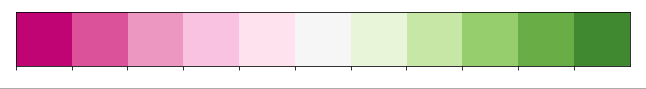
Diverging Color Palette
The two different colors are used by the Diverging palettes. Every color describes the distinction in the value ranging from a common point in both directions.
consider that we are plotting the data ranges between -1 to 1.
One color is taken by the values ranging from -1 to 0 and another is taken by 0 to +1.
Example:
import seaborn as sns

import matplotlib.pyplot as plt


# current palette

palette = sns.color_palette('PiYG', 11)


# diverging palette

sns.palplot(palette)


plt.show()
Output:
Setting the Default Color Palette
The set_palette() function is the mate of the function color_palette(). For both set_palette() and color_palette() the arguments are same.
The default Matplotlib parameter is changed by the set_palette() method.
Example:
import seaborn as sns

import matplotlib.pyplot as plt


# dataset loading

data = sns.load_dataset("iris")


def plot():

    sns.lineplot(x="sepal_length", y="sepal_width", data=data)


# default color palette setting

sns.set_palette('vlag')

plt.subplot(211)


# color palette plotting

# as vlag

plot()


# setting another default color palette

sns.set_palette('Accent')

plt.subplot(212)

plot()


plt.show()
Output:
Multiple Plots with Seaborn
In seaborn, by using the Matplotlib library the multiple plots can be created. Some functions are also provided for the same.
Using Matplotlib
There are various functions in Matplotlib for plotting subplots. These are ass_axes(), subplot(), and subplot2grid().
Example - Using add_axes() method
import seaborn as sns

import matplotlib.pyplot as plt


# dataset loading

data = sns.load_dataset("iris")


def graph():

    sns.lineplot(x="sepal_length", y="sepal_width", data=data)


# defining width = 5 inches

# and height = 4 inches

fig = plt.figure(figsize =(5, 4))


# first axes is creating

ax1 = fig.add_axes([0.1, 0.1, 0.8, 0.8])


# plotting the graph

graph()


# second axes is creating

ax2 = fig.add_axes([0.5, 0.5, 0.3, 0.3])


# plotting the graph

graph()


plt.show()
Output:
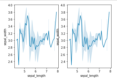
Example - Using subplot() method
import seaborn as sns

import matplotlib.pyplot as plt


#dataset loading

data = sns.load_dataset("iris")


def graph():

    sns.lineplot(x="sepal_length", y="sepal_width", data=data)


# sublot to be added at the grid position

plt.subplot(121)

graph()


# subplot to be added at the grid position

plt.subplot(122)

graph()


plt.show()
Output:
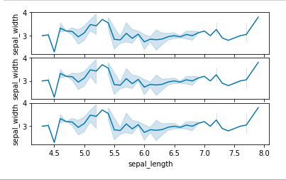
Example - Using subplot2grid() method
import seaborn as sns

import matplotlib.pyplot as plt


# loading dataset

data = sns.load_dataset("iris")


def graph():

    sns.lineplot(x="sepal_length", y="sepal_width", data=data)


# adding the subplots

axes1 = plt.subplot2grid (

  (7, 1), (0, 0), rowspan = 2, colspan = 1)

graph()


axes2 = plt.subplot2grid (

  (7, 1), (2, 0), rowspan = 2, colspan = 1)

graph()


axes3 = plt.subplot2grid (

  (7, 1), (4, 0), rowspan = 2, colspan = 1)

graph()
Output:
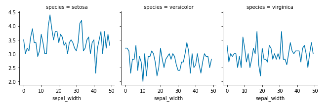
Facetgrid() Method
The Facegrid() method is used for visualizing the arrangement of one variable and association between multiple variables individually in the subsets of the dataset utilizing multiple panels.
A FacetGrid can be described with up to three dimensions - row, col, and hue.
The first two have precise conformity with the resulting array of axes; think of the hue variable as the third dimension with a depth axis, where various levels are plotted with various colors.
As an input, The Facegrid object accepts a dataframe and the variable names that will form the row or grid hue dimensions.
The variables should be definite and the data at every level of the variable will be used for a facet with that axis.
Syntax:
seaborn.FacetGrid( data, \*\*kwargs)
Example:
import seaborn as sns

import matplotlib.pyplot as plt


# dataset loading

data = sns.load_dataset("iris")


plot = sns.FacetGrid(data, col="species")

plot.map(plt.plot, "sepal_width")


plt.show()
Output:
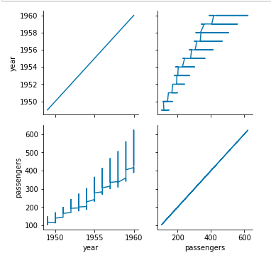
PairGrid() Method
A subplot grid() is drawn with PairGrid() method by using a similar type of plot for the data visualization.
The pairgrid is the same as facetgrid. Firstly, the initialization is done and then the plotting function is passed.
It is depicted as the supplementary level of conventionalization with the hue parameter. Then, the different subsets of data are plotted in different colors. To resolve the elements on a third dimension it uses color but only subsets are drawn on top of each other.
Syntax:
seaborn.PairGrid( data, \*\*kwargs)
Example:
import pandas as pd

import seaborn as sb

from matplotlib import pyplot as plt

df = sb.load_dataset('iris')

g = sb.PairGrid(df)

g.map(plt.scatter);

plt.show()
Output:
Different Types of Plots
We can create different types of plots in Seaborn. Some of them are listed below.
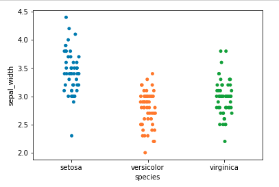
Categorial plots
stripplot()
By using striplot() method, a Scatter plot is created which is based on the category. The data is represented in sorted order with one of the axis.
Syntax:
stripplot([x, y, hue, data, order, ...])
Example:
import seaborn as sns

import matplotlib.pyplot as plt


# dataset loading

data = sns.load_dataset("iris")


sns.stripplot(x='species', y='sepal_width', data=data)

plt.show()
Output:
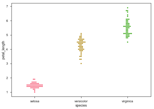
Swarmplot()
The swarmplot is quite the same as striplot instead of the fact that points are arranged so that they do not overlay. Sometimes, the very large numbers do not well scaled by the swarmplot, this is the disadvantage of using swarmplot() method.
Syntax:
swarmplot([x, y, hue, data, order, ...])
Example:
import seaborn as sns

import matplotlib.pyplot as plt


# dataset loading

data = sns.load_dataset("iris")


sns.swarmplot(x='species', y='sepal_width', data=data)

plt.show()
Output:
Distribution Plots
Distribution Plots are used for analyzing univariate and bivariate patterns. Below are the important distribution plots.
Histogram
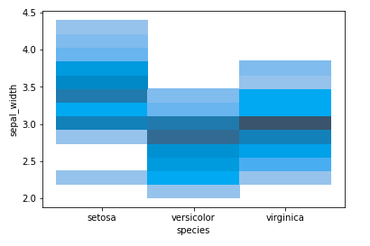
The data presented in a form of some groups are represented with the histogram. This method is very accurate for graphical representation of the distribution of numerical data. This can be done with histplot() function.
Syntax:
histplot(data=None, *, x=None, y=None, hue=None, **kwargs)
Example:
import seaborn as sns

import matplotlib.pyplot as plt


# dataset loading

data = sns.load_dataset("iris")


sns.histplot(x='species', y='sepal_width', data=data)

plt.show()
Output:
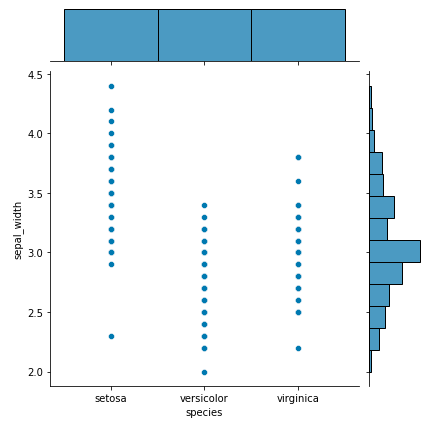
Jointplot
If we want to draw a two variables plot with bivariate and univariate graphs then the joinplot method is used for this purpose.
It combines two distinct plots. It is plotted using the jointplot() method.
Syntax:
jointplot(x, y[, data, kind, stat_func, ...])
Example:
import seaborn as sns

import matplotlib.pyplot as plt


# dataset loading

data = sns.load_dataset("iris")


sns.jointplot(x='species', y='sepal_width', data=data)

plt.show()
Output:
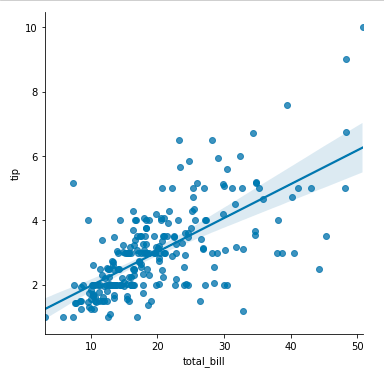
Regression Plots
The regression plots are fundamentally dedicated to adding a visual model that helps to maintain patterns in a dataset while exploratory analysis of the data.
As the name implies Regressions plot creates a line of regression among two parameters and it helps to visualize the linear relations.
lmplot
A linear model plot can be created using the function implot().A scatter plot is created with the linear fit on top of it.
Syntax:
seaborn.lmplot(x, y, data, hue=None, col=None, row=None, **kwargs)
Example:
import seaborn as sns

import matplotlib.pyplot as plt


# dataset loading

data = sns.load_dataset("dips")


sns.lmplot(x='total_bill', y='dip', data=data)

plt.show()
Output:
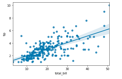
Regplot
The regplot() method and implot() method are similar by which the linear regression model is created.
Syntax:
seaborn.regplot( x, y, data=None, x_estimator=None, **kwargs)
Example:
import seaborn as sns

import matplotlib.pyplot as plt


# loading dataset

data = sns.load_dataset("dips")


sns.regplot(x='total_bill', y='dip', data=data)

plt.show()
Output:
Matrix Plots
Matrix plot is used for plotting matrix data where the rows data, column data and, values showed by color-coded diagrams. The heatmap and clustermap are used for showing that.
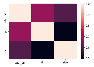
Heatmap
The heatmap is used to represent the graphical data by utilizing the colors for visualizing the matrix value. Reddish colors are used for representing the more general values or higher activities and for representing activity values or less common values, dark colors are used. The heatmap() function is used for plotting.
Syntax:
seaborn.heatmap(data, *, vmin=None, vmax=None, cmap=None, center=None, annot_kws=None, linewidths=0, linecolor=’white’, cbar=True, **kwargs)
Example:
import seaborn as sns

import matplotlib.pyplot as plt


# dataset loading

data = sns.load_dataset("tips")


# correlation between the different parameters

tc = data.corr()


sns.heatmap(tc)

plt.show()
Output:

Clustermap
The Seaborn clustermap() function plots the hierarchically clustered heatmap of the specified matrix dataset.
Grouping of data based on relations between the variables of data is known as clustering.
Syntax:
seaborn.heatmap(data, *, vmin=None, vmax=None, cmap=None, center=None, annot_kws=None, linewidths=0, linecolor=’white’, cbar=True, **kwargs)
Example:
import seaborn as sns

import matplotlib.pyplot as plt


# dataset loading

data = sns.load_dataset("tips")


# correlation between the different parameters

tc = data.corr()


sns.heatmap(tc)

plt.show()
Output:
Conclusion
In the above article, we have studied the Seaborn library in Python. Also, we have understood the different types of methods and functions for creating plots.