Data Distribution in python
Before discussing data distribution, we will discuss each word that is data and Distribution.
What is meant by data?
- A collection of raw facts and figures is called data. The word "raw" means that the facts are unprocessed.
- Data is collected from different sources. It is collected for different purposes.
- Data may consist of numbers, characters, symbols or pictures etc.
Example of data
Students fill out an admission form when they get college admission. The form consists of raw facts about the students. These raw facts are the student's name, father's name, address etc. The main purpose of collecting the data is to maintain the records of the students during their study period in the college or any educational institution.
What kinds of data exist?
- Property records
- Census records
- Animal control records
- Test scores
- Arrest records
- Auto accident records
- Budgets
- Criminal/court records and more!
What is meant by Distribution?
In a programming language, the word distribution means the phase which will follow some packages. The package will be on any distribution medium, such as a compact disk, or maybe it is located on a server where the customers can download it electronically.
In python, Distribution is a collection that contains an implementation of python along with a group of libraries or tools.
The best python distributions are Anaconda Python, PyPy, Jython, Active Python, CPython etc.
Now, we will learn about Data Distribution.
Data Distribution
In the real world, the data sets are big, and it is more difficult to gather this real-world data at the early stage of a given project.
We get doubt about how can we get this type of data sets.
For creating the big sets for testing, we use modules in python like NumPy that contain many methods to create random data sets that can be of any size. Let us discuss an example of this.
Example
Let us create an array containing floating-point numbers containing 50 between 0 and 1.
import numpy
x = numpy.random.uniform(0.0, 1.0, 50)
print(x)
Output
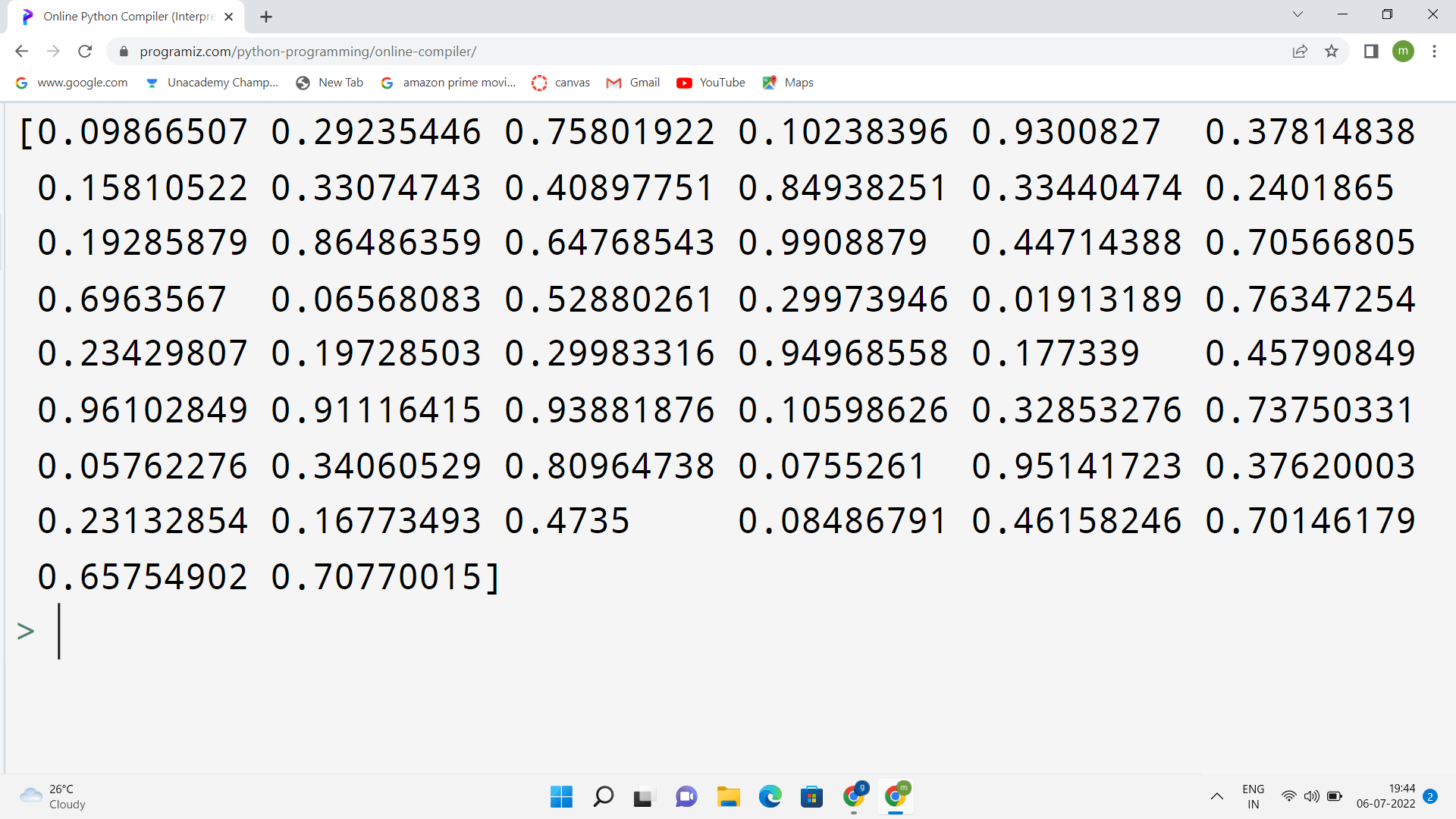
The above output shows that the floating-point numbers are displayed between 0 and 1. The total number of floating-point numbers is 50, as we have given as an input.
Now, we will discuss "Histogram".
What is Histogram?
A histogram is a bar graph that shows data in intervals. It is also called the graphical representation of a frequency distribution (in complete form) in a rectangle with class intervals as bases and the corresponding frequencies as heights. There should be no gap between any two successive rectangles. It is also fine when there is a gap.
It has adjacent bars at intervals. The histogram shown here illustrates the Distribution of weights in KG of 40 persons of a locality.
In other words, we can draw a histogram with the data we collected to visualize the data set.
Here, we will use the python module Matplotlib to draw a histogram.
Let us check an example showing a histogram.
Example program
import numpy
import matplotlib.pyplot as plt
x = numpy.random.uniform(0.0, 5.0, 250)
plt.hist(x, 5)
plt.show()
Output
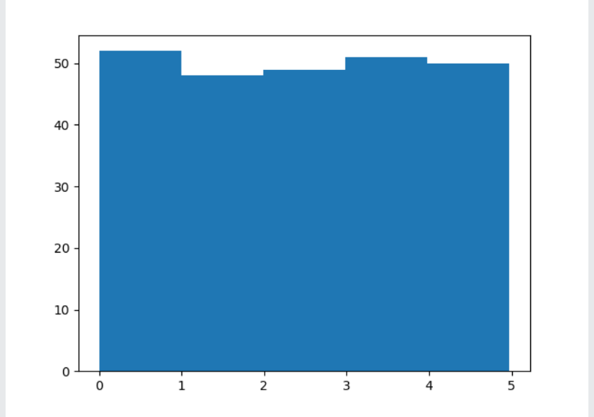
From the above histogram, we use the array from the example for drawing the histogram with 5 bars.
The first bar will represent how many values are in the array between 0 and 1.
The second bar represents how many values are in the array between 1 and 2.
The third bar represents how many values are in the array between 2 and 3.
And so on.
From this, the result will be as follows:
- There are 52 values between 0 and 1
- There are 48 values between 1 and 2
- There are 49 values between 2 and 3
- There are 51 values between 3 and 4
- There are 50 values between 4 and 5
NOTE: From the histogram, the array values are random numbers, and also, it will not show the exact result on our system.
There are many types of distributions, such as:
- Discrete Distribution
- Geometric Distribution
- Continuous Distribution
- Lognormal Distribution
- Weibull Distribution
- Non-normal Distribution
We will discuss these types later, and now let us know how to evaluate data distribution.
We all observe that data distribution is generated by its number of peaks, uniformity, symmetry possession, and skewness. Skewness means the measure of the lack of symmetry in data distribution.
We discussed the definition of data and distribution and data distribution and learned about a random array of a given size and between two given values.
Here in this article, we will learn how to create an array in which the values concentrate only on a given value.
In the theory of probability, this type of distribution is called the normal data distribution, or it is also called Gaussian data distribution. This name arrived from a scientist called Carl Friedrich, who devised a formula for this data distribution.
An example of this normal data distribution is as follows:
# the three lines that will make the output able to draw
import sys
import matplotlib
matplotlib.use('Agg')
import numpy
import matplotlib.pyplot as plt
x = numpy.random.normal(5.0, 1.0, 100000)
plt.hist(x, 100)
plt.show()
#the two lines will make the compiler to draw
plit.savefig(sys.stdout.buffer)
sys.stdout.flush()
Output
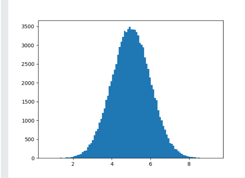
A normal data distribution graph is also known as a "bell curve" because it is in the shape of a bell.
From the above program, we have used the "NumPy. random. normal ()" method, giving input with 100000 values, which will draw a histogram with 100 bars.
We also specified that the mean value is 5.0 and the standard deviation is 1.0. It means that the values must concentrate only around 5.0, and it will rarely cross the value of the mean, which is 1.0.
The above histogram shows that most values are between 4.0 and 6.0, and the top value is 5.0.
Now let us discuss a topic called "Scatter Plot".
Scatter Plot
The scatter plot is a diagram where a dot will represent every value belonging to the data set.
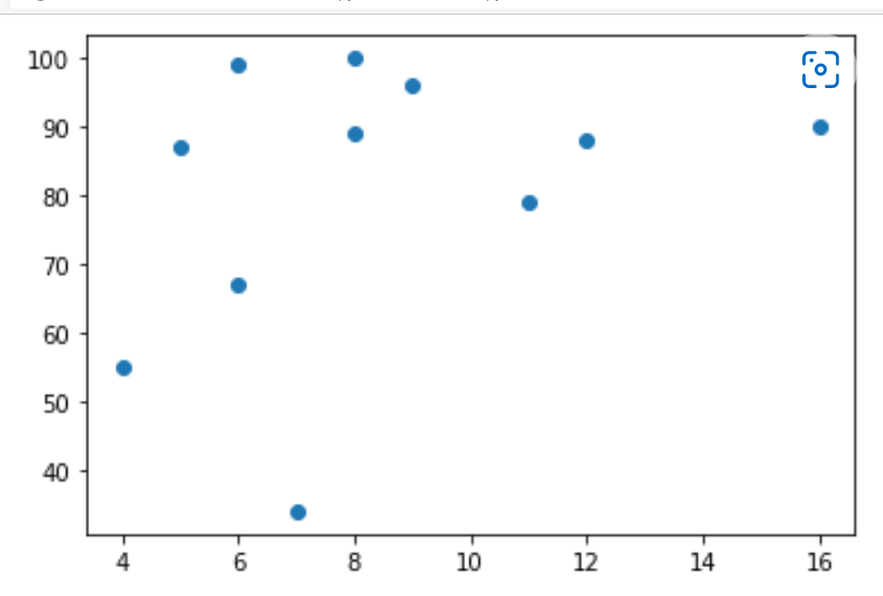
In python, a matplotlib module method is used for drawing these scatter plots. For this, we need two arrays of the same length, one is for values on the x-axis, and the other array is for the values on the y-axis.
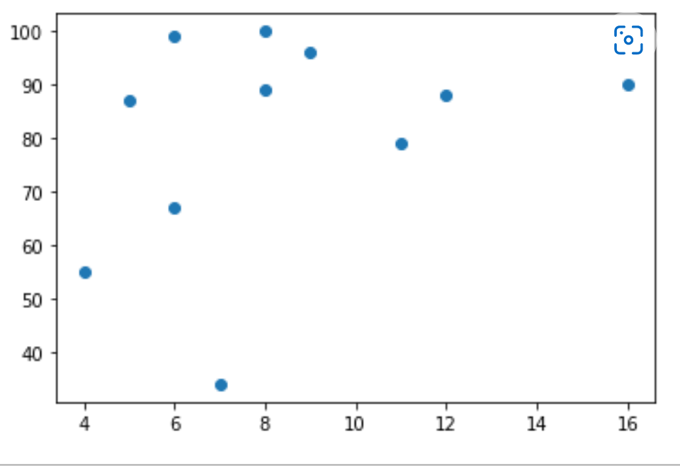
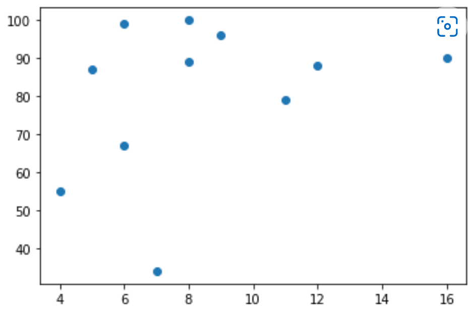
For example, let us take two arrays named x and y
x = [4,7,6,8,16,11,12,9,8,6,5]
y = [55,34,67,89,90,79,88,96,100,99,87]
The array "x" will represent the car age of every car.
The array "y" will represent the speed of every car.
Let us take an example using the scatter () method for drawing scatter plot diagrams.
An example program showing scatter () method
import matplotlib.pyplot as plt
x = [4,13,6,8,16,11,12,9,8,6,5]
y = [55,34,67,89,90,79,88,96,100,99,87]
plt.scatter(x,y)
plt.show()
Output

Explanation of the program
The x-axis will represent the car's age, and the y-axis will represent the car's speed.
We observed from the diagram that the fastest speed of the car is 100, and the age of it is 8 years, and the slowest car is 7, and its age is 13.
It shows that the new car's speed is more than the old car and there will also be a coincidence, and we only registered 11 cars.
Random Data Distributions
In python, the data sets contain thousands or millions of values.
We might not have the real-world data when we test an algorithm; for this, we have to generate randomly generated values.
We learned the above about the NumPy module; it will help us with that.
So, let us create two arrays filled with 500 random numbers from a normal data distribution.
The first and foremost array will have the set of the mean is 3.0 having a standard deviation of 1.0.
The second array consists of the mean set is 4.0 and has a standard deviation of 2.0.
import numpy
importmatplotlib. pyplot as plt
x = numpy.random.normal(3.0, 1.0, 500)
y = numpy.random.normal(4.0, 2.0, 500)
plt.scatter(x, y)
plt.show()
Output
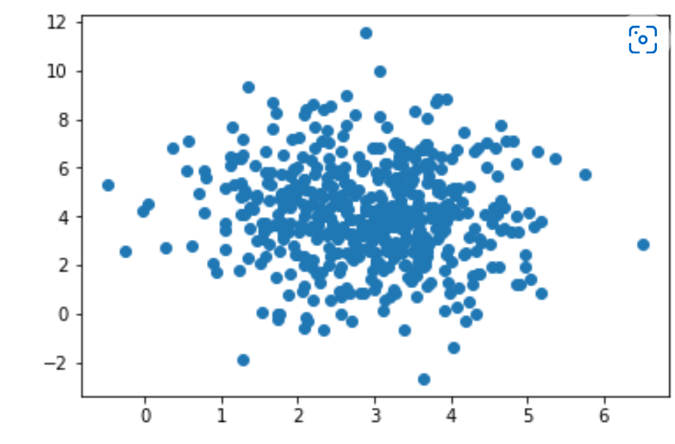
Explanation of Scatter Plot
From the above graph, we can see that the program of scatter plot results in a graph consisting of dots, which are results around the value "3" on the x-axis and value "4" on the y-axis and these values are given as input from us. We also observed that the spread of dots or result of dots is more on the y-axis compared to the axis x.
Now, we will learn a new concept called "Regression".
Regression
The term regression will be used when we are trying to find the relation among variables.
In python, machine learning and statistical modelling, this relationship is used to predict future events' results.
Here in this regression, there are many types:
- Linear Regression
- Polynomial Regression
- Multiple Regression
In python, regression is a form of predictive modelling technique which investigates the relationship between a dependent and an independent variable.
It involves graphing a line over a set of data points that most closely fits the overall shape of the data. The regression shows the changes in a dependent variable on the y-axis and the explanatory variable on the x-axis.
Uses of Regression
- Determining the strength of predictors. Here, it is used to determine the strength of the independent variables' effect on the dependent variables.
- Forecasting an effect, and in this, the regression is used to forecast the effects or impact of changes in one or more independent variables.
- Trend forecasting the regression analysis is used to predict trends and future values.
Types of Regression
There are three types of regression, such as:
- Linear Regression: In simple terms, we know and are interested in y=mx+c, which is the equation of a straight line. It explains the correlation between 'x' and 'y' variables. It means every value of 'x' has a corresponding value of 'y' if it is continuous.
In linear regression, the data is modelled using a straight line. It uses the relation between the data points to draw a straight line through them. The result produced as a straight line is used to predict the future values.
In python, predicting the values of the future is very important.
Now, we will learn how it will work.
How does It Work?
In python, many methods and libraries for finding the relationship between data points are used to draw a linear regression line.
We will now discuss using these methods instead of a mathematical formula.
Linear regression is used with continuous variables. The output or linear regression prediction is the variable's value. Here, we use measured by loss, R squared, Adjusted R squared etc. are used for accuracy and goodness of fit.
Selection Criteria
- Classification and Regression Capabilities
- Regression models predict a continuous variable such as sales made on a day or a city's temperature. Reigning on a polynomial like a straight line to fit a data set poses a real challenge in building a classification capability.
- For example, we fit a line with ten points that we have and now imagine if we add some more data points to it. In order o fit it, we have to change our existing model; that is, we have to change the threshold itself.
- Hence, the linear model is not good for classification models.
Data Quality
Each missing value removes one data point that could optimize the regression. In simple linear regression, the outliers can significantly disrupt the outcome. If you remove the outliers, your model will become very good.
Computational Complexity
Linear regression is often not computationally expensive compared to the decision tree or the clustering algorithm. The order of complexity for 'n' training example and "X" features usually falls in either BigO(X)^2 or BigO(Xn).
Comprehensible and Transparent
The linear regression is easily understandable and transparent. A simple mathematical notation can represent by anyone and can be understood very easily.
So, these are some criteria based on which we will select the linear regression algorithm.
Where is Linear Regression used?
1. Evaluating trends and sales estimates.
Linear regression can be used in business to evaluate trends and make estimates or focus.
Suppose a company's sales have increased steadily every month for the past few years. In that case, conducting a linear analysis of the sales data with monthly sales on the y-axis and time on the x-axis will give us a line predicting the upwards trends in the sale; after creating the trend line, the company could use the slope of the lines to focus sale in coming months.
2. Analyzing the Impact of Price Changes
Linear regression can be used to analyze the effect of pricing on consumer behaviour. For instance, if a company changes the price of a certain product several times, then it can record the quantity itself or each price level and then perform a linear regression with sold quantity as a dependent variable and price as the dependent variable. It will result in a line that depicts the extent to which they reduce their product consumption as the price increases.
Polynomial Regression
It is opposite to the linear regression that we discussed previously. When the points of our data do not fit a linear regression that is a straight line through all the data points, it will be a curve or ideal for polynomial regression.
Like linear regression, polynomial regression also uses a relationship between the variables a and b that will find a good way, and we can draw a line through the data points.
How does it work?
We know that python has many methods for finding a relationship between data points and drawing a polynomial regression line.
Here, we will discuss how it works and how to use these python methods apart from using a mathematical formula.
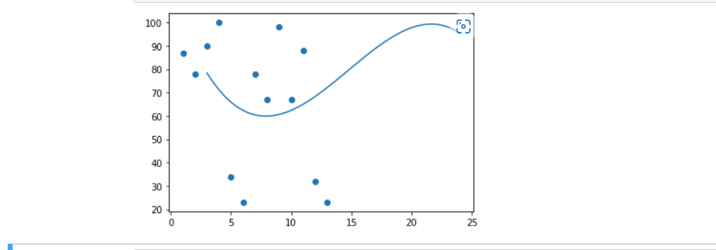
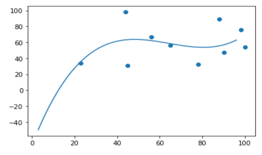
Now, let us discuss an example that shows 13 cars as they are passing through a tollbooth. We have already registered those cars' speed and the time of hours for which those cars are passed.
For drawing the polynomial regression graph, the x-axis represents the time of hours, and the y-axis represents the speed of those cars.
So, let us start by drawing a scatter plot.
import matplotlib.pyplot as plt
x = [4,13,6,8,16,11,12,9,8,6,5]
y = [55,34,67,89,90,79,88,96,100,99,87]
plt.scatter(x,y)
plt.show()
Result
By drawing a scatter plot graph, we get an idea of how to draw the graph for polynomial regression.
At first, we should import NumPy and matplotliband then draw the line of polynomial regression.
import numpy
import matplotlib.pyplot as plt
a = [1, 2, 3, 4, 5, 6, 7, 8, 9, 10, 11, 12, 13]
b = [87, 78, 90, 100, 34, 23, 78, 67, 98, 67, 88, 32, 23]
myexample = numpy.poly1d(numpy.polyfit(a, b, 3))
myline = numpy.linspace(3, 24, 99)
plt.scatter(a, b)
plt.plot(myline, mymodel(myline))
plt.show()
Result
We need to import the modules.
import numpy
import matplotlib.pyplot as plt
After importing the modules, we need to represent the arrays and the array values of the x and y-axis.
a = [1, 2, 3, 4, 5, 6, 7, 8, 9, 10, 11, 12, 13]
b = [87, 78, 90, 100, 34, 23, 78, 67, 98, 67, 88, 32, 23]
To make a polynomial model, NumPy has a method.
myexample = numpy.poly1d(numpy.polyfit(a, b, 3))
Now, we can specify the line like it displays, so we start at position 3 and end at position 24.
myline = numpy.linspace(3, 24, 99)
Now, we can draw the original scatter plots.
plt.scatter(a, b)
After drawing the scatter plots then, draw the line of polynomial regression.
plt.plot(myline, mymodel(myline))All the steps are completed, and now we can display the diagram by using:
plt.show()
By learning all these types of regressions, we get doubt about how the relationship is measured. So, let us discuss how this relationship is measured and predict anything.
R-Squared
As discussed above, it is important to know the relationship between the values of the x and y-axis; if there is no relationship between these axes, the polynomial regression will be unable to be used for predicting anything.
So, this relationship is measured with a value called r-squared.
The values of r-squared values range from 0 to 1, where "0" means no relationship and "1" means totally (100%) related.
Python programming language and SkLearn module will compute this value for us, and all we have to do is keep the x and y arrays and feed them.
import numpy
from sklearn.metrics import r2_score
x = [4,13,6,8,16,11,12,9,8,6,5,3,6]
y = [55,34,67,89,90,79,88,96,100,99,87,49,76]
myexample = numpy.poly1d(numpy.polyfit(x, y, 3))
print(r2_score(y, myexample(x)))
Result

Note: The result we got is 0.49, which shows an average relationship, and there should be more value in a relationship for future predictions.
Predicting future values
We all gathered the information to predict the future values, and now we can use this information to predict future values.
Let us consider an example: Let us now try to predict the car's speed that will pass the tollbooth at around 15P.M:
To do this calculation, we need an array called "myexample" from the example above.
myexample = numpy.poly1d(numpy.polyfit(x, y, 3))
Example
We are predicting the speed of a car that is passing at 15P.M:
import numpy
from sklearn.metrics import r2_score
a = [4,13,6,8,16,11,12,9,8,6,5,3,6]
b = [55,34,67,89,90,79,88,96,100,99,87,49,76]
myexample = numpy.poly1d(numpy.polyfit(a, b, 4))
speed = myexample(15)
print(speed)
Result

From the above code, we got the result of 58.7, which is the speed of the car passing at "15P.M".
It is not always possible to create a perfect polynomial regression. Sometimes, there may be no best method for predicting future values and now let us create an example for polynomial regression would not be the best method.
Bad fit
The above-discussed things are known as "Bad fit", and we will discuss an example showing the method for bad fit and prove that it is impossible to find the best method for polynomial regression. So, let us discuss an example.
Example
We can prove a bad fit method by taking before discussed examples like arrays, my example, importing numpy and matplotlib and considering the scatter plots. The values for the x and y-axis must return a bad fit for polynomial regression
import numpy
import matplotlib.pyplot as plt
a = [78, 56, 88, 98, 100, 45, 23, 90, 65, 44]
b = [32, 67, 89, 76, 54, 31, 34, 47, 56, 98]
myexample = numpy.poly1d(numpy.polyfit(a, b, 3))
myline = numpy.linspace(3, 96, 100)
plt.scatter(a, b)
plt.plot(myline, myexample(myline))
plt.show()
Result
From the above graph, we observed a bad fit line across the data points and hence observed that the regression produced is a bad fit. We can also calculate an r-squared value for the above program.
import numpy
from sklearn.metrics import r2_score
a = [78, 56, 88, 98, 100, 45, 23, 90, 65, 44]
b = [32, 67, 89, 76, 54, 31, 34, 47, 56, 98]
myexample = numpy.poly1d(numpy.polyfit(a, b, 6))
print(r2_score(b, myexample(a)))
Result

The result is 0.3145, indicating a bad relationship and that the data set is unsuitable for polynomial regression.
There is another type of regression called multiple regression.
Multiple regression
Multiple regression is the same as linear regression; the only difference is that it has more than one independent value; we should try using two or more variables to predict a value.
To understand better, we take an example as a data set, which contains information about car models, weight, volume, and CO2.
So, let us randomly select the column CO2 emission of a car, which will be based on the engine's size; although it has multiple regression, we cannot estimate the correct value, and we can throw more variables for this. So, consider the car's weight to make the prediction better and more accurate.
So, how does it work?
We have modules in a python programming language that will work for the above example. So, for this, we need to importthe Pandas module.
import pandas
Pandas:These are python libraries and are used to initialize data. These are also used for working with data sets. It consists of functions for analyzing, cleaning, exploring, and manipulating data.
The name "pandas" comes from both "panel and data". Pandas allow us to analyze big data and make conclusions based on statistical theories.
It allows us to read CSV files and return a data frame object.
To read the values of cars from the table, we use,
df = pandas.read_csv("cars.csv")Let us list the independent values, call this variable "X", and keep all the dependent values in a variable "y"
X = df[['weight', 'volume']]
y = df['CO2’]
Note: It is easy to name the entire list of independent values with an upper-case X and a list of dependent values with a lower-case y.
We should import the sklearn module because we had used the same methods from sklearn.
from sklearn import linear_model
Sklearn module uses LinearRegression() method for creating linear regression objects.
The linear regression object has a method called fit() which takes the independent and dependent values as parameters and fills the regression object with some data, and it describes the relationship:
regr = linear_model.LinearRegression()
regr.fit(X, y)
So, by this relationship, we have an object called regression which predicts CO2 values based on the car's weight and volume.
For predicting the CO2 emission of a car and the weight of the car is 2300kg, and its volume is 1300cm^3:
predictedCO2 = regr.predict([[2300,1300]])
Example
import pandas
from sklearn import linear_model
df = pandas.read_csv("cars.csv")
X = df[['Weight', 'Volume']]
y = df['CO2']
regr = linear_model.LinearRegression()
regr.fit(X, y)
#For predicting the emission of Co2 for a car where the weight is 2300kg, and the volume is 1300cm3:
predictedCO2 = regr.predict([[2300, 1300]])
print(predictedCO2)
Result
[107.2087328]
The result explains that when we take a car with a 1.3-litre engine and a weight of 2300kg, it will release 107.208 grams of CO2 for driving one kilometer.
Coefficient
A coefficient is a number or constant present before a variable in an algebraic expression. It describes the relationship with an unknown number.
For example, take a variable "x" then "2x" means double of "x". Here, "x" is an unknown variable, and the number "2" is the coefficient of "x".
We all had learned molecules in chemistry. Now, we take an example using this case. The coefficient of the CO2 molecule is "1"; there is nothing before the term. The weight and volume against CO2 tell us what will happen when we increase or decrease one of the independent values.
Example
import pandas
from sklearn import linear_model
df = pandas.read_csv("cars.csv")
x = df[['weight', 'volume']]
y = df['CO2']
regr = linear_model.linearRegression()
regr.fit(X ,y)
print(regr.coef_)
Result
[0.00755 0.00780]Explanation of result
The above result of the coefficient code represents the coefficient values of CO2 weight and value.
Weight: 0.00755095
Volume: 0.00780526
These weight and volume values describe that if the weight increase by 11kg, then the CO2 emission increases by 0.00755g.
If the size of the engine or volume is increased by 1cm^3, the emission of CO2 will increase by 0.00780g.
We have already mentioned that if a car with a 1300cm^3 engine weighs 2300g, the CO2 emission will be approximately 107g.
Let us discuss another example but change the values from 2300 to 3300. Then, the program will be as below:
import pandas
from sklearn import linear_model
df = pandas.read_csv("cars.csv")
x = df[['weight', 'volume']]
y = df['CO2']
regr = linear_model.linearRegression()
regr.fit(X ,y)
predictedCO2 = regr.predict([[330, 1300]])
print(predictedCO2)
Result
114.75968007
From the above result, we had given a car with a 1.3-litre engine that weighed 3300kg, and it releases 115grams of CO2 approximately for each kilometre the car drives.
The above value needs some calculation to process the program's backside.
Calculation:
17.2087328 + (1000*0.00755095) =114.75968
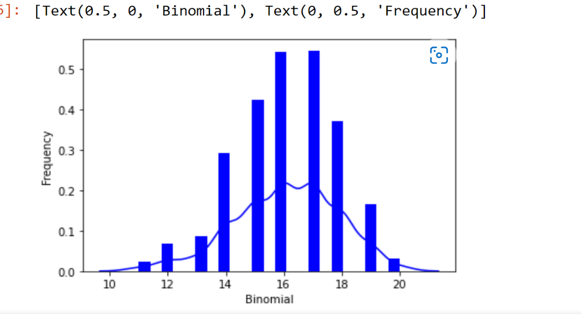
Binomial distribution
It is a part of the data distribution model that deals with the probability of winning an event which has two possible outcomes in many experiments.
For example, when we toss a coin, it always gives a head or a tail.
Let us move further on this topic. When the probability of finding exactly 3 heads for tossing a coin, immediately 10 times is examined during the binomial distribution.
For the binomial distribution, we use a library called "seaborn", which has many in-built functions, to create the graphs of such probability distribution.
Here, we also use a package called "scipy" that helps us for creating the binomial distribution.
from scipy.stats import binom
import seaborn as sb
binom.rvs(size=10,n=20,p=0.8)
data_binom = binom.rvs(n=20,p=0.8,loc=0,size=1000)
ax = sb.distplot(data_binom, kde=True, color='blue', hist_kws={"linewidth": 25,'alpha':1})
ax.set(xlabel='Binomial', ylabel='Frequency')
Output is as follows:
Correlation in python
The correlation analysis deals with the association between two or more variables. The degree of relationship between the variables under consideration is measured through correlation analysis. So, the correlation measure is called "correlation coefficient" or "correlation index".
A simple example is a correlation between parents and their offspring and the product price and its supplied quantity.
Chi-square test in python
The chi-square test in python is a statistical method that determines if there is any correlation between two categorical variables.
Both these categorical variables should belong to the same population, and they should be a part like Yes or No, Male or female, Red or green etc.
Let us consider a simple and general example. We can build a dataset with observations like people's tastes while buying ice cream, and there is a chance to correlate the gender of a person with the ice cream flavour they prefer.
If we find a correlation, we can plan for appropriate stock of flavours by knowing the total count of genders who visited.
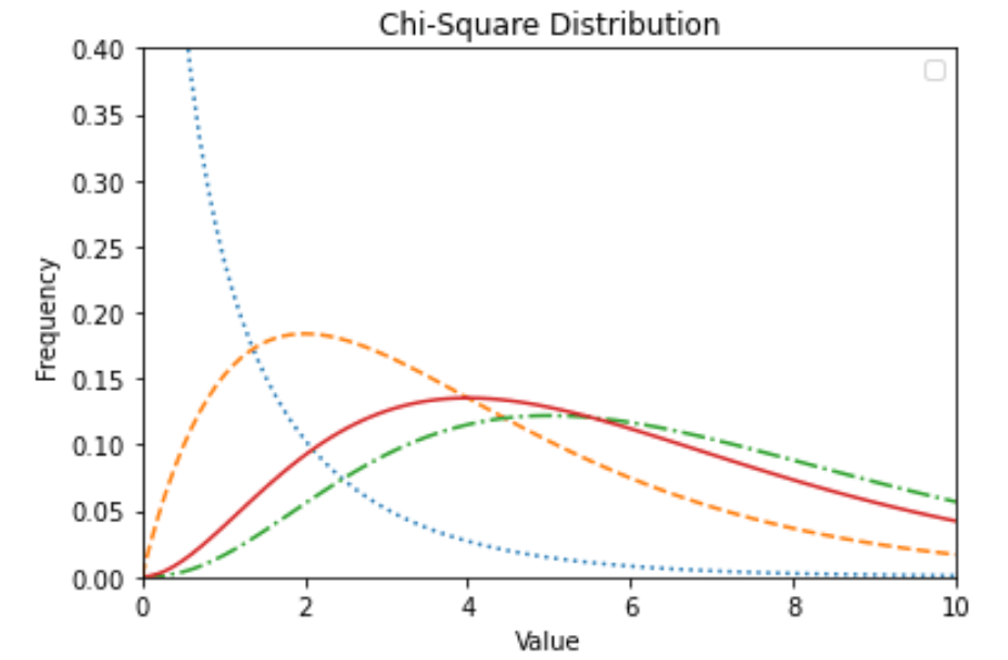
In the python program, we can use various functions and here, we use a library called "numpy" to perform the chi-square test.
from scipy import stats
import numpy as np
import matplotlib.pyplot as plt
x = np.linspace(0, 10, 100)
fig,ax = plt.subplots(1,1)
linestyles = [':', '--', '-.', '-']
deg_of_freedom = [1, 4, 7, 6]
for df, ls in zip(deg_of_freedom, linestyles):
ax.plot(x, stats.chi2.pdf(x, df), linestyle=ls)
plt.xlim(0, 10)
plt.ylim(0, 0.4)
plt.xlabel('Value')
plt.ylabel('Frequency')
plt.title('Chi-Square Distribution')
plt.legend()
plt.show()
Result
Evaluating our model
To evaluate whether our model is good enough or not, we will use a method called Train/Test.
What is Train/Test?
It is a method for calculating the accuracy of our model.
The name suggests Train/Test because we will split the data set into two sets: a training set and a testing set.
Train model is used to create the model and Test model test the accuracy of that model.
Applications of data distribution
- One of the best and most used applications is the data distribution method will organize the raw data into a graphical method like histograms, box plots, run charts etc. and will provide useful information.
- The main application is that it estimates the probability of any specific observation in a sample space.