Create a Stacked Bar Plot Using Matplotlib in Python
Matplotlib is a Python library that is used for visualizing data. This library is used for visualizing 2D plots of arrays. The matplotlib library is a multi-platform data visualization library that is built on the NumPy arrays and designed to work with scipy. The Matplotlib library was developed by John Hunter in 2002. The greatest advantage of visualization is that it allows people to visualize a huge amount of data in an easy and efficient manner. Matplotlib contains various plots such as line, bar, scatter, histogram, etc.
You can install the matplotlib library with the help of the pip command. Open your command prompt and type the following command:
Command:
$ pip install matplotlib
After successfully installing the matplotlib library, the matplotlib library can be installed by writing a single line of code, opening the IDE that you prefer to code that type the following code:
Code:
import matplotlib
Matplotlib library provides various plots. The plots help us understand the trends and patterns, make correlations to understand the data, and help obtain insightful results. These are typically used for reasoning about quantitative information. Some plots are given by the matplotlib library, such as line plots, bar plots, histogram plots, scatter plots, pie charts, and area charts.
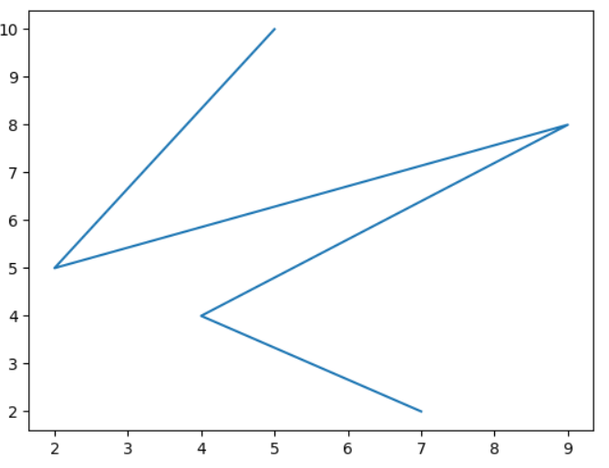
Let's see a simple line chart in matplotlib. The line chart can be drawn by defining the x and y values for a plot, the data is plotted with the help of the plot() function provided by the matplotlib library and to display the plot, the show() function is used that is provided by the matplotlib library. The plot() makes a line plot by connecting the points defined by x and y data points.
Let’s plot a line chart in matplotlib:
Code:
# importing matplotlib module

import matplotlib.pyplot as plt

# x-axis values

x = [5, 2, 9, 4, 7]

# Y-axis values

y = [10, 5, 8, 4, 2]

# Function to plot

plt.plot(x, y)

# function to show the plot

plt.show()
Output:
Explanation:
The matplotlib library is imported, and the x and y data points are defined. With the help of the plot function, the line plot is plotted by passing the x and y values in the plot function as parameters, and finally, the line plot is displayed with the help of the show() function in the matplotlib library.
Let's see how a bar plot is plotted with the help of the matplotlib library. For plotting the bar chart, the two axes are defined, that is, x and y. The bar function plots the bar chart of the given data points, and finally, the chart is displayed.
Code:
# importing matplotlib module

import matplotlib.pyplot as plt

x = [5, 2, 9, 4, 7]

# Y-axis values

y = [10, 5, 8, 4, 2]

# Function to plot the bar

plt.bar(x, y)

# function to show the plot

plt.show()
Output:
Explanation:
The bar chart is plotted by importing the matplotlib library, and x and y are the data points. These data points are passed into the bar function provided by the matplotlib for plotting the bar chart, and After plotting the chart, the chart is displayed with the help of the show() function.
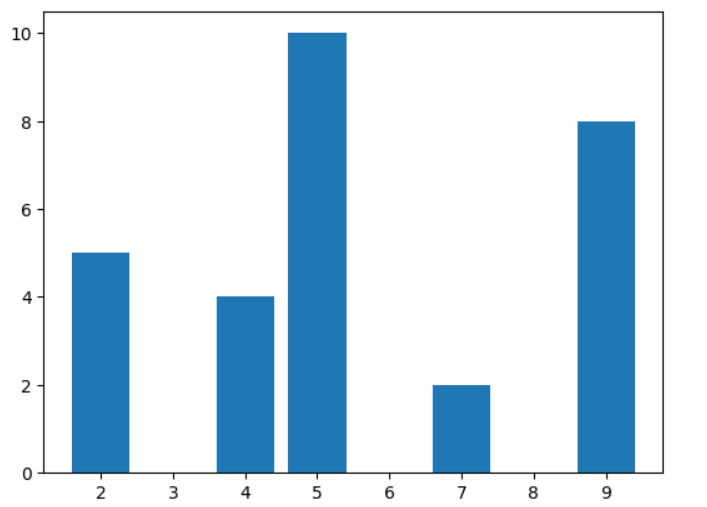
Let's see how to plot a histogram in the matplotlib. The histogram is plotted with the help of the hist() method provided by the matplotlib library. The hist method takes only one argument as the data points, and based on these data points, the plot is displayed.
Code:
# importing matplotlib module

import matplotlib.pyplot as plt

# Y-axis values

y = [10, 5, 8, 4, 2]

# Function to plot histogram

plt.hist(y)

# function to show the plot

plt.show()
Output:
Explanation:
In the above code, we can see that only one data point is defined, which is the y-axis point, which is an array. Then, these data points are passed into the hist method, and the histogram plot is displayed.
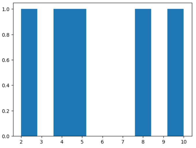
Let's see how to plot a scatter plot with the help of the matplotlib library. First, the data points are defined, that is, the x and y values for visualizing the scatter plot. Then, these data points are passed into the scatter function provided by the matplotlib library.
Code:
# importing matplotlib module

import matplotlib.pyplot as plt

# x-axis values

x = [5, 2, 9, 4, 7]

# Y-axis values

y = [10, 5, 8, 4, 2]

# Function to plot scatter

plt.scatter(x, y)

plt.show()
Output:
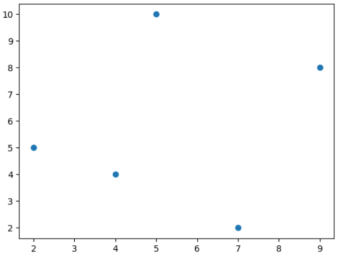
Explanation:
In the above code, we can see that two data point values are defined that is x and y, and these data points are passed into the scatter function provided by the matplotlib library, and then the plot is displayed with the help of the show function provided by matplotlib library.
You can also plot the scatter plot by inserting the marker style as ‘o’.
Code:
# importing matplotlib module

import matplotlib.pyplot as plt

# x-axis values

x = [5, 2, 9, 4, 7]

# Y-axis values

y = [10, 5, 8, 4, 2]

# Function to plot scatter using plot() method

plt.plot(x, y, 'o')

# function to show the plot

plt.show()
Output:
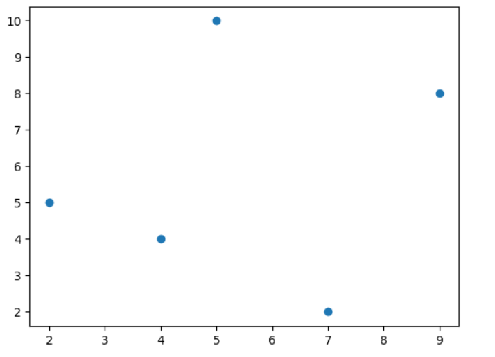
Explanation:
In the given code, the matplotlib library is imported, and the x and y data points are defined; these data points are passed into the plot function, and the marker as o and the plot are displayed with the help of the show method.
A pie chart can also be plotted by importing the Python matplotlib library to create the pie chart with three categories and respective sizes.
Code:
import matplotlib.pyplot as plt

# Data for the pie chart

labels = ['A', 'B', 'C']

sizes = [35, 35, 30]

# Plotting the pie chart

plt.pie(sizes, labels=labels, autopct='%1.1f%%', startangle=90)

plt.title('Pie Chart Example')

plt.show()
Output
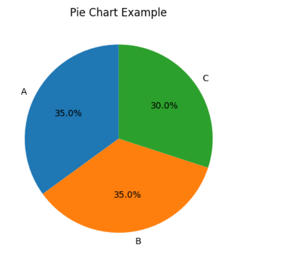
Explanation:
In the given code, the matplotlib library is imported, the labels and data are taken, the pie plot is plotted with labels, and the autopilot is set. The title is set with the help of the title() method provided by the matplotlib library.
Code:
import matplotlib.pyplot as plt

# Data

x = [1, 2, 3, 4, 5]

y1 = [10, 20, 15, 25, 30]

 y2 = [5, 15, 10, 20, 25]

# Area Chart

plt.fill_between(x, y1, y2, color='skyblue', alpha=0.4, label='Area 1-2')

plt.plot(x, y1, label='Line 1', marker='o')

plt.plot(x, y2, label='Line 2', marker='o')

# Labels and Title

plt.xlabel('X-axis')

plt.ylabel('Y-axis')

plt.title('Area Chart Example')

# Legend and Display

plt.legend()

 plt.show()
Output:
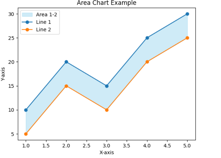
In the above code, the X and y axes are taken, and the area is filled between the y1 and y2 axes with the help of the fill_between method. The colour of the area is sky blue, and the Y1 and y2 points are plotted with the help of the plot method, and the labels are set.
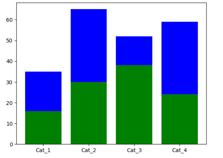
The Stacked Bar Graph in Python Using Matplotlib –
Step 1: Importing And Dummy Data Creation
In this step, the matplotlib package is imported first, and then dummy data will be created to visualize the data.
Code:
import matplotlib.pyplot as plt

#Dummy data

x = ['Cat_1', 'Cat_2', 'Cat_3', 'Cat_4']

y1 = [16, 30, 38, 24]

y2 = [19, 35, 14, 35]
In the above code, we have created dummy data.
Step 2: Plotting Stack Bar Chart
After creating the dummy data, the stack bar chart is plotted.
Code:
plt.bar(x, y1, color='g')

plt.bar(x, y2, bottom=y1, color='b')

plt.show()
Output: