What is a Chart?
A chart is a graphical representation of data that is used to present information clearly and concisely. Charts are commonly used to display trends, patterns, and relationships in data that may not be immediately obvious from a table or a list of numbers. Charts can take many forms, including line graphs, bar charts, pie charts, scatter plots, etc. Each chart type is best suited for different types of data and purposes. They are used in a wide variety of fields, including business, science, engineering, and finance, among others. They are a powerful tool for communicating complex information to others in a way that is easy to understand and visually appealing.
Types of Charts
There are many charts, each with strengths and weaknesses depending on the type of data being presented and the chart's purpose. Here are some of the most common types of charts:
1) Bar Graph
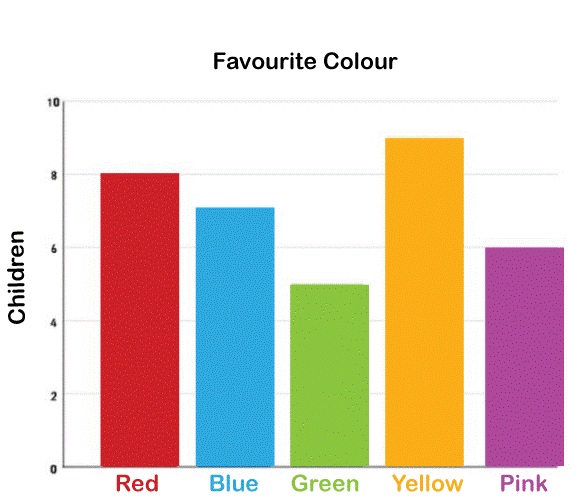
A bar graph, also known as a bar chart, is a type of chart that uses rectangular bars to represent the magnitude of data values. The length or height of each bar corresponds to the value being represented. Bar graphs are commonly used to compare data values across different categories or groups. Bar graphs can be horizontal or vertical. In a horizontal bar graph, the bars are arranged horizontally along the x-axis, with the length of each bar representing the data value. In a vertical bar graph, the bars are arranged vertically along the y-axis, with the height of each bar representing the data value.
Bar graphs are commonly used in a variety of fields, including business, economics, and social sciences. They are useful for visualizing discrete, categorical, or grouped data. For example, a bar graph can be used to compare sales figures for different products or the number of votes received by different political parties in an election.
One advantage of using a bar graph is that it allows for easy comparison of data values. The bars can be easily sorted or arranged in order to highlight the differences between the values. Additionally, bar graphs are easy to read and understand, even for people who need to become more familiar with the presented data.
2) Line Chart
A line chart, also known as a line graph, displays information as a series of data points connected by straight line segments. It is commonly used to show trends or patterns over time.
In a line chart, the x-axis represents time or another continuous variable, while the y-axis represents the measured variable's value. The data points are plotted on the chart and then connected by lines, creating a continuous line that shows the progression of the variable over time.
Line charts are commonly used in many different fields, including business, economics, and social sciences. They are useful for visualizing continuous data that can be measured over time. For example, a line chart can show a company's stock prices over several years or the change in average temperature over a year.
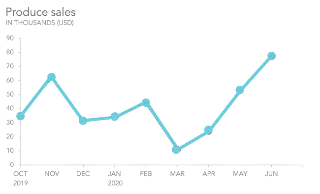
One advantage of using a line chart is that it allows for easy visualization of trends or patterns in data. The slope of the line can show whether the variable is increasing, decreasing, or remaining stable over time. Line charts can also be used to compare the trends of multiple variables on the same chart, making it easy to identify relationships between variables.
Another advantage of line charts is that they are easy to read and understand. The lines are simple and intuitive, making it easy for viewers to interpret the presented data.
3) Pie Chart
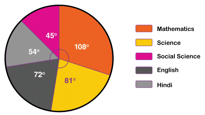
A pie chart is a circular chart divided into sectors, with each representing a proportion of the whole. The size of each sector is proportional to the value it represents. Pie charts commonly show the relative size or proportion of different categories or groups. In a pie chart, the entire circle represents the total value, and each sector represents a part of that value. The sectors are usually labelled with the category or group they represent and the percentage or value they represent.
Pie charts are commonly used in many fields, including business, economics, and social sciences. They are useful for visualizing data that is categorical and can be broken down into different groups or categories. For example, a pie chart can show the distribution of expenses in a household budget or the breakdown of votes in an election.
One advantage of using a pie chart is that it allows for easy comparison of different categories or groups. The viewer can quickly see the relative size of each sector and compare them to other sectors or the total value. Another advantage is that pie charts are visually appealing and easy to read, making them popular for presentations and reports. However, pie charts also have some limitations. They can be difficult to read if there are too many categories or groups, and it can be hard to compare sectors that are similar in size accurately. Sometimes, a bar chart or a stacked bar chart may be a better option for presenting categorical data.
4) Scatter Plot
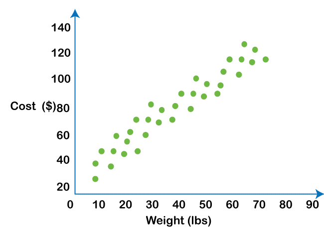
A scatter plot is a type of chart that uses Cartesian coordinates to display the values of two variables for a set of data. Each data point in a scatter plot represents a single observation, and the data point's position on the chart indicates the values of the two variables for that observation. In a scatter plot, one variable is plotted on the x-axis, and the other variable is plotted on the y-axis. The resulting chart shows how the two variables are related to each other. For example, a scatter plot can show the relationship between a person's age and income, with age plotted on the x-axis and income plotted on the y-axis.
Scatter plots are commonly used in many fields, including science, engineering, and social sciences.
They are useful for visualizing the relationships between two continuous variables. Scatter plots can be used to identify trends, patterns, or outliers in the data and to identify possible correlations between the two variables.
One advantage of using a scatter plot is that it easily identifies relationships between two variables. The viewer can quickly see how the data points are distributed on the chart, and whether there is a positive or negative correlation between the two variables. Scatter plots can also identify any outliers or unusual observations in the data set.
Another advantage of scatter plots is that they can be used to model data and make predictions. By identifying the trend or pattern in the data, it is possible to predict the variables' values. Scatter plots can also be used to test hypotheses and evaluate statistical models.
5) Bubble Chart
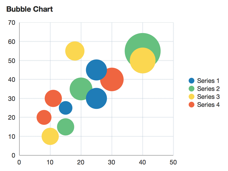
A bubble chart is a type of chart that displays data in a three-dimensional format. It is similar to a scatter plot but with the addition of a third variable represented by the size of the data points. In a bubble chart, the x-axis and y-axis represent the values of two variables, while the size of the bubbles represents the value of a third variable. Each bubble represents a single observation, and the bubble's position on the chart indicates the values of the two variables for that observation. The size of the bubble indicates the value of the third variable.
Bubble charts are commonly used in business, economics, and social sciences to visualize complex data sets that have three variables. For example, a bubble chart can be used to show the relationship between a company's revenue, profit, and market share, with revenue and profit, plotted on the x-axis and y-axis, and market share represented by the size of the bubbles.
One advantage of using a bubble chart is that it easily identifies relationships between three variables.
The viewer can quickly see how the data points are distributed on the chart and whether the two variables have a positive or negative correlation. The size of the bubbles provides an additional layer of information, allowing for quick identification of outliers or unusual observations in the data set.
Another advantage of bubble charts is that they can be customized to show additional information. For example, the color of the bubbles can be used to represent a fourth variable, allowing for even more complex data sets to be visualized in a single chart. However, bubble charts can also become cluttered if there are too many bubbles or if the bubbles are too close together, making it difficult to interpret the data.
6) Area Chart
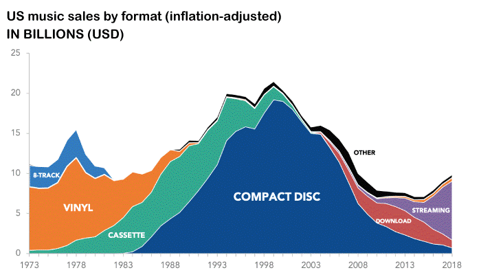
An area chart is a type of chart that displays data as a series of data points connected by a line, with the area between the line and the x-axis filled with color or shading. Area charts are similar to line charts, but with the addition of the shaded area. The shaded area helps to emphasize the magnitude of the values being displayed, and can be useful for showing trends over time or comparing multiple data series.
Area charts are commonly used in data visualization to display quantitative data, such as stock prices, temperature fluctuations, or website traffic. They can be particularly useful for highlighting changes in data over time and showing the relationship between different data series. However, they may not be the best choice for displaying discrete data or data with a limited number of categories, as the shading can make it difficult to discern individual values.
7) Histogram
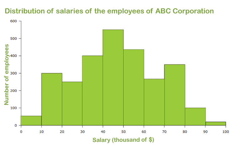
A histogram is a chart that displays the distribution of numerical data by grouping it into ranges or "bins" and showing the number or frequency of data points that fall within each bin. The horizontal axis represents the range of values, while the vertical axis represents the frequency of data points in each bin.
Histograms are useful for identifying patterns or trends in data, such as the shape of the distribution, the presence of outliers, or the degree of variability in the data. They are commonly used in statistical analysis, market research, and quality control.
To create a histogram, you must first determine the range of values to be included and the number of bins to use. You then count the number of data points within each bin and plot the results as a bar chart, with each bar representing a bin and the height representing the frequency of data points in that bin. Histograms can be customized by adjusting the bin size, changing the colour or style of the bars, adding labels or annotations, or overlaying multiple histograms for comparison.
8) Gantt Chart
A Gantt chart is a type of bar chart that displays the timeline of a project or series of tasks, along with their duration, start and end dates, and dependencies. Gantt charts are commonly used in project management to track progress and visualize the schedule of tasks. Each task or activity is represented by a horizontal bar, with its length proportional to its duration. The bars are positioned along a horizontal axis that represents the timeline of the project or tasks. The vertical axis shows the list of tasks or activities, typically in the order they will be completed.
Dependencies between tasks are indicated by arrows connecting the bars, showing which tasks must be completed before others can begin. Vertical lines or symbols can represent milestones or important deadlines.
Gantt charts can help project managers and teams to identify potential delays or bottlenecks, adjust timelines or resources as needed, and communicate progress to stakeholders. They can also be customized with different colours, labels, or additional information, such as resource assignments or costs. Many project management software tools include Gantt chart functionality.
9) Radar Chart
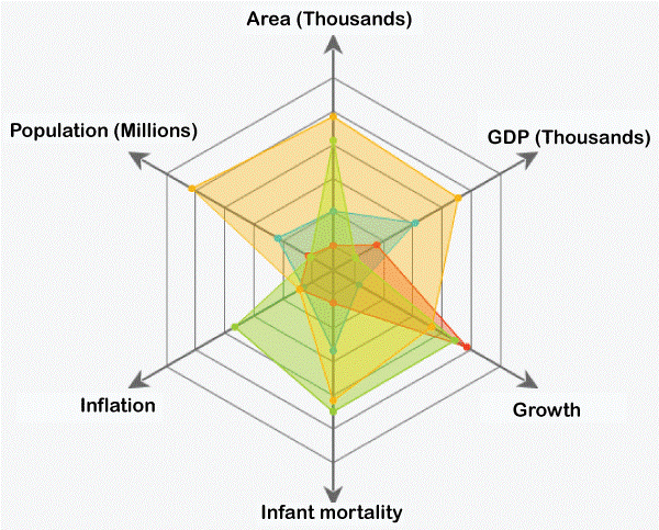
A radar chart, also known as a spider chart or a web chart, is a graphical representation of data that uses a circular or polygonal shape to display multiple variables or categories. It is called a "radar" chart because the shape resembles the spokes of a bicycle wheel or a radar screen.
In a radar chart, each variable is represented by a spoke radiating from the center of the chart, and the data points for each variable are plotted as a point along its respective spoke. The area inside the shape is often shaded or colored to make it easier to see the differences between the variables.
Radar charts are useful for comparing the relative strengths or weaknesses of different categories or variables and identifying data patterns or trends. They are commonly used in market research, performance evaluations, and sports analysis.
Radar charts can be customized by adjusting the number of spokes, changing the axis labels or scales, adding multiple data series or layers, or changing the colours or styles of the lines or shapes. However, they can be difficult to read accurately, especially when many variables or data values are close together.
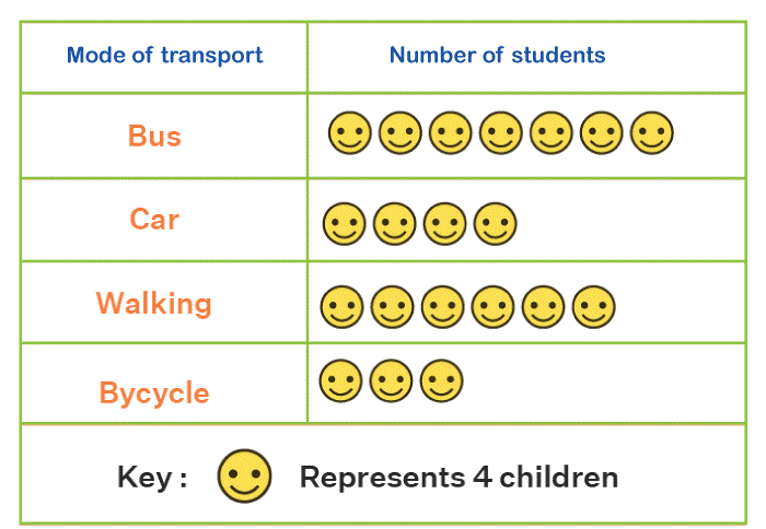
10) Pictograph
A Pictograph is a chart that uses symbols or pictures to represent data. Each symbol represents a certain quantity or value, and the number of symbols is proportional to the size or frequency of that value. Pictographs are often used to make data more engaging and visually appealing, especially for children or non-specialist audiences.
Pictographs can take various forms, such as icons, emojis, or drawings, and can be used to represent different types of data, such as quantities, percentages, or rankings. They are commonly used in advertising, education, and infographics.
To create a pictograph, you must first determine the data to be included and the symbols or pictures to use. You then select an appropriate scale for the symbols and plot the data using a grid or chart that shows the symbols arranged clearly and meaningfully. Pictographs can be customized by adjusting the size or shape of the symbols, changing the color or style of the chart, adding labels or annotations, or combining multiple pictographs for comparison. However, they can also be misinterpreted or biased, especially if the symbols need to be more consistent or appropriate for the data being represented.
Steps to Create a Chart
The specific steps to create a chart depending on the type of chart you want to create and the tools you use. However, here are some general steps to follow:
1. Determine the purpose and audience of your chart: Identify the data you want to display, the insights you want to provide, and the visual preferences of your audience.
2. Collect and prepare your data: Ensure that your data is accurate, complete, and relevant to your chart's purpose. Properly format and organize your data, and remove any outliers or errors.
3. Choose the chart that best fits your data: Select the chart that is most appropriate for the data you want to display and the insights you want to provide.
4. Select the right tools and software: Choose the software or tool that is best suited to your charting needs, such as Excel, Tableau, or Python libraries.
5. Input your data into the charting software: Input your prepared data into the charting software, and choose the appropriate chart type.
6. Customize the chart: Customize the chart to make it visually appealing and easy to understand. This can include adding titles, labels, axes, and legends, changing the colours and fonts, and adjusting the chart layout.
7. Test and refine your chart: Test the chart for accuracy, readability, and accessibility. Get feedback from colleagues or stakeholders, and refine the chart to improve its impact and effectiveness.
8. Share and present your chart: Share it with your audience and present the insights it provides clearly and engagingly.
Tools for Chart
Many tools are available for creating charts, ranging from basic spreadsheet programs to advanced data visualization software. Some common tools for creating charts include:
1. Microsoft Excel: Excel is a widely-used spreadsheet program that includes a variety of charting features, such as bar charts, line charts, pie charts, and scatter plots. It is easy to use and is a good choice for basic charting needs.
2. Google Sheets: Google Sheets is a free, cloud-based spreadsheet program that offers many of the same charting features as Excel. It also allows for real-time collaboration, making it a good choice for team projects.
3. Tableau: Tableau is powerful data visualization software that allows users to create interactive charts, maps, and dashboards. It offers many chart types and customization options but can be more complex than spreadsheet programs.
4. Python libraries: Python is a popular data analysis and visualization programming language. Several libraries, such as Matplotlib, Seaborne, and Plotly, allow users to create a wide range of charts and visualizations.
5. Canva: Canva is a design platform that offers a variety of templates and tools for creating charts, infographics, and other visual content. It is easy to use and does not require advanced design skills.
6. Adobe Illustrator: Illustrator is professional design software with advanced features for creating custom charts and graphics. It is more complex to use than other tools and requires a higher skill level.
The choice of tool depends on your needs, budget, and skill level. Spreadsheet programs such as Excel or Google Sheets are sufficient for simple charts and graphs. Data visualization software such as Tableau or Python libraries may be more suitable for more complex visualizations and interactive dashboards.
Advantages of Chart
Charts have several advantages, making them useful tools for visualizing and communicating data. Some of the key advantages of charts include the following:
1. Simplify complex data: Charts can help to simplify complex data by presenting it in a visual format that is easier to understand and interpret than a table of numbers.
2. Communicate information effectively: Charts can help to communicate information more effectively by presenting it in a way that is clear and easy to understand.
3. Identify patterns and trends: Charts can help to identify patterns and trends in data that may not be immediately apparent from a table of numbers. This can be useful for identifying insights and making decisions based on the data.
4. Highlight outliers and anomalies: Charts can help highlight outliers and data anomalies that may be important for analysis or decision-making.
5. Support decision-making: Charts can support decision-making by visually representing data that can be easily interpreted and understood.
6. Enhance engagement: Charts are visually appealing and can help to enhance engagement with the data by making it more interesting and engaging.
7. Provide a flexible tool: Charts can be created in various formats, allowing the creator to choose the best format for the presented data.
Note: Charts are a powerful tool for data visualization and communication, and their advantages make them an important tool for decision-making, analysis, and communication of information.